Where weathered wood meets whispered romance—craft a home that feels both deeply rooted and tenderly cherished, without tipping into clutter or cliché.
There exists a quiet magic in spaces that feel lived-in—not neglected, but lovingly worn. Where a sun-bleached linen curtain catches the afternoon light, a chipped porcelain pitcher holds wildflowers gathered that morning, and the gentle curve of a Louis XV chair invites you to linger over tea. Shabby chic and French country styles capture this essence: a celebration of imperfection, history, and soulful comfort. Yet too often, attempts to blend these beloved aesthetics result in rooms that feel either overly precious (“Is this too shabby?”) or confusingly rustic (“Does this floral clash with the farmhouse table?”). This guide dismantles the confusion. Drawing from documented design evolution, material considerations, and spatial principles observed across authentic European homes and contemporary adaptations, we provide a clear, actionable roadmap to harmonize these styles with intention. You’ll discover how to layer textures without chaos, honor authenticity without rigidity, and create a sanctuary that feels uniquely yours—a place where every nick, fade, and curve tells a story of warmth and welcome.
Introduction: Beyond the Pinterest Filter
Walk into a traditional French mas (farmhouse) in Provence at dawn, and you’ll encounter woodsmoke, baking bread, and lavender carried on the mistral wind. The stone floors are cool beneath bare feet; the wooden table bears generations of knife marks and wine stains; sunlight filters through lace curtains onto a faded toile de Jouy armchair. This isn’t staged decor—it’s a life deeply lived. Similarly, the shabby chic aesthetic, popularized in late-20th-century design publications yet echoing Victorian-era cottage sensibilities, finds beauty in the gentle unraveling of time: a silk ribbon fraying at the edges, a painted dresser softened by decades of use.
These styles are frequently conflated online, reduced to “distressed furniture + florals.” But their foundations differ meaningfully. French country draws from agrarian necessity and regional French craftsmanship—robust oak beams, terracotta tiles, functional pottery shaped by local resources and climate. Shabby chic leans into romanticized English cottage whimsy: delicate chintz, gilded mirrors with softly clouded glass, and an intentional softness. The magic emerges not in choosing one over the other, but in recognizing their shared heartbeat: a reverence for authenticity over perfection.
Historical records indicate both aesthetics crystallized as responses to prevailing design trends of their eras. French country aesthetics evolved organically across the 17th–19th centuries as rural households adapted accessible materials to emulate refined motifs seen in aristocratic settings—a practical democratization of elegance. Shabby chic, as documented in design journals from the 1980s onward, arose as a conscious counterpoint to minimalist and industrial aesthetics, championing tactile warmth, nostalgia, and comfort. Understanding this lineage isn’t academic trivia; it’s your compass. When you grasp why certain elements hold significance, you gain thoughtful freedom to adapt the spirit of the style to your life, climate, family rhythms, and existing architecture—without anxiety about “getting it wrong.” This foundation transforms decoration from mimicry into meaningful curation.
The Rooted Romance Framework: Four Layers to Authentic Harmony
Forget rigid checklists. True style cohesion emerges from building depth, not just accumulating objects. The Rooted Romance Framework offers a sequential, intuitive process to layer shabby chic’s ethereal softness with French country’s earthy grounding. Work through these layers room by room. Rushing to “decorate” before establishing Layer 1 is the most frequent cause of spaces feeling disjointed or costumed.
Layer 1: The Historical Soul (Anchor in Place & Purpose)
Before selecting a single paint swatch, pause and ask: What story does this room need to tell? A bedroom requires different poetry than a kitchen. French country design is inherently regional. Provence whispers of sun-drenched lavender fields and ochre cliffs; Normandy speaks of misty apple orchards and slate-gray skies; Burgundy evokes vineyard-rich earth and deep wine tones. Shabby chic, while less geographically bound, carries emotional geography: the coastal light of a Cornish cottage, the floral abundance of an English garden room.
Why this layer matters: Without this anchor, choices can feel random. A Provence-inspired kitchen with icy blue cabinets and chrome hardware may create subtle dissonance—the eye senses the style’s “language” is inconsistent. Conversely, aligning your palette and materials with a specific inspiration fosters immediate coherence.
How to implement it:
1. Choose your “spirit region” for the room. Avoid blending regions haphazardly (e.g., Provence colors with Normandy textures). Select one primary influence.
– Provence: Warm whites, sun-bleached terracotta, sage green, lavender, ochre. Materials: limestone, terracotta, wrought iron, faded linens.
– Normandy: Creamy whites, dove gray, moss green, apple red. Materials: rough-hewn oak, slate, wool, aged brass.
– Burgundy: Cream, deep burgundy, forest green, mustard. Materials: rich walnut, velvet (used sparingly), copper, heavy linen.
2. Define the room’s emotional purpose. Is the living room for lively family gatherings (lean French country: sturdy seating, durable fabrics) or quiet contemplation (lean shabby chic: plush chaise, soft lighting)?
3. Document your anchor. Write it down: “Master bedroom: Normandy-inspired sanctuary for rest. Palette: dove gray, cream, moss green. Feeling: calm, grounded, softly romantic.” Keep this visible during decisions.
Common considerations:
– Avoid tourism clichés: Generic Eiffel Tower motifs or tricolor flags rarely reflect authentic French country design, which celebrates local craft and regional identity rather than national symbols.
– Honor your actual environment: Installing pale limestone-look floors in a high-traffic mudroom with active pets may lead to frustration. Adapt the spirit (warmth, texture) using honed porcelain tile that mimics limestone’s appearance while offering practical resilience.
– Work with your architecture: A modern open-plan space with clean lines won’t convincingly mimic a centuries-old stone mas. Instead, honor your space’s truth. Bring the style through furniture silhouettes, textiles, lighting, and curated objects rather than structural alterations that feel imposed.
The Guiding Insight: Style is not about replicating a postcard; it’s about translating a feeling into your unique context. Authenticity flourishes where intention meets reality.
Layer 2: The Textural Palette (Weave Depth, Not Just Color)
Color sets the tone, but texture conducts the atmosphere. In traditional French country homes, texture arose from necessity: rough stone walls for insulation, woven rush seats for breathability, heavy wool blankets for warmth. In shabby chic, texture is curated tenderness: the slub of hand-loomed linen, the delicate weave of lace, the soft pile of a well-loved rug. Thoughtful layering creates visual and tactile interest that photographs cannot fully capture—but the senses deeply register.
Why texture deepens a space: A room painted entirely in a single “French gray” can feel flat. Introduce a nubby bouclé throw, a smooth ceramic vase, a rough-hewn wooden bowl, and a silky velvet pillow—and the space gains dimension, inviting touch and suggesting a history of use and care. Texture also offers practical benefits: subtle surface variation camouflages minor wear, and layered textiles absorb sound for greater comfort.
Building your textural library:
– Foundational Textures (70% of the room): These form the quiet backdrop. Think plaster walls (real or faux-finished), wide-plank oak floors (reclaimed or new with wire-brushed finish), linen curtains, wool rugs. French country emphasis: Rougher, organic—visible wood grain, uneven plaster, nubby weaves. Shabby chic emphasis: Softer refinements—smooth plaster finishes, bleached wood tones, finely woven linens.
– Supporting Textures (25%): Furniture and larger textiles. A rush-seated ladder-back chair (French country) beside a velvet-upholstered bergère (shabby chic). A chunky knit throw draped over a sofa. A ceramic garden stool used as a side table.
– Accent Textures (5%): Delicate details. Lace doilies under perfume bottles, a silk ribbon tying back curtains, the subtle crackle glaze on vintage porcelain, the fine weave of a macramé wall hanging.
Practical application by surface:
– Walls: Move beyond flat builder-grade paint. Consider:
– Limewash: Creates a soft, chalky, breathable finish with gentle variation. Ideal for French country. Apply in thin layers; it darkens slightly as it cures. Note: Requires proper surface prep; test extensively.
– Clay paint: Offers velvety, matte depth with mineral pigments. Excellent for shabby chic’s soft-focus effect.
– Faux finish: A skilled artisan can mimic aged plaster. For DIY enthusiasts: mix joint compound with paint for a subtle “skip trowel” effect. Always practice on a sample board first.
– Floors:
– Wood: Wide planks (5″+), preferably oak. Finish with matte oil (like Rubio Monocoat) to enhance grain and allow for easy spot repairs—scuffs blend into the evolving patina. Avoid high-gloss finishes, which highlight every mark and feel incongruent with the style’s warmth.
– Tile: Terracotta (unglazed, properly sealed), limestone, or encaustic cement tiles. Lay in herringbone or brick patterns for old-world character. In moisture-prone areas (bathrooms), choose porcelain tiles mimicking these materials for durability.
– Rugs: Layer a large, neutral flat-weave (sisal, jute) as a base. Top with a smaller, vintage-inspired rug (Persian, Aubusson-style, or faded floral). Ensure rugs are large enough that front furniture legs rest on them to anchor the space.
– Textiles (The Heartbeat of the Style):
– Linen is foundational. Its natural slub, gentle wrinkling, and beautiful fading over time embody the “lived-in” ethos. Use for curtains, slipcovers, tablecloths, and bedding.
– Cotton: Choose percale for crisp bedding, voile for airy curtains, or heavy duck canvas for durable slipcovers.
– Wool: For throws and area rugs—adds warmth and sound absorption.
– Considerations: In humid climates, pure linen curtains may require extra care; a linen-cotton blend offers similar aesthetics with improved moisture resistance. In homes with pets, reserve delicate lace accents for low-traffic surfaces like bedroom shelves. Texture should support your life, not complicate it.
Layer 3: The Furniture Language (Shape, Scale, and Soul)
Furniture is where the styles converse most vividly. French country furniture speaks of utility and regional craft: sturdy, often substantial pieces built for longevity. Shabby chic furniture whispers of refined comfort and romantic repurposing: lighter forms, gentle curves, and a sense of cherished history. Blending them thoughtfully requires attention to proportion and narrative flow.
Decoding the silhouettes:
– French Country Signatures:
– Farm tables: Thick planks (often oak or walnut), trestle or pedestal bases, visible joinery. Signs of use—knife marks, water rings—are often embraced as character.
– Armoires: Tall, paneled wardrobes, sometimes with carved motifs (grapes, wheat). Originally for linens or clothing; today ideal for media storage or pantry organization.
– Ladder-back or Windsor chairs: Simple, rush-seated or solid wood. Functional and versatile.
– Buffets/Console tables: Substantial, with drawers and cabinets for storage. Essential in dining rooms or entryways.
– Shabby Chic Signatures:
– Bergère chairs: Enclosed upholstered arms, often with exposed wooden frames. Epitomizes cozy elegance.
– Chaise lounges: Curved, inviting forms for reading nooks.
– Demilune tables: Half-moon shaped, ideal for narrow hallways or against walls.
– Vintage vanities: With ornate mirrors and delicate legs.
A blending approach: The 70/30 Guideline
For harmonious fusion, let one style inform the room’s foundational pieces (approximately 70%), while the other provides accent elements (approximately 30%). This creates balance without competition.
– Example 1 (Kitchen): 70% French country (a substantial reclaimed oak farm table, rustic open shelving with pottery) + 30% shabby chic (painted Windsor chairs with removable floral seat cushions, a delicate crystal chandelier).
– Example 2 (Living Room): 70% shabby chic (a large slipcovered sofa, a bergère chair) + 30% French country (a sturdy oak coffee table with iron strap details, a woven rush ottoman).
Key considerations for authenticity and function:
– Wood tones and finishes: Avoid striving for perfect uniformity. French country often celebrates the warmth of natural wood (oak, walnut, cherry). Shabby chic frequently features painted pieces (white, cream, soft gray). Limit visible wood tones to 2-3 for cohesion. For painted furniture, aim for an aged appearance rather than factory-perfect uniformity. Techniques include lightly sanding edges and corners, using a crackle medium under a top coat, or applying a dark wax glaze to settle into crevices.
– Scale and proportion: Ensure furniture relates comfortably to the room’s size and to each other. A delicate shabby chic chair may feel visually overwhelmed beside a massive French country armoire. In smaller rooms, select French country pieces with lighter visual weight (e.g., a trestle table with slender legs versus a chunky pedestal table).
– Upholstery wisdom:
– Slipcovers offer versatility. They embody shabby chic’s adaptable charm while addressing French country’s need for practicality. Choose washable linen or cotton duck.
– Fabric choices: For high-use seating (family room sofa), performance fabrics designed to mimic linen or cotton (brands like Crypton or Revolution) provide stain resistance without compromising aesthetics. Reserve delicate chintz or silk for low-traffic areas (guest room chair).
– Patterns: Toile, floral chintz, and striped ticking are classics. Scale matters: large-scale florals feel contemporary; tiny, dense prints evoke vintage charm. Confidently mix patterns: pair a large-scale floral pillow with a small-scale stripe on a chair. Anchor with solid textiles.
– The “found object” perspective: Before purchasing new “distressed” furniture, consider: “Does this suggest a history, or does it appear artificially aged?” Mass-produced “distressed” pieces often feature random, unnatural marks. Authentic wear follows patterns of use: edges smoothed by hands, centers of chair seats worn thin. When possible, source genuine vintage or antique pieces. Local flea markets, estate sales, and online marketplaces can yield treasures. Clean thoroughly, repair structurally, but preserve meaningful patina.
Room-specific furniture guidance:
– Dining Room: The farm table often anchors the space. Pair with a mix of chairs for eclectic charm (e.g., two ladder-backs, two upholstered side chairs). Verify table height (typically 29-30″) works with chair seats (18-20″). Add a substantial buffet for storage and display.
– Bedroom: A wrought-iron or carved wood bed frame sets the tone. Avoid overly ornate frames unless your space is generous with high ceilings. Pair with simple nightstands (a small armoire or vintage crate works beautifully). A chaise at the foot of the bed adds shabby chic luxury.
– Living Room: Prioritize comfort. A deep-seated sofa with down-blend cushions invites relaxation. Balance its softness with a sturdy wood coffee table. Include varied seating heights (armchairs, ottomans) to encourage conversation.
Layer 4: The Decorative Accents (Curate, Don’t Clutter)
Accents are the poetry of a space—the details that make a room feel personal and complete. Yet this layer carries the greatest risk: sentimentality tipping into visual clutter. French country accents often celebrate usefulness; shabby chic accents celebrate beauty. The most serene spaces honor both principles with intention.
The Philosophy of “Purposeful Beauty”:
Consider whether each object earns its place by fulfilling at least one role:
1. Functional (a ceramic pitcher holds utensils)
2. Meaningful (a framed photo of family in a Provence garden)
3. Sensory (a lavender sachet in a linen closet)
4. Narrative (a vintage scale hinting at market days)
If an item serves none of these purposes, it may contribute to visual noise. This isn’t minimalism; it’s curation with purpose.
Curating authentic accents by category:
– Lighting (Sets the Mood):
– French Country: Wrought iron chandeliers with candle-style bulbs (LED “flame effect” bulbs offer safety and ambiance), simple ceramic table lamps, lanterns.
– Shabby Chic: Crystal chandeliers (even small ones over a dining table), porcelain lamps with floral shades, gilded mirrors that reflect light.
– Layering tip: Combine ambient (chandelier), task (reading lamp), and accent (wall sconce highlighting art) lighting. Use warm white bulbs (2700K-3000K) exclusively. Dimmer switches significantly enhance ambiance.
– Textiles Beyond Basics:
– Tabletop: Vintage French linen napkins (monogrammed ones add character), mismatched porcelain plates (thrift stores are treasure troves), a simple woven bread basket.
– Bedding: Layer crisp white percale sheets with a chunky knit throw at the foot, a vintage quilt folded at the end, and Euro shams in a subtle stripe.
– Windows: Avoid heavy, formal drapes. Opt for simple linen panels hung high and wide to maximize light and perceived ceiling height. Tie-backs can be a silk ribbon or a strip of vintage lace.
– Natural Elements (The Soul of Both Styles):
– Fresh: Lavender bundles, olive branches, garden roses in a mason jar, herbs from your windowsill. Change with seasons.
– Dried: Wheat sheaves tied with twine, dried lavender in a sachet. (Note: Pampas grass is currently popular but may date quickly; use sparingly if at all.)
– Potted: Olive trees (in terra cotta pots), rosemary topiaries, ferns in hanging planters. Select plants suited to your light conditions—thriving greenery supports the serene vibe.
– Art and Wall Decor:
– French Country: Botanical prints (framed simply in reclaimed wood), vintage maps of French regions, black-and-white family photos in simple frames, a collection of antique copper pots hung as art.
– Shabby Chic: Gilded mirrors (cloudy glass adds character), watercolor florals, vintage sheet music framed, delicate botanical illustrations.
– Arrangement tip: Group items in odd numbers (3, 5, 7). Create a gallery wall with consistent frame style (all black, all gold, all natural wood) but varied art sizes. Allow breathing room—walls shouldn’t feel crowded.
– The “Quiet Corner” Vignette:
Every room benefits from a moment of pause. Create a small vignette: a single chair by a window with a small side table holding a book, a tiny vase with one sprig of greenery, and a soft throw. This isn’t merely decor; it’s an invitation to slow down.
Avoiding the clutter trap:
– Edit thoughtfully. If a surface feels busy, remove one-third of the items.
– Use closed storage (armoires, cabinets with doors) to contain daily clutter. Open shelves should display only your most cohesive, beautiful items.
– Rotate seasonal accents. Store off-season items carefully. A linen closet holding winter woolens need not also display summer seashells.
– Embrace negative space. A blank wall isn’t empty; it’s restful. A clear countertop isn’t bare; it’s peaceful.
Room-by-Room Application: Bringing the Framework to Life
Theory becomes tangible when applied. Let’s walk through key rooms, translating the Rooted Romance Framework into specific, adaptable choices. Always begin with your Layer 1 anchor for each space.
The Heart of the Home: Kitchen & Dining
The kitchen is where French country’s soul often shines brightest—a place of warmth, gathering, and honest materials. Shabby chic softens its edges with grace.
Walls & Floors:
– Walls: Limewash in a warm white (custom-mixed with a hint of ochre for authenticity) or a soft sage green. Avoid stark white. If upper cabinets exist, consider open shelving on one wall to display pottery thoughtfully.
– Floors: Unglazed terracotta tiles (properly sealed for moisture resistance) or wide-plank oak with a matte oil finish. In renovations, reclaimed brick adds character. For existing tile floors, a large, neutral jute rug defines the cooking zone.
– Backsplash: Consider hand-formed zellige tiles (irregular edges, subtle glaze variation), antique mirror tiles (for shabby chic shimmer), or simple beadboard painted the wall color.
Cabinetry & Countertops:
– Cabinets: Paint lower cabinets in a soft, earthy tone (like a warm greige). Leave uppers painted white or in natural wood. Lightly distress edges after painting for subtle character. Replace hardware with antique brass or iron bin pulls and cup handles.
– Countertops: Butcher block (walnut or maple) offers warmth and functionality—ideal for food preparation. Seal regularly with mineral oil. For durability near sinks, honed limestone or soapstone develops a beautiful patina over time. Avoid highly reflective surfaces that feel incongruent with the style’s warmth.
– Island: If space allows, a freestanding antique farm table or butcher block island on casters adds function and character.
Furniture & Layout:
– Table: A reclaimed oak table, 36-42″ wide, with visible character marks. Size it so chairs tuck under comfortably.
– Chairs: Mix is key. Two sturdy ladder-back chairs (French country) with rush seats. Two painted side chairs (shabby chic) with removable cushion covers for seasonal changes. Ensure all seat heights match the table.
– Buffet/Hutch: Essential for storage and display. Style the top minimally: a ceramic pitcher holding wooden spoons, a stack of vintage cookbooks, a small potted herb. Inside, store linens, serving dishes, and board games.
Lighting & Accents:
– Overhead: A wrought iron chandelier with 3-5 candle-style LED bulbs. Hang low enough to feel intimate (bottom 30-36″ above table).
– Task Lighting: Under-cabinet lighting with warm LEDs. A simple gooseneck lamp on the buffet for recipe reading.
– Functional Decor:
– Open shelves holding mismatched porcelain plates and bowls (thrifted).
– A copper pot rack hanging over the island with well-used pots.
– A vintage enamelware colander holding fresh fruit.
– A linen tea towel, monogrammed if possible, draped over the oven handle.
– Clutter prevention: Keep only daily-use items visible on countertops; store the rest. Avoid matching “kitchen sets” that can feel staged.
Adaptation for Small Kitchens: If space is limited, skip the hutch. Use wall-mounted plate racks or floating shelves. Choose a drop-leaf table that expands for guests. A single, well-placed mirror opposite a window enhances light and perceived space.
Sanctuary of Rest: Bedroom
The bedroom should feel like a gentle exhale—a retreat prioritizing calm and comfort. Here, shabby chic’s softness often takes the lead, grounded by French country’s simplicity.
Walls & Ceiling:
– Walls: A whisper-soft color. Think “barely there” blush, warm greige, or creamy white. Apply with a matte clay paint for velvety depth.
– Ceiling: Paint the ceiling a shade lighter than the walls (“ceiling white” can feel cold). In larger rooms, painting the ceiling the same color as the walls creates a cocooning effect.
– Accent Wall: Behind the bed, consider subtle grasscloth wallpaper (textural, not patterned) or a soft linen wall hanging. Avoid bold patterns that may disrupt rest.
Bed & Bedding:
– Bed Frame: A wrought-iron frame with gentle curves (shabby chic) or a low-profile reclaimed wood platform (French country). Avoid high, ornate headboards unless your ceiling height supports them—they can feel imposing in average rooms.
– Bedding Philosophy: Layer for luxury and practicality.
– Base: High-thread-count (300-400) white percale sheets.
– Middle: A lightweight duvet in a neutral cover (oatmeal, stone).
– Top: A vintage-inspired quilt or coverlet folded at the foot.
– Pillows: Two standard shams in a subtle stripe, two Euro shams in solid linen, sleeping pillows with crisp white cases. Add one accent pillow in a tiny floral print.
– Throw: A chunky cream knit throw draped over the bottom corner.
– Why this works: White bedding feels fresh. Layering adds visual interest and allows easy temperature adjustment. All pieces are washable.
Furniture & Storage:
– Nightstands: Avoid matching sets. Try: a small antique crate on casters (French country utility) topped with a simple ceramic lamp; or a painted demilune table (shabby chic elegance). Ensure the surface accommodates a book, water glass, and lamp.
– Dresser: A painted armoire (soft gray or cream) provides ample storage and hides clutter. Style the top minimally: a single framed photo, a small vase with one stem, a vintage perfume bottle.
– Seating: If space allows, a bergère chair or small chaise in the corner with a floor lamp creates a perfect reading nook.
Lighting & Atmosphere:
– Overhead: Minimize harsh ceiling lights. Use wall sconces flanking the bed (with dimmers) for ambient light and reading.
– Task: A delicate porcelain lamp on each nightstand.
– Ambiance: Blackout curtains lined with white linen for light control. During the day, tie them back with a silk ribbon. A small diffuser with lavender or chamomile essential oil on the dresser.
– Evening Ritual: Before bed, clear surfaces. Straighten the throw. Fluff pillows. This small ritual reinforces the room’s purpose: sanctuary.
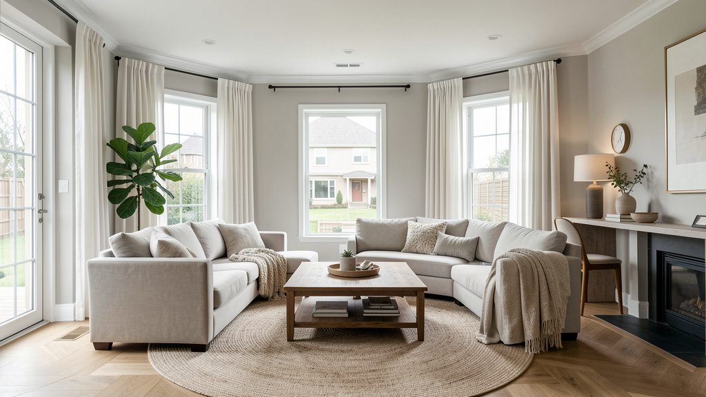
Gathering Space: Living Room
This room must balance aesthetics with real life—welcoming guests while accommodating family routines. The 70/30 blending guideline is especially useful here.
Defining Zones:
Even in open plans, create distinct areas:
– Conversation Zone: Sofa and chairs arranged to face each other (not solely the TV).
– Reading Nook: A single chair, floor lamp, small side table.
– Entertainment Zone: TV concealed in an armoire or on a simple media console.
Furniture Layout Principles:
– Float furniture away from walls to create intimacy.
– Ensure clear pathways (at least 36″ wide).
– Anchor the main seating area with a large rug (all front legs of furniture should rest on it).
– Avoid placing the largest sofa against the longest wall—it can feel like a barrier. Try angling it slightly.
Key Pieces in Detail:
– Sofa: A deep-seated, slipcovered sofa in washable linen or performance fabric. Neutral color (oatmeal, stone). Down-blend cushions for comfort. Why slipcover? It embodies shabby chic’s adaptable charm and addresses French country’s need for durability. Spills wipe clean; covers are machine-washable.
– Chairs: Mix two styles. Example: One sturdy oak ladder-back chair with a woven rush seat (French country—great for casual seating). One upholstered bergère chair in a faded floral chintz (shabby chic—ideal for relaxation).
– Coffee Table: Substantial but not overwhelming. A reclaimed oak trestle table (French country) or a painted oval table with a distressed finish (shabby chic). Include a lower shelf for stacking books or baskets.
– Storage: A large armoire painted to complement the walls hides toys, blankets, and media equipment. Style the top with intention: a stack of art books, a ceramic vase with dried grasses, a small framed mirror.
Textiles for Comfort & Cohesion:
– Rugs: Layer a large, neutral sisal or jute rug (8×10 ft minimum) as the base. Top with a smaller (5×8 ft) vintage-inspired rug—a faded Persian or Aubusson-style with soft colors. This adds warmth, defines the space, and hides wear.
– Throws & Pillows:
– Throws: Two chunky knit throws (cream, gray) draped over sofa arms. One lightweight linen throw for warmer months.
– Pillows: Vary sizes (22×22″, 18×18″, lumbar). Mix: one large-scale floral, one small-scale stripe, one solid textured (bouclé), one with subtle embroidery. All in harmonious colors from your Layer 1 palette.
– Curtains: Floor-length linen panels in a color one shade lighter than walls. Hang rods close to the ceiling and extend 8-12″ beyond the window frame to maximize light and height.
Lighting Strategy:
– Ambient: A wrought iron or crystal chandelier (dimmed low).
– Task: Adjustable floor lamp near reading chair; table lamps on console tables.
– Accent: Small LED puck lights inside an armoire to highlight displayed items; a discreet picture light over cherished artwork.
– Candles: Group unscented pillar candles of varying heights on the mantel or coffee table (use LED for safety with children or pets).
Personalizing Without Clutter:
– Gallery Wall: Frame children’s artwork in simple matching frames. Rotate seasonally.
– Memory Shelf: Dedicate one shelf of the armoire to meaningful objects: a seashell from a family vacation, a small trophy, a vintage key. Edit quarterly.
– Living Elements: A thriving fiddle-leaf fig in a terra cotta pot; a small dish of smooth river stones on the coffee table.
Troubleshooting Common Scenarios:
– Room feels too dark: Paint walls a warmer white; add mirrors opposite windows; choose lighter wood tones; use sheer linen curtains.
– Feels too “matchy-matchy”: Introduce one unexpected element—a modern ceramic lamp base, a vintage Moroccan rug layered under the Persian.
– Challenging to keep tidy with children: Prioritize closed storage (ottomans with lids, baskets under console tables). Establish a brief “reset” habit before bed.
Intimate Moments: Bathroom
Even a small powder room can embody the style’s soul. Focus on sensory details and thoughtful touches.
Walls & Surfaces:
– Walls: Beadboard wainscoting painted a soft cream (up to chair rail height), topped with subtle floral or stripe wallpaper above. Or, for simplicity, matte clay paint in a spa-like sage green.
– Vanity: Paint an antique dresser (with sink cutout) in a weathered white. Replace hardware with antique brass knobs. Top with a vessel sink in ceramic or stone.
– Mirror: A gilded mirror with softly aged glass. If new, distress the frame lightly with sandpaper and apply dark wax for subtle character.
– Hardware: Antique brass or oil-rubbed bronze for faucet, towel bars, toilet paper holder. Avoid chrome for a warmer feel.
Textiles & Accessories:
– Towels: Thick, looped cotton towels in cream or soft gray. Roll them and stack in a woven basket. Add one hand towel with delicate lace trim.
– Shower Curtain: Linen-look fabric with a subtle stripe or tiny floral. Use a weighted hem to prevent billowing.
– Functional Decor:
– A vintage enamelware pitcher holding rolled hand towels.
– A small wooden stool holding a potted fern.
– A framed botanical print (lavender or rose) in a simple wood frame.
– A ceramic dish holding soap and a single dried lavender sprig.
– Scent: A reed diffuser with a light, clean scent (bergamot, white tea) or a small pot of fresh mint on the windowsill.
Small Space Solutions:
– No window? Add a small LED mirror with warm lighting. Place a battery-operated candle on the vanity.
– Tiny sink? Use wall-mounted shelves above for storage and display.
– Cluttered counter? Store daily items in pretty ceramic jars (cotton balls, Q-tips). Keep only hand soap and a small plant visible.
First Impressions: Entryway
This space sets the tone for your entire home. It should feel welcoming, organized, and hint at the style within.
Essential Elements:
– Console Table: A narrow, sturdy table (reclaimed wood or painted). Height should be 30-34″.
– Seating: A small bench or chair for putting on shoes. Upholster in durable fabric (canvas, performance fabric with leather-like appearance).
– Storage: A woven basket under the bench for shoes. A wall-mounted rack for 3-4 coats. A small tray on the console for keys and mail.
– Mirror: A large, leaning floor mirror or wall-mounted gilded mirror. Practical for last checks, visually expands space.
– Lighting: A single wall sconce or small table lamp for a warm welcome.
– Natural Touch: A small vase with seasonal branches (cherry blossoms in spring, dried wheat in fall).
Creating Flow:
– Ensure a clear path to move through the space.
– Keep surfaces minimally styled—this is a transition zone, not a display room.
– Add a small, durable rug (flat-weave, indoor/outdoor) to catch dirt.
Navigating the Gray Areas: Blending Styles & Solving Real-Life Frictions
No home exists in a stylistic vacuum. You’ll encounter decisions where the “rules” blur. This section addresses nuanced tensions with practical, empathetic solutions.
When “Shabby” Tips into “Shoddy”: Defining the Line
The word “shabby” is the style’s greatest vulnerability. True shabby chic celebrates cherished wear, not neglect. The distinction lies in intention and care.
- Authentic “Shabby” (Desirable):
- A linen slipcover softened by years of washing, with gentle fading at the seams.
- A wooden chair leg sanded smooth by generations of hands resting there.
- A porcelain teacup with a hairline crack repaired with gold (kintsugi—honoring the break).
- Unintentional “Shoddy” (To Address):
- A sofa cushion permanently stained and flattened.
- Peeling paint on a windowsill due to moisture damage (not artistic distressing).
- Dusty, broken objects kept “for sentiment” but causing visual stress.
The Repair Mindset: French country tradition values mending. A torn rush seat is re-woven. A wobbly table leg is shimmed. This isn’t merely frugality; it’s respect for the object’s history. Before discarding something “shabby,” ask: “Can this be lovingly repaired?” Often, the answer is yes—and the repair adds character. For items beyond repair, thank them for their service and let them go. Cluttering your space with broken things contradicts the style’s core value: creating a comfortable, joyful home.
Modern Life Meets Old-World Style: Practical Adaptations
Your home must serve your life, not a historical reenactment. Here’s how to integrate modern needs gracefully:
- Technology Integration:
- TVs: Conceal in an armoire with louvered doors (sound passes through). When closed, it functions as beautiful cabinetry.
- Charging Stations: Dedicate a small drawer in the console table or nightstand. Line with felt, add a multi-port USB hub. Keep cords tidy with leather straps.
- Smart Home Devices: Choose neutral-colored devices (white, black). Place discreetly—a smart speaker inside a vintage ceramic bowl (with holes drilled for sound), a thermostat painted to match the wall.
- Family-Friendly Durability:
- Fabrics: Performance linen-look fabrics (Crypton, Sunbrella Indoor) resist stains and fading. Test samples with common spills before purchasing.
- Finishes: Use matte or satin paint on walls (hides scuffs better than flat; cleans easier than gloss). For high-touch areas (door frames, baseboards), semi-gloss offers wipeability.
- Rugs: Choose flat-weaves (sisal, jute) or low-pile wool in high-traffic zones. They hide dirt and are easier to maintain. Avoid delicate silk or high-pile rugs near entryways.
- Pet Considerations:
- Furniture: Choose tight-weave fabrics that resist claws (canvas, microfiber designed to mimic linen). Avoid delicate silks or loose weaves.
- Accents: Place fragile porcelain items on high shelves. Use sturdy ceramic or metal bowls for pet food/water—style them to complement your decor.
- Textiles: Keep a lint roller handy. Choose rug colors that camouflage pet hair (taupe, oatmeal).
Climate & Regional Adaptations
Style must respond to environment. A humid Florida home needs different solutions than a dry Arizona ranch.
- Humid Climates (Southeast US, Coastal Areas):
- Wood: Choose kiln-dried hardwoods. Avoid reclaimed wood with unknown moisture history. Seal thoroughly.
- Textiles: Prioritize moisture-wicking fabrics (linen, cotton) over wool. Use dehumidifiers to protect antiques.
- Walls: Use mold-resistant paint (like Benjamin Moore Aura Bath & Spa) in bathrooms and kitchens.
- Dry Climates (Southwest US, Mountain Regions):
- Wood: Reclaimed wood often thrives. Visible cracks can be embraced as character.
- Textiles: Layer wool throws and rugs for warmth. Linen remains ideal for breathability.
- Plants: Choose drought-tolerant varieties (olive trees, rosemary) for indoor greenery.
- Cold Climates (Northeast, Midwest):
- Warmth: Layer textiles generously—chunky knits, heavy wool rugs, velvet accents on chairs.
- Light: Maximize natural light with sheer curtains. Use warm-white bulbs exclusively. Add mirrors to reflect light.
- Color: Lean into deeper, warmer tones from your palette (ochre, burgundy, forest green) to counteract gray winter days.
Budget-Conscious Authenticity: Value Over Cost
Authentic style isn’t defined by price tags; it’s shaped by thoughtfulness. A $20 thrifted linen tablecloth styled beautifully holds more soul than a $500 mass-produced “shabby chic” centerpiece.
- High-Impact, Low-Cost Strategies:
- Paint: Transform dated furniture with chalk-style paint and dark wax. Sand edges for subtle age.
- Thrift Stores & Estate Sales: Hunt for solid wood furniture, porcelain dishes, linen napkins. Clean, repair, and repurpose.
- Nature: Free decor! Gather branches, pinecones, or stones. Display in a simple ceramic bowl.
- DIY Textiles: Dye faded sheets with tea for a vintage look. Sew simple pillow covers from remnant fabric.
- Where to Invest Thoughtfully:
- Comfort: Prioritize a quality sofa frame and cushions—you’ll use it daily.
- Lighting: A beautiful chandelier or lamp sets the mood for the entire room.
- Textiles: Invest in high-quality linen or cotton for items you touch often (bedding, sofa slipcovers). They age beautifully.
- Where to Save Confidently:
- Accents: Thrift stores, flea markets, online marketplaces. Imperfect vintage items add character.
- Art: Frame pages from old botanical books or sheet music. Print public domain art (like vintage French posters) on quality paper.
- Hardware: Update dated cabinet pulls with antique brass knobs—low cost, high impact.
Your Questions, Answered
Q: Can I mix shabby chic and French country throughout my entire home, or should I stick to one style per room?
A: Absolutely blend them throughout! Consistency emerges from your Layer 1 anchor (your chosen palette and regional inspiration) and Layer 2 textures, not from rigid room-by-room segregation. For example, your whole home might follow a Normandy-inspired palette (dove gray, cream, moss green). The kitchen leans French country with its oak table and terracotta floors; the living room leans shabby chic with its slipcovered sofa and crystal lamp; the bedroom blends both with a wrought-iron bed and linen bedding. The unifying thread is the cohesive color story and textural language.
Q: My house has modern architecture (open plan, large windows, minimal trim). Will this style look out of place?
A: Not at all. The key is to work with your architecture, not against it. Honor the clean lines and abundant light. Bring the style in through furniture shapes, textiles, and accents—not by adding fake beams or ornate moldings that feel pasted on. Choose French country furniture with simpler lines (a clean-lined trestle table versus a heavily carved armoire). Use shabby chic’s soft textiles (linen curtains, layered rugs) to warm up hard surfaces. Large windows are an asset—style them with simple linen panels to enhance the light. The contrast between modern bones and vintage soul can be deeply sophisticated.
Q: How do I keep a white or light-colored shabby chic space from looking dirty or dingy?
A: This is a valid concern. The solution lies in material choice, maintenance, and strategic contrast:
1. Choose the right white: Avoid cool, stark whites (they show every speck of dust). Opt for warm whites with subtle undertones (cream, oatmeal, barely-there blush).
2. Embrace texture: Textured surfaces (limewash walls, nubby linen) hide minor imperfections better than smooth, flat surfaces.
3. Layer with neutrals: Don’t use pure white exclusively. Mix in cream, oatmeal, stone, and soft gray. This creates depth and makes minor soiling less noticeable.
4. Maintenance routine: Vacuum upholstery weekly with an upholstery attachment. Spot-clean spills immediately. Wash slipcovers and curtains seasonally. A handheld steamer refreshes fabrics between washes.
5. Strategic contrast: A dark wood coffee table, black iron lamp base, or deep green plant provides visual grounding and prevents the space from feeling “floaty” or sterile.
Q: Are there any colors I should generally avoid?
A: While personal preference is paramount, certain colors can disrupt the style’s serene ethos:
– Neon or electric brights (hot pink, lime green): They often feel jarring against the soft, earthy palette.
– Cool, stark grays (without warmth): They can make a space feel cold. Opt for greiges (gray + beige) or warm taupes.
– Primary colors in large doses (fire-engine red wall, royal blue sofa): They may overwhelm the subtle, layered aesthetic. However, a tiny accent of true red (like a vintage French postal box on a shelf) can be a delightful surprise.
When in doubt, pull colors from nature: the gray of weathered stone, the green of sage leaves, the cream of unbleached linen.
Q: How do I incorporate family heirlooms that don’t “match” the style?
A: Heirlooms are the soul of a home—they should feel personal, not perfectly styled. Here’s how to integrate them gracefully:
– Assess the object’s essence: Does it have beautiful wood grain? A meaningful story? A lovely shape? Focus on that strength.
– Recontextualize: A dark, heavy Victorian dresser might feel overwhelming painted stark white. Instead, clean it thoroughly, polish the wood to enhance its grain, and style the top minimally with a single ceramic lamp and a small plant. Let its craftsmanship speak.
– Create a dedicated spot: Give the heirloom a place of honor where it doesn’t compete. A grandfather clock in a hallway nook; a quilt folded at the foot of the bed.
– Edit around it: If the heirloom is bold (like a brightly patterned rug), simplify everything else in the room. Let it be the focal point.
Remember: A home filled only with “on-style” items feels like a showroom. Heirlooms add authenticity and heart.
Q: Is shabby chic just “grandmillennial style”? Are they the same thing?
A: While overlapping in some aesthetics, they represent distinct movements. “Grandmillennial” (emerging circa 2019) describes a contemporary trend where younger generations intentionally embrace “grandma-core” elements—chintz, ruffles, needlepoint—as a reaction against sterile minimalism, often with a playful or ironic lens. Shabby chic is a specific, established interior design approach (popularized in the 1980s) focused on romanticized, softened vintage aesthetics emphasizing comfort and “lived-in” charm. French country is an even older, geographically rooted tradition. Grandmillennial style may borrow shabby chic or French country elements, but it’s filtered through modern cultural commentary. You can appreciate and implement shabby chic/French country principles without engaging with the “grandmillennial” label. Focus on what brings you joy and comfort.
Q: How do I clean and maintain antique or vintage furniture without damaging the patina?
A: Patina is the valued evidence of age and use—avoid stripping it completely. Gentle care preserves history:
– Dusting: Use a soft, dry microfiber cloth. For crevices, a soft-bristled brush (like a clean paintbrush).
– Cleaning: For wood, use a barely damp cloth with distilled water. Wipe with the grain. For stubborn grime, a tiny drop of mild soap (like Dr. Bronner’s) diluted in water. Always dry immediately with a soft cloth.
– Polishing: Avoid silicone-based polishes (they build up). Use a beeswax-based polish sparingly (once or twice a year). Apply a thin layer, buff gently.
– Repairs: For loose joints, consult a professional restorer. For minor scratches, rub with a walnut kernel (the oil can temporarily fill the scratch).
– When in doubt: Less is more. If an item is structurally sound and clean, leave it be. Patina is not dirt; it’s character.
Q: Can this style work in a very small apartment?
A: Absolutely—and it can make a small space feel more intentional and serene. Key strategies:
– Lighten the palette: Stick to whites, creams, and very pale neutrals to reflect light.
– Choose furniture with legs: Sofas and chairs that show floor space underneath feel less bulky.
– Multi-functional pieces: An armoire stores clothes and conceals a TV. A storage ottoman holds blankets and provides seating.
– Vertical space: Use tall, narrow bookshelves. Hang mirrors to create depth.
– Edit ruthlessly: In small spaces, every item must earn its place. Follow the “purposeful beauty” guideline strictly.
– Textiles: Use sheer linen curtains to maximize light. A single, well-chosen rug defines the space without overwhelming it.
Small spaces benefit immensely from the style’s emphasis on quality over quantity and meaningful objects.
Q: How do I avoid making the space feel “dated” or overly fussy?
A: This concern often stems from associating the style with clutter or outdated color palettes. Modernize it with intention:
– Edit consistently: Clutter is the primary culprit. Keep surfaces clear. Embrace negative space.
– Refresh the palette: Move beyond clichéd pastels. Use sophisticated neutrals (warm whites, greiges, taupes) with one subtle accent color (sage green, ochre, slate blue).
– Mix in clean lines: Pair a delicate bergère chair with a simple, modern side table. A crystal chandelier over a minimalist dining table creates dynamic tension.
– Update textiles: Choose contemporary floral prints (larger scale, muted colors) over tiny, dense “granny” prints.
– Focus on texture: Modern design values texture. Highlight the beautiful imperfections of linen, wood grain, and plaster.
The goal isn’t to erase the style’s heritage but to curate it through a contemporary lens of simplicity and intention.
Q: What’s the single most important thing I can do to make this style feel authentic?
A: Shift your focus from acquiring things to cultivating feeling. Authenticity isn’t found in a checklist of items (checkered curtains! rooster decor!). It’s found in:
– Using your things: Drink from the vintage teacups. Sit in the worn armchair. Cook on the farm table.
– Embracing gentle wear: Let the linen napkins show use. Allow the wood table to bear the marks of family meals. These aren’t flaws; they’re memories in the making.
– Prioritizing comfort: If a “correct” style element feels uncomfortable (a hard rush seat), adapt it. Add a cushion. Choose a different chair. Your home should serve you.
– Adding personal meaning: Display photos of your family in Provence, not generic French postcards. Use a quilt made by your grandmother. Grow your favorite flowers in the pitcher.
When your space reflects your life, your values, and your comfort—not just a curated image—it will feel deeply, unmistakably authentic.
Conclusion and Your Next Step
You now hold a compass, not just a map. The Rooted Romance Framework—Historical Soul, Textural Palette, Furniture Language, Decorative Accents—equips you to navigate choices with confidence, whether you’re refreshing a single corner or reimagining your entire home. Remember the core truth we’ve explored: shabby chic and French country are not about perfect replication. They are philosophies of living. They invite us to slow down, to cherish the imperfect, to find beauty in utility, and to surround ourselves with objects that carry meaning.
Recap: The Three Anchors
1. Intention over imitation: Define your room’s story (Layer 1) before acquiring items. This prevents missteps and creates cohesion.
2. Texture is the quiet hero: Layer linen, wood, wool, and stone to create depth that color alone cannot achieve. This is where the style’s soul resides.
3. Curate with purpose: Every object should serve function, meaning, sensory pleasure, or narrative. Edit without guilt; negative space is restful.
The 24-Hour Rule: Your Tiny, Transformative Action
Do not overhaul your home tomorrow. True style evolves gently. Instead, within the next 24 hours, complete this single, gentle task:
Walk into one room. Remove three items that do not serve purpose, meaning, sensory joy, or story. Wipe the surface clean. Place one single stem of greenery (a branch from your yard, a sprig of herbs) in a simple vessel—a vintage glass, a ceramic mug, even a small jar. Step back. Breathe.
This act is not about minimalism. It’s about intention. It creates space—physically and mentally—for beauty to emerge. It honors the style’s deepest lesson: that less, chosen with care, is infinitely more.
The Big Picture
Your home is not a project to be completed. It is a living, breathing extension of your journey. The nick on the table from moving furniture? A reminder of growth. The faded spot on the rug where afternoon sun streams in? A testament to light and time. The chipped edge of the porcelain bowl? A whisper of countless shared meals. These are not flaws to be hidden. They are the very evidence of a life well-lived.
Embrace the process. Start small. Celebrate progress over perfection. And as you layer texture, honor history, and infuse your space with personal meaning, you will not just create a beautiful room. You will cultivate a sanctuary—a place where every detail whispers, “You are home.”
Explore Our Complete System:
The Art of Layered Textiles: From Slipcovers to Statement Rugs | French Regional Palettes Decoded: Provence, Normandy & Beyond | Vintage Furniture Rescue: A Step-by-Step Restoration Guide | The Mindful Home Edit: Curating Spaces That Breathe | Seasonal Styling: Adapting Your Sanctuary Through the Year | Lighting for Atmosphere: Beyond the Overhead Switch | The Sentimental Edit: Honoring Heirlooms Without Clutter