Where every line serves a purpose, and beauty emerges from utility—not ornament.
Modern design is more than a visual aesthetic; it is a thoughtful philosophy of living. By embracing clean lines and functional beauty, you create spaces that feel intentionally crafted for daily life—serene yet dynamic, minimalist yet deeply human. This guide moves beyond fleeting trends to reveal enduring principles, actionable systems, and nuanced decisions that transform any room into a harmonious expression of intentional living. Whether refreshing a single corner or reimagining an entire home, you’ll discover how simplicity, executed with precision, becomes profoundly powerful.
Introduction
Walk into a space that feels effortlessly calm yet vibrantly alive. Sunlight glides across an unadorned wall. A single sculptural chair invites rest without visual noise. Every object has earned its place. This is the quiet resonance of modern design rooted in clean lines and functional beauty—a philosophy refined over a century yet perpetually relevant. Emerging from the Bauhaus school’s foundational principle “form follows function” and advanced by designers like Ludwig Mies van der Rohe and Charlotte Perriand, modern design rejects superfluous decoration in favor of honesty, clarity, and human-centered purpose. It is not cold minimalism but a deeply empathetic approach: architecture and objects exist to serve life, not the reverse. Today, as daily complexity increases, this design language offers sanctuary—a visual reset that reduces cognitive load while elevating everyday rituals. Drawing from established design history, environmental psychology insights, and material science, this guide provides a living framework. You’ll explore why certain lines support mental calm, how negative space fosters focus, and where to invest for lasting impact. This isn’t about replicating a magazine spread; it’s about cultivating a home that breathes with you.
The Six-Pillar Framework: Building Modern Design with Intention
Forget fragmented checklists. True modern design emerges from six interconnected pillars—a system where aesthetics and utility coexist seamlessly. Master these, and every decision becomes intuitive. This framework transforms abstract ideals into tangible actions, room by room, choice by choice.
Pillar 1: Form Follows Function—The Guiding Compass
At the heart of modern design lies a enduring truth: the shape of an object or space should arise directly from its intended use. Championed by architect Louis Sullivan and refined through the Bauhaus movement, this principle serves as a reliable compass for every decision. When form serves function, beauty becomes inherent—not forced.
Why this pillar matters:
Spaces where form disregards function often feel disjointed. A bulky entertainment console in a narrow hallway creates visual tension and physical obstruction. Conversely, a slim, wall-mounted media unit designed for specific equipment needs recedes visually while performing flawlessly. Function-first design reduces decision fatigue. You shift from asking, “Does this look modern?” to “Does this support how I live?” This perspective is liberating. Insights from environmental psychology suggest that environments aligned with user behavior can contribute to reduced stress and a greater sense of control. A kitchen island designed for both food prep and casual conversation (with seating oriented toward the cook) naturally fosters connection. A reading nook with integrated task lighting and accessible storage eliminates friction in the ritual of unwinding.
How to apply it concretely:
Begin with verbs, not nouns. Before selecting furniture, define the actions the space must support:
– Living Room: “Host two guests comfortably,” “Display three cherished art pieces without clutter,” “Store blankets discreetly.”
– Home Office: “Accommodate dual monitors without neck strain,” “File documents within arm’s reach,” “Allow natural light to reduce eye fatigue.”
Translate these verbs into physical requirements:
– For “store blankets discreetly,” seek a low-profile ottoman with a lift-top lid (function) featuring clean rectangular lines and neutral upholstery (form). An ornate carved chest may appear decorative but fails the functional test if awkward to access daily.
– For “file documents within arm’s reach,” a slim vertical file cabinet (function) in matte black steel with recessed handles (form) integrates seamlessly. A bulky wooden cabinet with protruding hardware disrupts flow.
Common pitfalls to avoid:
– The “Statement Piece” Trap: Selecting a dramatic sculptural chair that compromises comfort because “it looks modern.” True modern design prioritizes comfort as function. Test seating thoroughly. Does it support posture? Is entry and exit effortless?
– Over-Engineering: A coffee table with hidden charging ports, Bluetooth speakers, and motorized height adjustment may seem functional but introduces complexity. Does it genuinely serve daily needs? Or create maintenance burdens? Simplicity in mechanism is part of function.
– Ignoring Human Scale: Floor-to-ceiling shelving may maximize storage (function) but feel oppressive in a compact room. Scale to the space: lower shelves for frequently used items, open space above to preserve airiness. Function includes psychological comfort.
The Fundamental Principle: When an object’s purpose is instantly legible in its shape, it requires no explanation—and creates quiet confidence in the space.
Pillar 2: The Visual Language of Lines—Horizontal, Vertical, and the Power of Restraint
Lines form the silent grammar of modern design. They guide the eye, define space, and evoke emotion. Clean lines aren’t merely “straight edges”; they are intentional pathways creating rhythm, balance, and calm. Mastering this language transforms visual chaos into coherence.
Understanding line psychology:
– Horizontal lines (low-slung sofas, long console tables, wide window sills) evoke stability, rest, and expansiveness. They visually widen a room and ground the space. In a bedroom, a low platform bed with a continuous horizontal headboard encourages relaxation.
– Vertical lines (floor-to-ceiling bookshelves, tall narrow windows, slender table legs) suggest aspiration, growth, and height. They draw the eye upward, enhancing perceived ceiling height. In a compact entryway, a tall, narrow coat rack utilizes vertical space efficiently while creating visual lift.
– Diagonal lines (angled chair legs, zigzag bookshelves) introduce energy and movement. Use sparingly—they disrupt serenity if overused. A single sculptural floor lamp with an angled arm can energize a reading corner without overwhelming.
– Curved lines (a round dining table, an oval mirror, a kidney-shaped sofa) soften rigidity and invite approachability. They are essential for warmth. In a living room dominated by rectangles, a circular coffee table becomes a gentle focal point that encourages conversational flow.
Creating intentional line harmony:
Begin with your architecture. Note existing lines: window frames, doorways, ceiling beams. Furnishings should converse with them, not compete.
– Example: In a room with tall, narrow windows (strong verticals), choose furniture with horizontal emphasis—a long, low media console, a sofa with a straight back—to create balanced tension. Avoid stacking vertical elements directly beneath windows, which can feel visually busy.
– Counter-Example: A room with low ceilings and wide windows benefits from vertical accents: floor lamps reaching toward the ceiling, artwork hung in a vertical column, or tall indoor plants like a fiddle-leaf fig. This counters horizontal dominance and adds perceived height.
Material expression of lines:
Lines manifest through material joints and edges.
– A dining table with visible wood grain running horizontally emphasizes its length and warmth.
– A steel-framed glass desk showcases the precision of its structural supports.
– Avoid non-functional lines: Molding added purely for decoration (like crown molding on a minimalist cabinet) violates modern integrity. If a line exists, it should serve structure or function—like the groove where a drawer front meets the cabinet frame.
Practical exercise: Stand in your room. Trace dominant lines with your eyes. Do they create calming rhythm or visual chaos? Identify one element disrupting flow (e.g., a curvy ornate mirror in a room of straight lines) and consider replacing it with something whose lines converse intentionally with the space.
Pillar 3: Material Integrity—Honesty in Texture and Substance
Modern design celebrates materials as they are. Wood reveals grain; concrete shows its pour; steel bears its welds. This “honesty” builds trust and sensory richness. There are no veneers pretending to be solid wood, no plastic disguised as metal. Material integrity means selecting substances whose inherent qualities align with purpose and atmosphere.
Why authenticity resonates:
Synthetic materials can create subconscious dissonance. A laminate countertop mimicking marble lacks the thermal quality, subtle variation, and durability of natural stone. Over time, this mismatch may contribute to unease. Authentic materials age with character:
– Solid oak develops a honeyed patina.
– Brushed brass acquires a soft, lived-in glow.
– Unfinished concrete gains depth through gentle wear.
This aging process tells a story—it supports mindful consumption. In a culture of disposability, choosing integrity becomes a quiet act of sustainability.
Curating a modern material palette:
Focus on 3–5 core materials per space, repeated intentionally. This creates cohesion without monotony.
| Material | Best Applications | Why It Works | Budget-Conscious Alternative |
|---|---|---|---|
| Solid Wood (Oak, Walnut, Teak) | Tables, shelves, flooring | Warmth, durability, timeless grain | FSC-certified plywood with visible edge banding (celebrates layered construction) |
| Matte Black Steel | Table bases, lighting frames, shelving supports | Strength, precision, visual lightness | Powder-coated iron (ensure smooth, durable finish) |
| Natural Stone (Travertine, Basalt) | Countertops, fireplace surrounds, accent walls | Organic texture, thermal mass, uniqueness | Large-format porcelain tiles with realistic stone veining (matte finish preferred) |
| Textured Plaster | Feature walls, ceilings | Soft light diffusion, tactile depth, acoustic benefits | Limewash paint (applied in multiple thin coats for subtle variation) |
| Unbleached Linen/Cotton | Upholstery, curtains, bedding | Breathability, relaxed drape, natural slub texture | High-thread-count cotton with garment-washed finish |
Critical nuances often overlooked:
– Texture is essential: A room of all smooth surfaces (glossy cabinets, polished floors, sleek leather) risks feeling sterile. Introduce tactile contrast: a nubby wool rug underfoot, a rough-hewn wood bowl on a smooth console, a bouclé accent chair. Texture invites touch and adds warmth without color.
– Color within materials: Modern design isn’t “all white.” It embraces the natural hues of materials: the warm gray of concrete, the amber tones of oak, the deep charcoal of slate. Let these become your palette. A walnut dining table paired with black steel chairs and a cream linen rug creates a rich, grounded scheme without painted walls.
– Embracing variation: Showrooms often display uniform materials. Real life has character. Select wood with visible knots (they add history), stone with subtle fissures (they tell a geological story). This authenticity prevents spaces from feeling like sterile stage sets.
Pillar 4: The Strategic Power of Negative Space
Negative space—the intentional emptiness around and between objects—is modern design’s secret catalyst. It is not “wasted” space; it is active, breathing room that allows beauty to resonate. In a culture of accumulation, negative space supports mental clarity. It reduces visual noise, highlights what matters, and creates psychological calm.
Why negative space supports well-being:
Research in neuroaesthetics indicates that uncluttered environments may contribute to lower stress levels. When the eye has places to rest (a blank wall section, clear floor space around furniture), cognitive load decreases. Negative space frames focal points: a single piece of art on a large wall commands attention; a clear countertop makes morning routines feel intentional. It also enhances function: generous clearance around a dining table allows chairs to move comfortably—a functional necessity that appears as serene emptiness.
How to cultivate negative space intentionally:
– The 60/40 Guideline: Aim for approximately 60% open space (walls, floors, countertops) to 40% furnished space. In a living room, this means avoiding wall-to-wall furniture. Float the sofa away from the wall where possible; leave generous space between seating groups.
– Vertical breathing room: Hang artwork so its center aligns with average eye level (approximately 57–60 inches from floor), ensuring ample wall space above and below. A single large painting with generous margins feels more intentional than a crowded gallery wall.
– Surface discipline: Kitchen counters benefit from at least 50% clear space. Store infrequently used appliances in cabinets. A clear desk surface signals readiness for focused work.
– Architectural negative space: Embrace alcoves, window seats, or unused corners. Instead of filling them, leave them empty or place a single sculptural element (a tall plant, a minimalist floor lamp). This creates moments of pause.
Addressing common concerns:
– “But my space feels empty!” → Emptiness is often temporary perception. Live in the space for a week. Notice where items naturally accumulate. Add only what serves repeated need or genuine appreciation. Often, the perceived “emptiness” was actually visual calm previously unavailable.
– “I have too much stuff!” → Negative space requires editing. Consider a gradual approach: release items unused or unappreciated over the past year. Donate, sell, or recycle thoughtfully. This isn’t deprivation—it’s making room for what truly matters.
– Counter-Example: A bookshelf crammed floor-to-ceiling creates visual static. Edit intentionally: keep only books you love or reference regularly. Group remaining items with breathing room between clusters. Add a single meaningful object (a smooth stone, a ceramic vase) to anchor a section. The negative space between items elevates each one.
Pillar 5: Lighting as Architectural Sculpture
In modern design, lighting is never an afterthought. It is a primary design element that sculpts space, defines mood, and enhances function. Move beyond single overhead fixtures that flatten a room. Modern lighting is layered, intentional, and often visible as art.
The three essential layers:
1. Ambient Lighting: Soft, overall illumination. Avoid harsh central ceiling lights. Instead:
– Recessed adjustable downlights (use warm 2700K–3000K LEDs, spaced evenly)
– Coved ceiling lighting (LED strips hidden in a recess at the ceiling-wall junction, washing walls with gentle glow)
– Floor lamps with upward-facing shades (bounces light off ceiling for diffuse radiance)
2. Task Lighting: Focused light for specific activities. Should be adjustable and glare-free.
– Swing-arm wall sconces beside beds (frees bedside tables)
– Under-cabinet LED strips in kitchens (illuminates countertops without shadows)
– Adjustable desk lamps with articulated arms (directs light precisely where needed)
3. Accent Lighting: Highlights architecture, art, or texture. Creates depth and focus.
– Picture lights focused on artwork (minimizes glare on glass)
– Grazing lights aimed at a textured plaster wall (reveals subtle shadows)
– Miniature spotlights within open shelving (makes displayed objects glow)
Choosing fixtures with integrity:
– Form reveals function: A task lamp should show its adjustability—the joints, the counterweight. A George Nelson Bubble Lamp celebrates its spherical form while diffusing light softly. Avoid fixtures where the light source is hidden behind excessive ornament.
– Material continuity: Select lighting that echoes core materials. A black steel floor lamp complements a steel-framed coffee table. A paper lantern introduces organic texture.
– Scale matters: A massive chandelier can overwhelm a minimalist dining table. Choose a fixture proportional to the surface below: a linear suspension light should be roughly one-third to one-half the table’s length.
Real-world application: The Modern Living Room Lighting Plan
– Ambient: Four recessed 4-inch adjustable downlights (2700K, dimmable) placed symmetrically, avoiding the room’s center.
– Task: Two arc floor lamps positioned behind the sofa, adjustable heads directing light onto reading chairs. A slim wall sconce beside the media console for soft glow during evening relaxation.
– Accent: A single track light aimed at a large abstract painting above the sofa. LED strip hidden beneath the floating media console, casting a gentle upward glow.
Result: No single light source dominates. Light pools where needed, recedes where not. The room feels expansive at night, with shadows adding dimension—a contrast to the flat glare of a single ceiling fixture.
Pillar 6: Curated Minimalism—Editing with Intention
Modern design is often mislabeled “minimalist,” but true minimalism emphasizes subtraction for its own sake. Modern design practices curated minimalism: keeping only what serves function, sparks genuine appreciation, or holds deep meaning. It’s a compassionate edit, not deprivation. This pillar transforms space from “empty” to “essential.”
The curation process—room by room:
1. Empty the space completely. Reset your perception.
2. Reintroduce items slowly, asking three questions per object:
– Function: “Do I use this regularly? Does it solve a specific need?” (Keep: a sturdy stool that doubles as seating and plant stand. Release: a decorative box that holds nothing.)
– Emotion: “Does this bring calm, joy, or connection?” (Keep: a hand-thrown mug from a meaningful experience. Release: a generic souvenir you feel obligated to keep.)
– Integrity: “Does this align with my material palette and line language?” (Keep: a walnut tray that complements your coffee table. Release: a glossy red plastic organizer that clashes visually.)
3. Group like items: Store remotes in a single woven basket. Keep charging cables in a dedicated drawer with dividers. Clutter often hides in fragmentation.
4. Leave breathing room: After placing essentials, step back. Does the surface feel calm? If not, remove one more item.
The “One In, One Out” rhythm:
Adopt this gentle practice for sustainability: When a new meaningful item enters (a gift, a purchase), thoughtfully release an existing item of similar category. This prevents gradual accumulation and maintains intentionality. It’s not rigid—it’s mindful stewardship of your space.
Addressing emotional considerations:
– Sentimental items: Display isn’t required for all. Photograph bulky memorabilia (children’s artwork, awards). Keep one small box of irreplaceable items stored respectfully. Display one meaningful piece, rotated seasonally.
– “But it was expensive!” → Honor the lesson learned, not the object. Donate it so it serves someone else. The value existed in the experience of choosing it.
– Collaborative spaces: Start small. Curate one bookshelf together. Explain the why: “When we see only our favorite books, we enjoy them more.” Involve others in the “appreciation check”—does this item bring a smile? Collaboration builds shared ownership.
The Fundamental Principle: A space curated with intention doesn’t feel empty—it feels available. Available for connection, creativity, and the quiet moments that make a house a home.
Room-by-Room Application: Bringing the Framework to Life
Theory becomes transformative when applied. Let’s walk through key living spaces, translating the Six-Pillar Framework into specific, adaptable choices. These are not rigid templates but flexible blueprints—observe the reasoning behind each decision to empower your own choices.
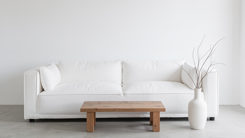
The Modern Living Room: Sanctuary for Connection
The living room should feel like a deep breath—a place where conversation flows and bodies relax. Avoid the “showroom syndrome” of furniture pushed against walls. Create intimate zones.
Layout Strategy:
– Float furniture away from walls where possible. A sofa 10–12 inches from the wall creates depth and defines the space.
– Arrange seating in a loose U-shape or L-shape around a central point (fireplace, media console), ensuring sightlines connect all seats. Maximum distance between seating: 8 feet for easy conversation.
– Maintain a clear pathway (minimum 36 inches wide) around the perimeter for circulation.
Furniture Selection Through the Pillars:
– Pillar 1 (Function): Choose a sofa deep enough for lounging (minimum 38-inch depth) but with clean lines—tight back cushions, no rolled arms. Test seat height: knees should bend near 90 degrees when feet are flat.
– Pillar 2 (Lines): Pair the sofa’s horizontal line with a coffee table featuring complementary contrast—a round wood table (soft curves) or a rectangular steel-and-glass table (sharp horizontals/verticals). Avoid matching sets; intentional contrast creates interest.
– Pillar 3 (Materials): Layer textures: a bouclé sofa, a smooth oak coffee table, a nubby jute rug. Repeat materials: if the coffee table has black steel legs, echo in the floor lamp base.
– Pillar 4 (Negative Space): Keep the coffee table 70% clear. Use a single tray to corral remotes. Leave floor space visible around furniture legs.
– Pillar 5 (Lighting): As detailed earlier—layered ambient, task, accent. Minimize table lamps on surfaces; use wall-mounted or floor lamps to preserve openness.
– Pillar 6 (Curation): Display only 3–5 items on shelves: a stack of favorite books, one ceramic vase, a small framed photograph. Rotate seasonally.
Illustrative Scenario:
The Challenge: A living room felt underutilized despite contemporary furniture.
The Diagnosis: Sofa against wall (limiting intimacy), matching beige sectional and coffee table (monotonous lines), cluttered media console, reliance on a single overhead light.
The Solution:
– Sofa moved 10 inches from wall; two armchairs added at an angle to create a conversational grouping.
– Beige sectional replaced with a charcoal bouclé sofa (introducing texture), matching coffee table swapped for a live-edge oak slab on black steel base (material contrast).
– Media console cleared to hold only essential electronics, a small plant, and a woven basket for remotes.
– Lighting updated to include coved ceiling lighting and two arc floor lamps.
Result: The space transformed into a frequently used gathering area. Feedback indicated the room felt more inviting and authentically reflective of daily life. “It finally feels like a space we enjoy spending time in,” was a common observation.
The Modern Kitchen: Efficiency Meets Serenity
The kitchen is a workspace first. Modern design elevates function into beauty through seamless integration, intuitive workflow, and honest materials. Clutter undermines both function and calm.
Workflow Optimization (Pillar 1 in Action):
Map the “work triangle”: refrigerator → sink → stove. Total perimeter ideally between 12–26 feet. Keep frequently used items within this zone:
– Sink zone: Cutting boards, colanders, dish towels stored in nearby drawers.
– Stove zone: Spatulas, oils, spices in a pull-out drawer beside the cooktop.
– Prep zone: Knives, mixing bowls accessible near open counter space.
Install deep drawers instead of lower cabinets—easier access, less bending. Use drawer dividers for utensils, cutting boards, baking sheets.
Material Choices for Durability and Beauty (Pillar 3):
– Countertops: Honed (matte) granite or quartzite. Avoid high-gloss finishes—they show every water spot and fingerprint. Honed surfaces hide minor wear and feel warmer.
– Cabinetry: Flat-panel doors (Shaker style is acceptable if lines are clean and hardware is minimal). Paint in warm white (e.g., Benjamin Moore Chantilly Lace) or soft gray. Avoid ornate molding.
– Hardware: Choose one finish throughout—matte black, brushed brass, or satin nickel. Use discreet pulls: recessed finger pulls on upper cabinets, slim bar pulls on drawers.
– Backsplash: Large-format tiles (12×24 inches or larger) in a neutral tone. Or extend countertop material up the wall for seamless flow. Avoid busy patterns.
Negative Space as Function (Pillar 4):
– Keep 50% of countertops clear. Store small appliances in appliance garages or deep drawers with lift-up fronts.
– Open shelving? Use sparingly—only for daily-use items you find beautiful (favorite mugs, a stack of cookbooks). Limit to one wall section. Too much open shelving creates visual clutter and requires constant tidying.
– Under-cabinet space: Install discreet LED strips for task lighting. Avoid hanging pots—store them in a deep drawer with a pegboard insert.
Lighting Precision (Pillar 5):
– Ambient: Recessed downlights over the perimeter, not centered over the island (creates shadows on work surfaces).
– Task: Bright, shadow-free light under upper cabinets. Choose LEDs with high CRI (90+) for accurate color rendering while cooking.
– Accent: A single pendant over the sink (if near a window) for visual interest, or a linear suspension light centered over the island—but ensure it’s high enough (30–36 inches above counter) to avoid head bumps and maintain sightlines.
Budget-Conscious Adaptation:
– Instead of full cabinet replacement: Paint existing cabinets in a warm neutral, replace hardware with minimalist pulls, add under-cabinet lighting.
– Instead of new countertops: Use a large, beautiful cutting board as a permanent island topper. It adds warmth and protects the surface.
– Instead of open shelving: Remove doors from one upper cabinet section, paint the interior a contrasting color (deep navy, charcoal), and style minimally. Creates a focal point without full renovation.
The Modern Bedroom: A Haven for Restoration
Your bedroom should signal “rest” the moment you enter. Modern design excels here by eliminating visual triggers of stress (clutter, harsh lighting, competing patterns) and prioritizing sensory comfort.
Bed as Anchor (Pillars 1, 2, 3):
– Choose a low-profile platform bed (max 18 inches high) with clean lines—no ornate headboard. Upholstered headboards in linen or wool add softness without fuss.
– Mattress height matters: When seated on the edge, knees should be near level with hips. Test before buying.
– Bedding: Layer textures, not patterns. Crisp percale cotton sheets, a heavyweight linen duvet cover, a chunky knit throw at the foot. Stick to a tonal palette: oatmeal, warm white, soft clay.
Strategic Negative Space (Pillar 4):
– Nightstands: Choose slim profiles (depth under 18 inches). Keep surfaces 80% clear: only a lamp, a book, a glass of water. Use drawers for everything else.
– Floor space: Ensure 24 inches of clear space on both sides of the bed for easy movement. Avoid placing large furniture directly opposite the bed—it creates visual weight upon waking.
– Walls: One piece of calming art above the bed (abstract landscape, soft photograph). Avoid busy gallery walls.
Lighting for Circadian Rhythm (Pillar 5):
– Critical: Minimize overhead lights. Install dimmable wall sconces flanking the bed (with adjustable arms for reading). Use warm dim technology (light grows warmer as dimmed, mimicking sunset).
– Add a single floor lamp in a corner with a fabric shade for ambient glow.
– Blackout curtains support sleep quality. Choose heavy linen or cotton in a neutral tone. Mount the rod 6 inches above the window frame and extend 8 inches beyond each side—makes the window appear larger and blocks peripheral light.
Curation for Calm (Pillar 6):
– Remove non-essential electronics. Charge devices outside the bedroom if possible. If an alarm is needed, use a simple analog clock.
– Edit closet contents seasonally. Store off-season clothing in under-bed bins (choose low-profile, fabric-covered bins).
– Keep only items that support rest: a journal, a cherished photograph, essential oils for diffusion.
Addressing Common Considerations:
– “Won’t it feel too sparse?” → Warmth comes from texture and light, not clutter. A sheepskin rug beside the bed, a wood tray on the nightstand, soft woven baskets for storage—these add soul without chaos.
– “I need storage!” → Prioritize hidden storage: beds with drawers, ottomans with lids, deep closet systems with uniform bins. Modern design embraces storage—it just insists it be invisible until needed.
The Modern Bathroom: Spa-Like Simplicity
Transform your bathroom from utilitarian to sanctuary. Modern design focuses on material honesty, intuitive function, and sensory calm.
Material Integrity in Wet Zones (Pillar 3):
– Walls/Floor: Large-format porcelain tiles (24×48 inches) in a matte or honed finish. Choose tone-on-tone variation (e.g., light gray tile with subtle darker veining) for depth without busyness. Avoid small mosaic tiles—they create visual noise and grout lines trap dirt.
– Vanity: Floating vanity (creates floor space visibility, feels lighter). Material: solid wood (teak for moisture resistance) or matte-finish engineered stone. Avoid particleboard—it swells with humidity.
– Fixtures: Single-handle faucets with clean geometric shapes (square, cylindrical). Finish: brushed nickel or matte black for durability and modern feel. Avoid chrome—it shows water spots readily.
Functional Layout (Pillar 1):
– Store daily essentials within easy reach: toothbrush holder, soap dispenser, hand towel on a discreet wall-mounted rack.
– Recessed niches in the shower (instead of bulky corner caddies) keep products organized and surfaces clear. Tile the niche to match walls for seamless look.
– Heated floors: A small luxury with meaningful impact. Install under tile for even warmth.
Negative Space for Serenity (Pillar 4):
– Keep countertops 90% clear. Store cotton balls, Q-tips, lotions in matching apothecary jars inside the vanity.
– Use wall-mounted fixtures: toilet paper holder, towel bar, robe hook. Frees floor space, easier to clean.
– Mirror: Choose a large, frameless mirror. Or, for warmth, a wood-framed mirror with clean lines. Avoid ornate frames.
Lighting for Clarity and Calm (Pillar 5):
– Critical: Vanity lighting should be beside the mirror (not above) to minimize shadows on the face. Install vertical sconces at eye level on both sides. Use 3000K LEDs with high CRI for true color rendering.
– Ambient: Recessed downlights in the shower area and over the toilet. Dimmable.
– Accent: A small, discreet LED strip under the floating vanity casts a gentle glow—functional for nighttime visits, atmospheric for relaxation.
Budget-Friendly Upgrades:
– Paint existing vanity in a warm, moisture-resistant paint (Benjamin Moore Advance). Replace hardware.
– Update lighting fixtures—this has significant visual impact.
– Replace shower curtain with a frameless glass door (if budget allows) or a high-quality linen-look fabric curtain on a matte black rod.
– Add a small stool in the shower (teak or bamboo) for shaving or resting feet—functional and spa-like.
The Modern Home Office: Focus Without Friction
In an era of remote work, your office must support deep focus and mental clarity. Modern design eliminates distractions and optimizes ergonomics.
Ergonomic Foundation (Pillar 1):
– Desk height: 28–30 inches. Ensure knees fit comfortably underneath.
– Chair: Prioritize adjustability—lumbar support, seat depth, armrests. Test thoroughly.
– Monitor position: Top of screen at or slightly below eye level. Use a monitor arm for adjustability and to free desk space.
– Keyboard/mouse: Positioned so elbows rest near 90 degrees.
Desk as Command Center (Pillars 2, 3, 4):
– Shape: Rectangular desks emphasize workflow. Avoid L-shaped unless space demands it—they can feel fragmented.
– Material: Solid wood top (warmth) on steel base (stability). Or, a minimalist white laminate desk if budget-constrained (choose one with subtle woodgrain texture).
– Negative space: Keep desk surface 70% clear. Use a single shallow tray for pens, a notebook stand, and a small plant. Store everything else in drawers. Cable management is essential: use adhesive clips under the desk to bundle cords.
Lighting for Productivity (Pillar 5):
– Position desk perpendicular to windows to avoid screen glare.
– Task lamp: Adjustable arm lamp with dimmable LED (3000K). Place on the side opposite your dominant hand to prevent shadows.
– Ambient: Soft, indirect light. Avoid overhead lights directly above the desk—they cause eye strain.
Psychological Boundaries (Pillar 6):
– Define the space: Even in a small apartment, use a room divider (a tall plant, a slim bookshelf) to separate work from living areas.
– End-of-day ritual: At day’s end, clear the desk surface completely. Close the laptop. This mental cue separates work from rest.
– Personal touch: One small item that inspires focus—a smooth stone, a single framed quote. Not a shelf of trinkets.
Adapting for Compact Spaces:
– Wall-mounted drop-leaf desk: Folds down when needed, disappears when not.
– Floating shelves above desk for essential supplies—keeps floor space open.
– Use a rolling cart for printer/supplies; tuck away when not in use.
Navigating Real-World Frictions: Practical Solutions for Imperfect Homes
No home exists in a design vacuum. Older architecture, budget constraints, family needs, and existing furniture create friction. Modern design isn’t about perfection—it’s about thoughtful adaptation. Here’s how to navigate common challenges with integrity.
Friction 1: “My Home Has Ornate Architectural Details (Crown Molding, Wainscoting)”
The Tension: You appreciate your home’s historic character but seek modern simplicity. Forcing stark minimalism against ornate details creates visual conflict.
The Solution: Respectful Dialogue, Not Erasure
– Preserve original features. They hold historical value. Instead, create intentional contrast.
– Strategy: Let the architecture be the “art.” Keep furnishings and decor exceptionally clean-lined and uncluttered. The ornate molding becomes a framed backdrop, not competition.
– Example: In a room with detailed crown molding, choose a sofa with razor-straight lines, a simple rectangular coffee table, and monochromatic art. The eye rests on the clean furniture, with the molding as a subtle, appreciated accent.
– Color Approach: Paint walls and trim the same warm neutral color (e.g., Sherwin-Williams Alabaster). This visually softens the molding’s prominence while preserving its shape. The detail remains but doesn’t dominate.
– What to Avoid: Adding more decorative elements (patterned rugs, carved furniture) that amplify visual noise. Or, painting molding high-contrast black—which can feel heavy in a modern context.
Nuanced Approach: In pre-war apartments with picture rails, use them functionally. Hang a single, large piece of art from the rail with minimalist cord. This honors the architecture while serving modern curation.
Friction 2: Budget Constraints—Achieving Impact Without Renovation
Modern design is often perceived as expensive. Truth: intentionality costs less than accumulation. Focus investment where it matters most.
Strategic Investment Guidance:
| Priority Tier | Where to Focus | Why | Budget-Conscious Alternative |
|—————|—————-|—–|—————————–|
| Tier 1 (High Impact) | Lighting fixtures, key seating (sofa, desk chair) | Lighting defines ambiance; seating affects daily comfort and posture. Compromises here undermine the entire space. | Seek well-maintained vintage lighting (clean-lined mid-century pieces often available secondhand). Prioritize one supportive chair over multiple inexpensive ones. |
| Tier 2 (Medium Impact) | Textiles (rugs, curtains, bedding), paint | Textiles add warmth and texture instantly. Paint transforms walls affordably. | Buy remnant rugs. Use garment-washed cotton for curtains. Paint one accent wall in a warm plaster tone. |
| Tier 3 (Low Impact) | Decorative objects, small accessories | Easily changed later. Avoid overspending here early. | Edit existing items. Use nature: a single branch in a vase, smooth stones collected on a walk. |
Room-Specific Budget Approaches:
– Living Room: Paint existing wood furniture in matte black or warm white. Replace dated hardware with minimalist pulls. Add a large, affordable textured rug (jute, sisal) to anchor the space.
– Kitchen: Remove upper cabinet doors for open shelving (sand edges smooth, paint interior). Update hardware. Add under-cabinet lighting ($20 LED strips).
– Bedroom: Swap bulky headboard for a low-profile platform bed frame (many affordable options exist). Layer inexpensive linen-look bedding. Install wall sconces instead of bedside tables with lamps (saves space and cost).
The “Gradual Curation” Mindset:
Transformation need not be immediate. Focus on one pillar per month:
– Month 1: Edit surfaces (Pillar 6). Clear countertops, nightstands, coffee table.
– Month 2: Improve lighting (Pillar 5). Add one quality floor lamp.
– Month 3: Introduce texture (Pillar 3). Acquire one meaningful textile—a wool throw, a nubby pillow.
This builds intentionality without financial strain and deepens connection to the space.
Friction 3: Blending Modern Design with Existing Furniture or Other Styles
You cherish a beloved antique dresser. Your household appreciates rustic wood. Modern design doesn’t require purging everything—it requires curating the conversation.
The Bridge Strategy:
Identify the essence of the non-modern piece and find modern elements that echo it.
– Antique Wooden Dresser (ornate carvings):
– Challenge: Carvings may clash with clean lines.
– Bridge: Style the top minimally—only a single ceramic vase with dried grasses. Update hardware with discreet leather pulls or minimalist knobs. Place it against a plain wall; let it be a solitary statement. The negative space around it honors its history.
– Rustic Farm Table:
– Challenge: Heavy, distressed wood may feel chaotic.
– Bridge: Pair with ultra-sleek chairs (black steel frames, linen seats). Use a solid-color tablecloth for formal occasions to soften texture. Highlight the table’s honesty—its wear tells a story. Modern design values authenticity; this is material integrity.
– Traditional Upholstered Chair:
– Challenge: Rolled arms, patterned fabric.
– Bridge: Recover in a solid, textured fabric (bouclé, heavy linen). Remove decorative trim. Place it in a corner with a modern floor lamp—its comfort becomes the function, its new fabric aligns with the palette.
The 80/20 Guideline for Style Blending:
Aim for 80% modern foundation (clean-lined sofa, neutral walls, minimalist lighting) and 20% intentional contrast (the antique dresser, a vintage rug). This prevents visual chaos while honoring what you love. The contrast pieces become focal points because of the calm backdrop.
Critical Boundary: Avoid blending with elements that consistently create visual tension (maximalist patterns, heavily ornamented furniture). If a piece causes daily friction (“I feel unsettled by how busy that looks”), it may not serve the space’s purpose. Modern design aims to reduce stress—not add aesthetic conflict.
Friction 4: Making Modern Design Feel Warm and Inviting (Not Cold or Sterile)
This is a common misconception. Coldness stems from execution—not the philosophy. Warmth is cultivated through texture, light, and human scale.
The Warmth Toolkit:
– Texture Layering: Combine at least three textures in every room:
– Example (Living Room): Smooth oak coffee table + nubby wool rug + bouclé sofa + linen curtains + rough ceramic vase.
– Warm Material Palette: Prioritize materials with inherent warmth:
– Wood tones (oak, walnut—not cool gray stains)
– Natural fibers (jute, sisal, wool, linen)
– Earthy stone (travertine, terracotta)
– Unbleached textiles (ivory, oat, clay)
– Light Temperature: Use exclusively warm white bulbs (2700K–3000K). Avoid cool white (4000K+) in living spaces. Install dimmers on every circuit.
– Human Scale: Choose furniture proportional to your body and room. A massive sectional in a small room feels imposing. Two comfortable armchairs with a small side table feels intimate.
– Organic Forms: Introduce gentle curves: a round mirror, an oval dining table, a kidney-shaped sofa. Curves feel approachable.
– Nature Integration:
– Plants: Snake plant (architectural, low light), ZZ plant (glossy leaves), olive tree (sculptural).
– Natural Elements: A bowl of river stones, a driftwood sculpture, a beeswax candle.
– Personal Artifacts: Display one meaningful item per shelf: a child’s drawing in a simple frame, a souvenir from a meaningful trip. Authenticity breeds warmth.
Counter-Example Analysis:
A room feels cold because:
– All surfaces are smooth (glossy floors, leather sofa, glass table)
– Lighting is cool white and undimmable
– Color palette is stark white and black with no texture
– Furniture is oversized for the space
Adjustment: Add a chunky knit throw, swap bulbs to 2700K dimmable LEDs, place a large wool rug under the sofa, introduce a wood bowl on the coffee table. Instantly warmer.
Your Questions, Answered
Q: Is modern design the same as minimalism?
A: Not at all. Minimalism often prioritizes extreme reduction—sometimes for aesthetic purity alone. Modern design prioritizes function and human experience. It embraces warmth, texture, and meaningful objects. A modern room can feel rich and layered; a minimalist room may feel sparse by comparison. Modern design asks, “Does this serve a purpose or bring genuine appreciation?” Minimalism may ask, “Can I live without this?” The former is compassionate; the latter can be austere.
Q: Can modern design work in a small apartment?
A: Absolutely—it’s particularly well-suited. Clean lines prevent visual clutter, making spaces feel larger. Floating furniture creates floor visibility. Strategic negative space enhances flow. Focus on multi-functional pieces: a sofa bed with clean lines, a wall-mounted drop-leaf desk, storage ottomans. Light, matte finishes (not glossy) bounce light gently. The key is rigorous curation—every item must earn its square footage.
Q: How do I add color without breaking the modern aesthetic?
A: Modern design isn’t monochromatic—it embraces the natural hues of materials (walnut’s amber, travertine’s blush). For intentional color:
– Start small: One accent pillow in terracotta, a single ceramic vase in muted sage.
– Use earth tones: Clay, olive, ochre, deep indigo. Avoid neon or overly saturated hues.
– Let art lead: A painting with subtle color variations can inspire a room’s palette.
– Textiles are safest: A rug with tonal variations (ivory, oat, taupe) adds depth without chaos.
Avoid painting all walls a bold color. Instead, use color on one accent wall in a textured plaster finish, or through large-scale art.
Q: What’s the most common misstep when attempting modern design?
A: Focusing on objects instead of principles. Buying a “modern-looking” sofa but placing it in a cluttered room with mismatched lighting won’t create cohesion. Start with the Six-Pillar Framework: edit first (Pillar 6), optimize layout for function (Pillar 1), then layer in furniture and lighting. Another frequent oversight: ignoring scale. A massive sectional in a small room violates Pillar 1 (function) and Pillar 4 (negative space). Measure thoughtfully; live with the floor plan before purchasing.
Q: Is modern design family-friendly? Won’t it feel too precious?
A: When executed with intention, modern design can be more family-friendly. Durable materials (solid wood, performance fabric) withstand use. Clear surfaces are easier to clean. Hidden storage (deep drawers, labeled bins) contains toys. The key is choosing appropriate materials:
– Instead of delicate linen: Performance fabric that resembles linen but resists stains.
– Instead of glass coffee table: Solid wood with rounded corners.
– Instead of light-colored rug: A textured, medium-tone rug (like jute) that hides everyday wear.
Modern design reduces visual chaos—which can lower household stress. Establish simple systems: “one toy out at a time,” low open bins for easy cleanup. The calm environment benefits everyone.
Q: How do I choose between matte, satin, and gloss finishes?
A: Modern design typically favors matte and satin for their sophistication and practicality:
– Matte: Absorbs light, hides minor imperfections, feels warm and contemporary. Ideal for walls, cabinetry, large furniture.
– Satin: Soft sheen, durable. Best for high-touch areas like doors, trim, and furniture that needs wiping.
– Gloss: Reflects light, shows every fingerprint and scratch. Use sparingly for dramatic accent (a single black lacquered side table) but avoid on large surfaces.
Guideline: Approximately 90% of surfaces should be matte or satin. Gloss is an intentional exception, not the norm.
Q: Can I mix black and brown wood tones?
A: Yes—with thoughtful strategy. The old rule “only one wood tone” is increasingly flexible. Modern spaces often blend tones intentionally:
– Anchor with a dominant tone: If your floor is light oak, let 60% of wood elements echo it (coffee table, shelves).
– Introduce contrast sparingly: A walnut dining chair or teak stool adds depth.
– Bridge with neutrals: Black steel furniture legs, linen textiles, or stone surfaces unify disparate wood tones.
– Avoid: Three or more competing wood tones in one small space. Edit thoughtfully. When uncertain, paint non-structural wood elements (like a dated dresser) in a warm neutral to simplify the palette.
Q: What’s the role of art in a modern-designed space?
A: Art is the soul—not mere decoration. In modern design, art should resonate emotionally, not just fill wall space.
– Scale: One large piece often has greater impact than multiple small pieces. It creates focus with simplicity.
– Frame: Minimalist frame (thin black metal, natural wood) or frameless canvas. Avoid ornate gold frames.
– Content: Abstract landscapes, monochromatic photography, textured canvases. Choose pieces that evoke calm or curiosity.
– Placement: Hang so the center aligns with average eye level. Allow generous negative space around it. Art should feel intentional, not crowded.
Remember: A child’s drawing displayed in a simple frame holds more meaning than an expensive print you feel indifferent toward. Authenticity matters most.
Q: How do I maintain the “clean” look with daily life happening?
A: Design for real life. Modern design isn’t about perfection—it’s about systems that support ease:
– Hidden storage: Baskets with lids for remotes, trays to corral mail, deep drawers for toys.
– Daily reset ritual: Spend 5 minutes each evening returning surfaces to calm (clear coffee table, tidy sofa cushions).
– Edit relentlessly: If clutter accumulates in one spot (the kitchen counter), ask why. Do you need a better home for keys? A designated spot for incoming mail? Solve the root cause.
– Embrace “lived-in” warmth: A slightly rumpled linen sofa, a book left on the chair—these aren’t failures. They signal a home that’s used, not a showroom. Modern design accommodates life; it doesn’t demand sterility.
Q: Is modern design sustainable?
A: At its core, yes—when practiced intentionally. The philosophy inherently opposes fast furniture and disposable decor:
– Quality over quantity: Investing in solid wood, steel, and natural fibers means pieces last decades.
– Editing reduces consumption: Keeping only what you need minimizes waste.
– Material honesty: Choosing FSC-certified wood, low-VOC paints, and natural fibers supports healthier environments.
– Adaptation over replacement: Updating hardware, reupholstering chairs, or refinishing wood extends life.
However, be mindful of “fast modern”—cheaply made furniture mimicking clean lines but using particleboard and toxic finishes. Seek brands demonstrating commitment to ethical production. True modern design is a mindful, long-term relationship with your space.
Conclusion and Your Next Step
Modern design, distilled to its essence, is an act of care. Care for how light falls across your morning coffee. Care for the ease of finding your keys. Care for the quiet moment of calm after a demanding day. It is not about rigid rules or sterile perfection. It is a compassionate framework for shaping spaces that honor your humanity—where clean lines create mental clarity, functional beauty supports daily rituals, and negative space makes room for what truly matters.
Recap: The Three Anchors to Carry Forward
1. Function is the foundation. Before aesthetics, ask: How does this serve my life? Let purpose guide every choice.
2. Texture is the warmth. Layer wood, linen, stone, and wool to create sensory richness that feels inviting, not cold.
3. Editing is the courage. Release what no longer serves you—physically and emotionally. What remains will shine brighter.
The 24-Hour Rule: One Tiny Action
Tomorrow, before noon, choose one surface in your home—a countertop, a bookshelf, a nightstand. Clear everything off it. Wipe it clean. Then, place back only the items that pass the three-question test:
– Does it serve a clear function?
– Does it bring genuine calm or appreciation?
– Does it align with the feeling you want this space to hold?
Leave the rest aside. Notice how that small patch of negative space feels. Breathe into that calm. This single act is not about perfection—it’s proof that intentionality is accessible, today.
The Big Picture
Your home is not a project to be completed. It is a living ecosystem that evolves with you. Modern design provides the compass—not the map. Some days, the sofa will be piled with laundry. Some weeks, the desk will hold stacks of papers. That’s life. The framework isn’t broken; it’s resilient. Return to the pillars when you feel overwhelmed. Edit one shelf. Adjust a lamp. Honor a material. Each small act of intention reinforces a deeper truth: you deserve spaces that feel like sanctuary. Spaces that don’t just look beautiful, but work beautifully for the life you live. Start where you are. Use what you have. Do what you can. The journey toward functional beauty begins with a single, mindful line.
Explore Our Complete System:
The Art of Negative Space: Designing Rooms That Breathe | Material Mastery: Choosing Surfaces That Age with Grace | Lighting Layers: A Room-by-Room Guide to Ambiance | The Curated Home: Editing Your Space with Compassion | Modern Kitchens Decoded: Workflow, Materials, and Calm | Sustainable Style: Building a Home That Lasts | The Psychology of Space: How Design Shapes Well-Being