Move beyond cluttered clichés. Discover how to weave global treasures, layered textures, and deeply personal artifacts into a cohesive, soulful space that feels authentically yours—without the overwhelm.
Bohemian design whispers of faraway markets, handwritten journals filled with pressed flowers, and sun-drenched corners where creativity flows freely. Yet for many, attempting this style leads to spaces that feel chaotic rather than calming, cluttered rather than curated. This guide transforms bohemian design from an elusive aesthetic into an intentional practice. Through a proven three-layer framework, room-by-room implementation strategies, and thoughtful solutions to common frustrations, you’ll learn to cultivate a home that doesn’t just look bohemian—it lives bohemian. A space where every texture tells a story, every color holds meaning, and every object reflects a chapter of your journey. This isn’t about replicating a magazine spread; it’s about building a sanctuary that breathes with your unique spirit.
Introduction: Beyond the Pinterest Board
Walk into any well-executed bohemian interior, and you feel it immediately—a sense of warmth, history, and unhurried authenticity. There are no matching furniture sets. No sterile perfection. Instead, sunlight filters through macramé hangings onto a vintage kilim rug. A well-loved armchair draped in a hand-embroidered textile sits beside a stack of poetry books. A ceramic vase, imperfectly glazed by a local artisan, holds wildflowers gathered that morning. This is bohemian design at its essence: a visual language of freedom, self-expression, and deep connection to people, places, and memories.
Yet the path to creating such a space is often paved with frustration. Scroll through social media, and you’ll find thousands of “boho inspo” images—lush junglescapes of plants, overflowing shelves of trinkets, and rainbow-hued textiles piled high. What’s rarely shown? The intentional choices behind the scenes. The editing. The thoughtful curation. The respect for cultural origins. Without this foundation, bohemian design easily tips into visual noise, leaving homeowners feeling overwhelmed rather than inspired.
Historically, bohemian style emerged in 19th-century Europe among artists, writers, and intellectuals who rejected bourgeois conventions. They embraced unconventional lifestyles, drew inspiration from diverse global traditions, and filled their studios with artifacts from travels and local markets. This spirit of creative expression and mindful living evolved through subsequent cultural movements and continues today as a philosophy centered on authenticity, sustainability, curiosity, and human connection. Understanding this lineage is crucial: bohemian design has never been merely decorative. It is inherently philosophical—a physical manifestation of values. When approached with this awareness, every design decision becomes meaningful. A handwoven basket isn’t just storage; it’s a tribute to craftsmanship. A faded map isn’t just wall art; it’s a reminder of curiosity. This historical and cultural context forms the bedrock of intentional bohemian design—a practice that honors its roots while evolving with contemporary consciousness.
The Soulful Layering Framework: Your Blueprint for Intentional Eclecticism
Forget the myth that bohemian style is “anything goes.” True bohemian interiors possess a quiet cohesion—a rhythm beneath the richness. Observation of enduring bohemian spaces across cultures and time periods reveals a consistent pattern: successful designs are built not randomly, but through three intentional layers. This framework transforms overwhelm into clarity. It provides structure without stifling creativity. Think of it as composing music: the foundation sets the key, the expression adds melody and harmony, and the soul infuses the piece with emotion and meaning. Apply these layers sequentially to any room, and watch chaos crystallize into character.
Layer 1: The Foundation – Creating Calm Amidst Chaos
Before a single vintage rug or macramé wall hanging enters the room, the foundation must be established. This layer is your anchor—the quiet canvas upon which your story unfolds. Its sole purpose: to prevent visual overwhelm and create breathing room for the layers to come. Without this intentional calm, even the most beautiful objects compete for attention, resulting in fatigue rather than fascination.
Why this layer is non-negotiable: Human eyes seek rest. In environmental psychology, “visual rest” refers to neutral, unadorned surfaces that allow the brain to process complexity elsewhere. A room lacking foundation feels like a crowded party where everyone is shouting—exhausting. A strong foundation acts as the quiet listener, making the vibrant conversations (your expressive layers) more enjoyable. Research suggests that spaces with balanced visual weight can support reduced stress and increased perceived spaciousness. This isn’t minimalism; it’s strategic restraint.
How to build your foundation correctly:
– Walls: Choose one neutral base color. Warm whites with subtle beige or clay undertones, soft beiges, or muted earth tones work universally. Avoid stark whites—they can feel clinical. Apply this color to 70–80% of wall surfaces. Exception: In a small powder room or closet nook, a deeper earth tone can serve as an intentional “jewel box” foundation—but use sparingly and ensure adequate lighting.
– Floors: Opt for natural, textured materials that age gracefully. Wide-plank wood floors (lightly finished), sisal or seagrass rugs in high-traffic areas, or clay-based tiles provide organic warmth. If you have existing dark flooring, layer a large neutral jute or undyed wool rug to soften the base.
– Large Furniture: Select foundational pieces with clean lines and natural materials. A simple linen-upholstered sofa, a low-profile wooden bed frame, or an unadorned oak dining table. These should feel substantial but not ornate. Critical nuance: “Clean lines” doesn’t mean modern or cold. A rustic farmhouse table with visible wood grain has clean lines—it’s the ornamentation (carvings, excessive hardware) that distracts. Prioritize solid wood, cane, or wrought iron where possible.
– Window Treatments: Unbleached linen or cotton curtains in a relaxed, floor-length style. They filter light softly and add subtle texture without pattern competition.
Common foundation mistakes to avoid:
– Mistake: Painting all walls in a bold color “to feel boho.”
Why it fails: Bold colors consume visual energy. They leave no neutral space for your expressive layers to shine, making the room feel smaller and busier. Save bold hues for Layer 2 accents.
– Mistake: Using a highly patterned area rug as the only floor covering on bare flooring.
Why it fails: Without a neutral sisal or jute rug underneath to ground it, the pattern can feel visually unstable. Layer rugs intentionally: neutral base rug first, then patterned rug on top where appropriate.
– Mistake: Choosing foundational furniture in multiple competing wood tones.
Why it fails: Wood tones should harmonize. Stick to one dominant wood family (light, medium, or dark) for large pieces. Variation is welcome in Layer 3 (small accents), but foundation requires unity.
Imagine a living room where warm-toned walls meet light wood floors. A simple, low-slung sofa upholstered in oatmeal linen anchors the space. Unbleached linen curtains pool softly on the floor. This room feels open, calm, and ready. It doesn’t feel empty—it feels expectant. This is the power of Layer 1. It’s the deep breath before the story begins.
Layer 2: The Expression – Weaving in Color, Pattern, and Global Influences
With your foundation secure, Layer 2 invites joy, personality, and cultural resonance. This is where color blooms, patterns dance, and global influences converse. But “eclectic” does not mean “random.” The magic lies in intentional connections—threads that tie disparate elements into a harmonious whole. Think of this layer as your room’s vocabulary: each word (object) is chosen deliberately to contribute to the sentence (the space).
Why this layer requires strategy: Eclecticism without cohesion feels accidental. Cohesion without eclecticism feels sterile. The goal is curated contrast—intentional juxtaposition that creates visual interest while maintaining rhythm. Successful Layer 2 implementations often follow an invisible “color story” and “texture map.” These aren’t rigid rules but guiding principles that prevent chaos.
Building your color story:
Begin by identifying 3–5 core colors inspired by a meaningful source. This could be:
– A vintage textile you love (e.g., a rug with terracotta, indigo, saffron, and cream)
– A landscape photo from a meaningful journey (e.g., desert sands, sagebrush, sunset pink)
– A piece of art that moves you (e.g., watercolor washes of olive green, ochre, and slate blue)
Once chosen, apply the Adapted 60-30-10 Guideline:
– 60% Dominant Neutral: Your Layer 1 foundation (walls, large furniture). This remains the visual anchor.
– 30% Secondary Color: Your primary expressive hue. This appears in medium elements: a large area rug, sofa cushions, curtains, or a thoughtfully placed accent. Example: If your story includes “terracotta,” this might be a vintage rug or clay pottery collection.
– 10% Accent Colors: Your vibrant sparks. These appear in small, intentional doses: a saffron-yellow throw pillow, indigo-dyed napkins, a cluster of emerald green vintage bottles. Crucially: These accents should echo colors already present in your secondary elements. If your rug has hints of saffron, your pillow pulls from that thread. This creates continuity.
Real-life example: A bedroom foundation features warm-toned walls and light wood floors (60%). A vintage rug in faded rose, charcoal, and cream becomes the secondary layer (30%), dictating the palette. Accent colors (10%) emerge from the rug: charcoal-gray linen pillow shams, a single rose-pink ceramic vase on the nightstand, cream-colored macramé wall hanging. Every color has a “parent” in the room—it didn’t arrive alone.
Mastering pattern mixing:
Bohemian design celebrates pattern, but successful mixing follows subtle principles:
1. Vary the scale: Combine one large-scale pattern (a bold ikat rug), one medium-scale (floral pillow covers), and one small-scale (striped throw blanket or geometric-printed books). This creates rhythm.
2. Share a common color: All patterns should include at least one shared hue from your color story. The ikat rug has indigo; the floral pillow has indigo veins; the striped blanket has indigo threads. This shared thread binds them.
3. Balance busy with calm: Place a highly detailed pattern next to a simpler pattern (a subtle herringbone weave on a chair) or a solid texture (a chunky knit throw). This gives the eye places to rest.
Incorporating global influences with respect:
This is where intentionality becomes ethical practice. Global textiles, artifacts, and motifs carry rich histories—but must be handled with cultural humility.
– Research before you acquire: If drawn to a traditional textile as wall art, learn about its cultural significance. Was it made for ceremonial use? Understanding context prevents trivialization.
– Prioritize provenance: Seek items from fair-trade cooperatives, artisan markets (when traveling), or vintage sources where the original cultural context is documented. Avoid mass-produced decor that appropriates sacred symbols without context.
– Contextualize with care: Display a handwoven bag not as a random trinket, but beside a small framed note: “Woven by the Chinchero community, Sacred Valley, Peru. Purchased directly from the artisan.” This transforms object into story, honoring its origin.
– Focus on appreciation, not appropriation: Appreciation involves learning, crediting, and supporting source communities. Appropriation extracts aesthetics while ignoring meaning and people. When in doubt, ask: “Does this item honor its culture of origin? Am I amplifying its story or silencing it?”
Counter-example to avoid: Using a mass-produced replica of a culturally significant religious object as casual decor without understanding its meaning. Instead, choose locally made ceramics inspired by organic forms, or display a meaningful quote about mindfulness in a hand-lettered frame.
Layer 2 is where your space begins to speak. But its voice gains depth, warmth, and true authenticity only when Layer 3 is woven through it.
Layer 3: The Soul – Infusing Personal Artifacts and Meaningful Objects
Layer 3 is the heartbeat of bohemian design. It transforms a styled room into a lived-in sanctuary. This layer consists solely of objects imbued with personal meaning: the seashell from your daughter’s first beach trip, the ticket stub from a life-changing concert, the chipped mug hand-thrown by your grandfather. These items require no aesthetic justification—they earn their place through memory, emotion, or significance. They are the punctuation marks in your home’s story: the commas that pause reflection, the exclamation points of joy, the ellipses of ongoing journeys.
Why this layer is transformative: Environments filled with personally meaningful objects can support psychological well-being by reinforcing identity and belonging. Layer 3 isn’t decorative; it’s deeply human. It answers the quiet question every space must address: “Do I belong here?” When your home reflects your unique narrative, the answer resonates.
How to curate with intention (not accumulation):
The greatest pitfall in Layer 3 is sentimentality without editing. Not every souvenir deserves display. Apply the Meaning Filter:
1. Does this object spark genuine emotion? Hold it. Does it bring a specific memory, person, or feeling to mind? If it evokes only guilt (“I spent so much on this”) or obligation (“My aunt gave me this”), it may not belong in Layer 3.
2. Does it align with my current story? That concert t-shirt from college may hold memories, but if it no longer reflects who you are, photograph it and let it go. Layer 3 should honor your evolving self.
3. Can its story be shared? The best Layer 3 objects invite connection. A guest might ask about the unusual stone on your shelf; you share how you found it hiking with your father. This transforms decor into dialogue.
Grouping for impact (avoiding “museum syndrome”):
Scattering meaningful objects randomly creates visual noise. Group them intentionally to amplify their power:
– The Memory Vignette: Cluster 3–5 related items on a shelf or table. Example: A small framed photo of your wedding day, the dried bouquet preserved under glass, and the vintage compass your partner used to propose. Grouped, they tell a cohesive chapter.
– The Journey Timeline: Arrange artifacts chronologically along a mantel or windowsill. A seashell from childhood vacations, a ticket from your first solo trip abroad, a pressed flower from your garden. This creates a visual autobiography.
– The Functional Heirloom: Integrate meaningful objects into daily use. Your grandmother’s quilt becomes a sofa throw. Your father’s old toolbox holds knitting supplies. This honors legacy through lived experience, not passive display.
Illustrative scenario: Consider two bookshelves. Shelf A holds every book, souvenir, and trinket acquired over 20 years—crowded, dusty, overwhelming. Shelf B has been edited. Books are grouped thoughtfully, with intentional gaps. In one section: a smooth river stone from a transformative solo hike, nestled beside Wild by Cheryl Strayed. In another: a tiny ceramic bird made by your child in kindergarten, perched next to The Velveteen Rabbit. The books provide context; the objects provide soul. Shelf B feels curated, intentional, and deeply personal. Shelf A feels like storage. Layer 3 is the difference.
The Fundamental Principle: Bohemian design is not about accumulating objects; it is about curating a visual narrative where every piece has earned its place through beauty, memory, or meaning. Abundance without intention is clutter. Intention without abundance is emptiness. The soul lives in the balance.
Mastering the Elements: A Room-by-Room Deep Dive
The Soulful Layering Framework provides the architecture. Now, let’s explore how its principles manifest through specific design elements. This section moves beyond theory into tangible application—offering nuanced guidance for color, texture, furniture, and more. Each element is examined through the lens of intentionality, with practical techniques, common pitfalls, and adaptable solutions for diverse lifestyles and spaces.
Color Alchemy: Building a Cohesive Palette from Eclectic Sources
Color is bohemian design’s most expressive tool—and its most misunderstood. The stereotype of “boho = rainbow explosion” leads many to timidly avoid color or recklessly overdo it. True bohemian color is nuanced, earth-rooted, and deeply personal. It draws inspiration from nature’s imperfect palettes: the gradient of a desert sunset, the muted tones of weathered stone, the unexpected jewel tones hidden in a forest floor.
Developing your authentic color story:
Forget generic “boho color palettes” found online. Your palette should feel uniquely yours. Begin with a Personal Color Audit:
1. Gather inspiration physically: Collect items that resonate—fabric swatches, paint chips, magazine tears, photos from your phone. Include non-decor items: your favorite sweater, a leaf from your garden, the cover of a beloved book.
2. Identify recurring hues: Spread items on a table. What colors appear repeatedly? You might discover a love for “muddy” tones (olive green, burnt sienna, slate blue) rather than pure primaries.
3. Define your color personality: Are you drawn to:
– Earth Alchemist: Warm terracottas, ochres, clay reds, deep greens (inspired by deserts, forests, pottery)
– Coastal Dreamer: Sea-glass blues, sandy beiges, driftwood grays, coral accents (inspired by shorelines, oceans)
– Botanical Soul: Sage greens, mossy browns, floral pinks, leafy yellows (inspired by gardens, jungles, meadows)
– Global Nomad: Indigo blues, saffron yellows, ruby reds, charcoal blacks (inspired by textiles, markets, art)
Your personality isn’t restrictive—it’s a compass. An Earth Alchemist might incorporate a single Coastal Dreamer accent (a sea-glass vase) for surprise, but the foundation remains warm and grounded.
The Bohemian Color Approach in Practice:
Traditional color theory applies, but with bohemian flexibility. Key adaptations:
| Color Role | Traditional Approach | Bohemian Adaptation | Practical Application |
|---|---|---|---|
| Neutrals | Pure white, gray, beige | Warm, textured neutrals: Oatmeal, bone, clay, unbleached linen, weathered wood | Use for 60% of space (walls, large furniture). Adds organic warmth missing in cool neutrals. |
| Secondary Hues | One dominant color | Two harmonizing earth tones: Terracotta + olive green; Indigo + mustard | Appears in 30% of space (rugs, curtains, upholstery). Choose tones with similar saturation (muted, not neon). |
| Accents | One or two bright pops | Three subtle accents pulled from secondary hues: Rust from terracotta; Sage from olive; Gold from mustard | Appears in 10% of space (pillows, art, small decor). Must exist within your secondary elements (e.g., rust threads in rug). |
| Unexpected Element | Avoided | One “wildcard” tone: Deep plum, emerald green, burnt orange | Used sparingly (under 5%). Creates intrigue. Example: A single plum velvet pillow on an olive sofa. |
Room-specific color guidance:
– Living Room: Prioritize warmth and invitation. Base: Warm-toned walls. Secondary: Terracotta rug + olive green armchair. Accents: Mustard throw, indigo pillow. Wildcard: Deep plum ceramic vase. Why it works: Earth tones feel grounding; plum adds sophistication without clashing.
– Bedroom: Prioritize calm and sanctuary. Base: Soft clay-pink walls. Secondary: Cream linen bedding + charcoal gray woven headboard. Accents: Sage green velvet pillow, dried lavender bundle. Wildcard: Pale gold picture frame. Why it works: Pink promotes relaxation; charcoal adds depth without heaviness; gold catches morning light gently.
– Kitchen: Prioritize energy and warmth. Base: Matte-finish tiles. Secondary: Terracotta floor tiles + walnut open shelves. Accents: Indigo-dyed tea towels, mustard-yellow ceramic canisters. Wildcard: A single emerald green vintage stool. Why it works: Warm wood and terracotta balance cool tile; emerald stool becomes a joyful focal point.
Troubleshooting common color dilemmas:
– Problem: “I love bold colors, but my room feels overwhelming.”
Solution: Reduce the scale of bold colors. Instead of painting an entire wall emerald green, use it on the inside of a bookshelf, the underside of a table, or as a single accent chair. Let bold colors be discovered, not shouted.
– Problem: “My vintage rug has many colors—how do I build around it?”
Solution: Identify the rug’s dominant neutral (often cream, gray, or brown) and two key accent colors. Use the neutral for walls/furniture. Pull the two accents into pillows, art, and textiles. Ignore minor colors in the rug—they add complexity but shouldn’t dictate your palette.
– Problem: “My space feels flat and beige.”
Solution: Add depth through tonal variation. Layer multiple shades of beige: oatmeal sofa, camel throw, taupe rug, bone-colored ceramics. Introduce texture (rough linen, smooth ceramic, nubby wool) to create visual interest within a monochromatic scheme. Then add one small accent color (e.g., rust) for warmth.
Color in bohemian design is never arbitrary. It is a language of emotion and memory. When chosen with intention, it doesn’t just decorate a room—it narrates it.
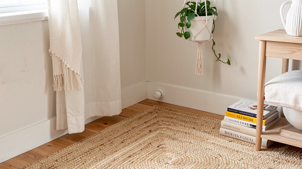
Texture as Language: The Unseen Thread That Binds
If color is bohemian design’s vocabulary, texture is its grammar—the invisible structure that gives meaning to the words. In a style defined by visual richness, texture provides depth, comfort, and sensory engagement. It’s why a room can feel “cozy” even with minimal furniture, or “cold” despite vibrant colors. Texture invites touch, slows the eye, and creates rhythm where pattern might overwhelm. Mastering texture is the secret weapon of intentional bohemian design.
Why texture transcends trend: Unlike color or pattern, which can feel dated, texture is timeless. A handwoven basket, a rough-hewn wooden bowl, a nubby wool blanket—these elements carry inherent authenticity. They speak of human hands, natural materials, and the passage of time. Neuroaesthetic research suggests that textured surfaces can create a deeper, more embodied connection to a space than smooth, uniform surfaces. Texture isn’t just seen; it’s felt, even visually. This sensory richness is core to bohemian philosophy: a rejection of sterile perfection in favor of lived-in warmth.
The Bohemian Texture Palette: A Sensory Inventory
Build a mental library of textures. When sourcing items, ask: “What does this feel like?” Group textures by sensory quality:
| Texture Family | Materials & Examples | Sensory Quality | Best Used In |
|---|---|---|---|
| Woven & Fibrous | Macramé, rattan, seagrass, jute, sisal, hand-knotted rugs, linen, raw silk | Organic, earthy, tactile | Wall hangings, rugs, baskets, curtains, pillow covers |
| Soft & Nubby | Chunky knit throws, bouclé upholstery, ethical faux fur, mohair, wool felt | Cozy, comforting, inviting | Throws, accent chairs, ottomans, bedspreads |
| Smooth & Cool | Unglazed ceramic, river stones, driftwood, raw marble, hammered metal | Calming, grounding, elemental | Vases, bowls, trays, candle holders, sculptures |
| Rough & Aged | Reclaimed wood, distressed leather, weathered stone, cracked pottery | Authentic, storied, resilient | Furniture, shelves, planters, wall art |
| Delicate & Ethereal | Sheer cotton, vintage lace, dried botanicals, feather details | Light, airy, poetic | Canopy beds, window treatments, delicate art, mobiles |
Layering textures with intention:
The goal is contrast, not competition. Pair textures from different families to create visual and tactile interest:
– The Classic Contrast: Smooth ceramic vase (cool) holding dried pampas grass (fibrous) on a rough-hewn wooden table (aged). Each texture highlights the others.
– The Cozy Cluster: A bouclé armchair (nubby) draped with a chunky knit throw (soft) beside a seagrass basket (woven) holding a faux fur pillow (soft). Textures harmonize within a “warm” family but vary in scale and feel.
– The Unexpected Pairing: A sleek, raw marble tray (smooth) holding rough river stones and a delicate lace doily (ethereal). This creates sophisticated tension.
Critical technique: The Texture Triangle. In any vignette or seating area, include at least three distinct textures. Example: Sofa (linen = woven), throw pillow (velvet = soft), side table (reclaimed wood = rough). This simple rule prevents flatness and adds dimensional richness.
Room-by-room texture strategies:
– Living Room: Prioritize comfort and invitation.
Foundation: Jute rug (fibrous), linen sofa (woven).
Expression: Bouclé accent chair (nubby), macramé wall hanging (fibrous).
Soul: Grandmother’s crocheted blanket (soft) folded over sofa arm; smooth river stone from a memorable hike on coffee table.
Pro Tip: Add a “texture tray” on your coffee table—a wooden tray holding a smooth ceramic bowl, a rough sea sponge, and a delicate dried flower. It becomes an interactive sensory moment.
-
Bedroom: Prioritize sanctuary and rest.
Foundation: Undyed cotton sheets (woven), wool rug beside bed (nubby).
Expression: Chunky knit bedspread (soft), rattan headboard (fibrous).
Soul: Silk pajamas draped over a chair (smooth), a smooth worry stone on the nightstand.
Pro Tip: Layer bedding textures: flat sheet (smooth cotton), duvet cover (textured linen), throw blanket (chunky knit). This creates depth without visual clutter. -
Bathroom: Prioritize spa-like serenity.
Foundation: Terracotta tiles (rough), bamboo bath mat (fibrous).
Expression: Woven seagrass baskets for towels (fibrous), hammered brass fixtures (smooth/cool).
Soul: A smooth river stone soap dish; a small bundle of dried lavender (delicate) in a ceramic dish.
Pro Tip: Roll towels with a sprig of eucalyptus tucked inside—adds scent (another sensory layer) and visual texture.
Avoiding texture overload:
Too many competing textures create visual static. Apply these filters:
– Scale Balance: If using a large-scale texture (a thick macramé wall hanging), balance it with smaller-scale textures nearby (a smooth ceramic vase, fine linen curtains).
– Color Unity: When textures are highly varied, unify them with a cohesive color story. A room with jute, rattan, linen, and wool all in cream/beige/taupe feels harmonious despite textural complexity.
– Negative Space: Leave some surfaces smooth and untextured—like a plain plaster wall or a simple wooden shelf. This gives the eye rest and makes textured elements pop.
Texture is the quiet poetry of bohemian design. It whispers where color shouts. It grounds the eclectic in the tangible. By consciously curating texture, you transform a room from a collection of objects into an immersive, sensory experience—a space that feels not just seen, but lived.
Furniture with History: Sourcing and Styling Character Pieces
Bohemian furniture rejects the uniformity of mass production. It celebrates imperfection, patina, and the stories embedded in wood grain, worn upholstery, and hand-forged metal. A bohemian room feels collected over time, not purchased in a single afternoon. Yet “vintage” or “eclectic” furniture sourcing can feel daunting—where to look, how to assess quality, how to blend eras without creating discord. This section provides a practical roadmap for building a furniture collection that feels authentic, comfortable, and deeply personal.
The Philosophy of “Character Furniture”:
Before diving into tactics, embrace the mindset shift: Furniture isn’t just functional; it’s biographical. A scratch on a wooden table isn’t a flaw—it’s evidence of shared meals. Faded upholstery on an armchair isn’t shabby—it’s a record of quiet moments. This perspective transforms how you source and live with furniture. You’re not seeking “perfect” pieces; you’re seeking pieces with presence. Pieces that have lived before you and will live beyond you. This aligns with bohemian values of sustainability (extending an object’s life) and mindful consumption (valuing uniqueness over newness).
Sourcing Strategies for Every Budget and Lifestyle:
| Source | Best For | Pros | Cons | Pro Tips |
|——–|———-|——|——|———-|
| Thrift Stores / Charity Shops | Beginners, budget-conscious, small accents | Low cost, frequent inventory turnover, local impact | Requires patience, inconsistent quality | Go weekly; build relationships with staff; focus on solid wood frames (upholstery can be redone) |
| Estate Sales | Statement pieces, vintage gems, hidden treasures | Authentic history, often well-maintained, reasonable prices | Time-sensitive, competitive, may require transport | Arrive early; bring cash; inspect for structural integrity (wobbly legs, loose joints) |
| Online Marketplaces | Local deals, specific searches, negotiation | Direct communication with seller, see item in home context | Scams possible, limited return policy | Meet in public; inspect thoroughly; ask “Why are you selling?” (reveals history) |
| Antique Malls / Flea Markets | Curated vintage, global artifacts, unique finds | Expert curation (sometimes), social experience, bargaining | Higher prices, variable authenticity | Visit regularly; talk to dealers—they often hold items for loyal customers |
| Family Attics / Hand-Me-Downs | Heirlooms, emotional connection, sustainability | Deep meaning, zero cost, preserves legacy | May not fit style/function needs | Repurpose: Old trunk becomes coffee table; dining chairs reupholstered in new fabric |
| Artisan Markets / Ethical Online Shops | New-but-handmade, supporting makers, custom pieces | Ethical sourcing, unique designs, direct maker connection | Higher investment, shipping considerations | Read maker stories; ask about materials/process; prioritize local artisans when possible |
Assessing Quality: The 5-Point Furniture Inspection
Whether buying vintage or new handmade, evaluate these elements:
1. Frame Construction: Lift one front corner of a chair or sofa. If the entire piece lifts, the frame is solidly joined (good). If only the leg lifts, it’s poorly constructed (avoid). For wood furniture, look for dovetail joints in drawers—sign of craftsmanship.
2. Wood Type: Solid wood (oak, walnut, teak, mango) ages beautifully. Avoid particleboard or MDF (swells with moisture, doesn’t last). Check undersides and interiors—real wood continues throughout.
3. Upholstery Integrity: Sit on vintage upholstered pieces. Springs should feel supportive, not saggy or poking. Smell for mildew. Fabric can be replaced; a broken frame cannot.
4. Hardware & Joinery: Drawers should slide smoothly. Look for wood pegs or mortise-and-tenon joints (strong) vs. nails or screws alone (weak). Original hardware (brass pulls, iron hinges) adds character.
5. Patina vs. Damage: Patina is surface wear that adds character (faded finish on a tabletop). Damage is structural compromise (deep cracks, water stains penetrating wood). Patina is desirable; significant damage requires skilled restoration.
Styling Eclectic Furniture: Creating Harmony from Diversity
The magic of bohemian furniture lies in intentional juxtaposition. A mid-century modern sofa can coexist with a Moroccan daybed and a rustic farmhouse table—if unified by thoughtful choices.
- Unify with Color: Paint disparate wood pieces in a consistent tone. A faded oak dresser and a dark walnut chair both refreshed in matte white or warm gray create cohesion. Alternative: Stain all wood pieces to a similar tone (e.g., all light oak).
- Anchor with Scale: In a room with varied furniture styles, ensure one piece dominates visually (e.g., a large low-profile sofa). Smaller accent pieces (armchair, stool, side table) can be wildly eclectic because the anchor provides stability.
- Repeat Materials: If your sofa has cane details, echo cane in a side chair or room divider. If your table is reclaimed wood, use wood trays or bowls elsewhere. Material repetition creates invisible threads.
- Embrace Low Profiles: Bohemian spaces often feel grounded and intimate. Prioritize low-slung seating (floor cushions, Moroccan poufs, low sofas) and low tables. This encourages connection, relaxation, and makes ceilings feel higher. Exception: In rooms with high ceilings, a tall bookshelf or canopy bed adds vertical interest.
Real-world example: A living room features a vintage brown leather sofa (mid-century), a hand-carved daybed (global influence), and a simple white oak coffee table (Scandinavian). They harmonize because: 1) All wood elements are light oak (table legs, daybed frame), 2) Neutral textiles (cream linen pillows, oatmeal throw) unify the seating, 3) The low profile of all pieces creates a cohesive, grounded feel. The leather’s patina and the daybed’s carvings provide character without clashing.
Ethical Sourcing and Cultural Respect:
When acquiring furniture with cultural origins:
– Research its origin and significance. Understanding context prevents disrespect.
– Prioritize fair trade. Seek sellers who partner directly with artisan communities and share profits equitably. Look for certifications or detailed maker stories.
– Avoid homogenizing labels that erase cultural specificity. Instead, specify origins when verified and appropriate.
– When in doubt, choose local or neutral pieces for foundational furniture, and incorporate cultural elements through smaller, ethically sourced textiles or art where provenance is clearer.
Furniture with history doesn’t just fill space—it fills silence with story. Each scratch, each repair, each unique detail whispers of lives lived. By sourcing and styling with intention, your furniture becomes more than functional; it becomes familial.
Lighting the Bohemian Way: Creating Ambiance and Warmth
Lighting is the silent conductor of atmosphere. In bohemian design, it rejects the clinical uniformity of overhead fluorescents in favor of layered, warm, and human-scaled illumination. It’s the difference between a room that feels occupied and one that feels alive. Bohemian lighting is inherently poetic—it casts shadows that dance, highlights textures you’d otherwise miss, and creates pockets of intimacy for reading, conversation, or quiet reflection. This section moves beyond “add string lights” to a nuanced philosophy of light as an emotional tool.
The Three Layers of Bohemian Lighting:
True ambiance comes from layering three types of light, each serving a distinct purpose. Overhead lighting alone creates flat, shadowless spaces that feel institutional. Bohemian lighting is intentionally decentralized.
-
Ambient Light (The Glow): Soft, overall illumination that defines the room’s baseline mood.
Sources: Dimmable ceiling fixtures (paper lanterns, woven rattan pendants), wall sconces with fabric shades, clusters of candles (real or high-quality LED).
Bohemian Twist: Avoid bright white bulbs. Choose warm white (2700K) or soft amber (2200K) bulbs. Place ambient sources low—floor lamps, table lamps—to create upward-washing light that feels embracing, not exposing. A cluster of three mismatched ceramic table lamps on a console creates a warmer, more organic glow than one central fixture. -
Task Light (The Focus): Directed light for specific activities—reading, crafting, cooking.
Sources: Adjustable arm floor lamps beside seating, swing-arm wall lamps over beds, under-cabinet lighting in kitchens.
Bohemian Twist: Choose task lights with character: a vintage architect lamp with a brass finish, a woven rattan shade on a reading lamp, a ceramic base hand-thrown by a local potter. Function doesn’t require blandness. Position task lights to minimize glare—angle a floor lamp so light falls on your book, not your eyes. -
Accent Light (The Magic): Dramatic, directional light that highlights textures, art, or architectural features.
Sources: Small LED spotlights grazing a textured wall, fairy lights tucked into a bookshelf, a single candle illuminating a vignette, rope lights outlining a window.
Bohemian Twist: Use accent light to tell stories. Shine a small spotlight on your Layer 3 memory vignette. Tuck warm-white fairy lights behind a macramé wall hanging to create a soft halo effect. Place a single candle in a colored glass holder to cast a subtle tint on a nearby wall.
Material Matters: Choosing Fixtures with Soul
The fixture itself is decor. Prioritize natural, textured materials that diffuse light softly:
– Paper & Rice Paper: Creates a gentle, diffused glow. Ideal for ambient pendants. Tip: Handmade paper lanterns cast delicate shadow patterns.
– Rattan, Wicker, Seagrass: Adds organic texture and casts interesting shadows. Perfect for pendants over dining tables or bedside lamps. Tip: Ensure weaving is tight; loose weaves can create harsh light spots.
– Ceramic & Clay: Unglazed or matte-glazed ceramics provide warm, earthy bases. Glazed ceramics in indigo or terracotta add color accents. Tip: Choose fixtures with irregular shapes—hand-thrown asymmetry feels more authentic.
– Metal (Brass, Iron, Copper): Adds warmth and vintage charm. Hammered finishes diffuse light beautifully. Tip: Mix metals intentionally—aged brass with black iron—but keep dominant metal consistent in one room.
– Glass (Colored, Textured): Stained glass, ribbed glass, or seeded glass adds color and softens light. Tip: Place a colored glass lamp on a windowsill; daylight filters through it during the day, artificial light glows through it at night.
Room-Specific Lighting Scenarios:
– Living Room Sanctuary:
Ambient: A large rattan pendant centered over the seating area (dimmed to 30%). Two ceramic table lamps on side tables with warm amber bulbs.
Task: An adjustable brass floor lamp angled over the reading chair.
Accent: Fairy lights woven through a tall potted plant; a small LED spotlight highlighting a gallery wall of travel photos.
Evening Ritual: As dusk falls, turn off overhead lights. Light three soy candles on the coffee table. The room transforms—shadows deepen, textures emerge, conversation softens. This intentional shift signals relaxation.
-
Bedroom Retreat:
Ambient: Two mismatched ceramic bedside lamps with fabric shades (no harsh bulbs visible). A small paper lantern in the corner on a dimmer.
Task: Swing-arm wall lamps mounted above the bed (frees bedside table space).
Accent: A single strand of warm fairy lights draped along the headboard; a salt lamp on a dresser casting a soft pink glow.
Wind-Down Tip: Use smart bulbs programmed to shift from daylight (5000K) in the morning to warm amber (2200K) by evening. This supports natural circadian rhythms—cool light for energy, warm light for rest. -
Dining Nook:
Ambient: A cluster of three varying-height rattan pendants over the table (creates intimacy).
Task: None needed—dining is the task.
Accent: A small candle centerpiece in a ceramic holder; under-shelf lighting on open kitchen shelves to highlight pottery.
Host’s Secret: Place candles at different heights—a tall pillar, short votives, a floating candle in a bowl. This creates dynamic light play across faces during meals, enhancing connection.
Safety and Sustainability Notes:
– Candle Safety: Never leave burning candles unattended. Use sturdy holders. Keep away from curtains/textiles. For homes with children/pets, high-quality LED candles now mimic real flame movement convincingly.
– Bulb Efficiency: Use LED bulbs exclusively—they use significantly less energy, last longer, and emit minimal heat (safer near textiles/paper). Look for “dimmable” and “warm dim” LEDs that mimic incandescent warmth when dimmed.
– DIY with Care: If crafting your own fixture (e.g., turning a basket into a pendant), consult an electrician for wiring. Safety > aesthetics. Alternatively, use plug-in pendant kits designed for DIY.
Lighting is where bohemian design becomes experiential. It’s not about seeing the room clearly; it’s about feeling the room deeply. By layering light sources with intention, you don’t just illuminate space—you sculpt mood, memory, and meaning. A well-lit bohemian room doesn’t just look beautiful at golden hour; it feels like a sanctuary at midnight.
Textiles: The Heartbeat of Bohemian Comfort
If texture is bohemian design’s grammar, textiles are its heartbeat—the element that transforms architecture into embrace. They are the first thing you touch upon waking (linen sheets), the comfort that wraps you after a long day (a chunky knit throw), the visual rhythm that ties a room together (a vintage rug). Textiles carry cultural histories, artisanal techniques, and deeply personal memories. They are simultaneously functional, artistic, and emotional. Mastering textiles is non-negotiable for authentic bohemian design; without them, a space feels stark, regardless of other elements.
Understanding Textile Origins and Ethics:
Bohemian style draws heavily from global textile traditions. Appreciating these origins is part of the practice—but must be paired with ethical awareness. Below is a concise guide to common bohemian textiles, their cultural roots, and mindful sourcing practices:
| Textile Type | Cultural Context | Traditional Use | Mindful Sourcing Tips | What to Avoid |
|---|---|---|---|---|
| Kilim / Soumak Rugs | Turkey, Iran, Caucasus regions | Nomadic floor coverings, ceremonial textiles | Seek vintage (pre-1980s) or new from certified fair-trade cooperatives. Ask about dyes (natural vs. synthetic). | Mass-produced rugs with no origin info; rugs from sources with questionable labor practices. |
| Ikat | Indonesia, India, Central Asia | Ceremonial clothing, wall hangings | Look for “double ikat” (pattern aligned in warp AND weft—sign of high skill). Support artisans via ethical platforms. | Cheap prints mimicking ikat pattern with no cultural context or artisan credit. |
| Mud Cloth (Bògòlanfini) | Mali, West Africa | Traditionally worn; symbols convey stories | Purchase from Malian cooperatives or verified ethical retailers. Learn the symbols’ meanings. | Mass-produced cotton prints labeled “mud cloth” made outside Mali with no connection to Bambara culture. |
| Suzani | Uzbekistan, Tajikistan | Traditional wedding dowries; embroidered textiles | Seek vintage or new from Uzbek artisan groups. Note regional styles. | Machine-embroidered replicas sold as “authentic”; using sacred motifs disrespectfully. |
| Macramé | Historical knotting traditions across cultures; popularized globally | Sailors’ knots; plant hangers, wall art | Support contemporary fiber artists. Learn basic knots to make your own. | While macramé is a technique, credit origins when discussing history. |
| Block Print | India, Japan | Traditional clothing, home goods | Choose brands using natural dyes and supporting artisan families. | Fast-fashion block prints using toxic dyes and exploitative labor. |
Critical Principle: Context over extraction. When displaying a textile with cultural significance, provide context. A small discreet label: “Hand-embroidered textile from Lake Atitlán, Guatemala. Woven by Doña Maria using techniques passed through generations. Purchased directly during my visit.” This shifts from appropriation to appreciation—honoring the maker and the meaning.
The Layered Textile Strategy: Building Depth Without Clutter
Textiles should be layered like an outfit—each layer serving a purpose, harmonizing with others. Apply the Textile Pyramid:
-
Base Layer (Floor): The largest textile sets the tone.
Ideal: A vintage kilim, Oushak, or Beni Ourain rug. Size should anchor the seating area (front legs of furniture on rug).
Budget Alternative: A large neutral jute or sisal rug. Layer a smaller vintage rug on top for color/pattern.
Small Space Tip: Use a round rug to soften angular furniture and create flow. -
Mid Layer (Seating & Beds): Upholstery, throws, pillows.
Ideal: Mix 3–5 pillow sizes/shapes (lumbar, square, bolster). Combine solids (linen), subtle patterns (stripes), and one bold pattern (ikat). Throws draped casually.
Budget Alternative: Thrift solid-colored wool blankets; dye them with natural dyes (avocado pits for pink, onion skins for gold). Sew simple envelope pillow covers from vintage scarves.
Pro Technique: “Pillow Styling Rule”: Place largest pillows at back, smallest in front. Angle corners toward seating area for invitation. -
Top Layer (Walls & Windows): Curtains, tapestries, wall hangings.
Ideal: Floor-length unbleached linen curtains. A vintage suzani or macramé wall hanging as focal point.
Budget Alternative: Use large vintage scarves as wall art (stretched on canvas or hung with clip rods). Dye cheap cotton curtains with tea for a warm, aged look.
Small Space Tip: Hang curtains higher and wider than the window frame to create illusion of height/space.
Fabric Fundamentals: Choosing for Comfort and Character
Not all fabrics suit bohemian ethos. Prioritize natural fibers—they age gracefully, breathe well, and carry inherent texture.
| Fiber | Qualities | Best Uses | Care Tips |
|---|---|---|---|
| Linen | Wrinkles beautifully, breathable, gets softer with age | Curtains, pillow covers, tablecloths, bedding | Wash in cold water; air dry; embrace wrinkles as character |
| Cotton (Handwoven, Slub) | Soft, versatile, durable | Quilts, throws, casual pillow covers | Pre-wash to prevent shrinkage; use oxygen bleach for stains |
| Wool (Undyed, Felted) | Warm, sound-absorbing, naturally stain-resistant | Rugs, throws, poufs | Spot clean; air out regularly; avoid direct sunlight to prevent fading |
| Silk (Vintage, Raw) | Lustrous, delicate, luxurious | Accent pillows, small wall hangings, scarves as art | Dry clean only; display away from direct sun; handle gently |
| Jute / Sisal / Seagrass | Rough, earthy, durable | Base rugs, baskets, storage | Vacuum regularly; spot clean only; not for damp areas |
| Velvet (Cotton, Linen Blend) | Rich texture, light-catching, cozy | Accent pillows, small upholstery | Brush pile regularly; vacuum with soft brush attachment |
Avoid: Polyester blends (trap heat, feel synthetic), overly stiff fabrics (lack lived-in softness), or fabrics with loud logos/patterns that date quickly.
Textile Care as Ritual:
Bohemian textiles are meant to be used, not preserved behind glass. Embrace gentle aging:
– Rotate rugs seasonally to ensure even wear.
– Air out textiles monthly—hang quilts over a railing, shake out rugs. Sunlight freshens but fades; limit direct exposure.
– Mend visibly: A visible stitch on a torn pillow cover isn’t failure—it’s history. Learn basic visible mending techniques to transform repairs into art.
– Store with care: Fold textiles with acid-free tissue paper; store in breathable cotton bags, not plastic. Add cedar blocks to deter moths (avoid mothballs—they’re toxic).
Illustrative Moment: Imagine a rainy Sunday. You sink into your sofa, wrapped in a hand-knitted alpaca throw your sister gifted you. Your feet rest on a vintage rug, its faded colors telling stories of decades past. Sunlight (when it returns) will filter through linen curtains onto a macramé wall hanging you learned to make during lockdown. These textiles aren’t just decor—they’re companions. They hold memories, provide comfort, and connect you to people and places. This is the true power of bohemian textiles: they make a house feel like a home, woven together with threads of love, history, and intention.
Art and Wall Decor: Telling Your Story Vertically
Walls are the pages of your home’s storybook. In bohemian design, they reject sterile minimalism and uniform gallery walls in favor of curated collages that feel discovered, not designed. Yet “eclectic wall art” often results in chaotic arrangements that overwhelm rather than inspire. The key lies in intentional composition—a balance of cohesion and surprise, where each piece contributes to a larger narrative. This section provides a framework for creating wall displays that feel personal, layered, and deeply resonant.
The Philosophy of the “Living Wall”:
Bohemian walls should evolve with you. They are not static installations but dynamic reflections of your journey. A gap isn’t emptiness—it’s anticipation for the next chapter. A slightly crooked frame isn’t a mistake—it’s evidence of human hands. This mindset frees you from perfectionism. Your wall decor should include:
– Artistic expressions: Paintings, prints, photographs
– Textile art: Tapestries, embroidery, framed scarves
– Natural elements: Pressed botanicals, woven grasses, driftwood
– Functional objects: Mirrors, shelves, hooks (disguised as art)
– Personal artifacts: Maps, letters, children’s drawings (elevated)
The goal isn’t to fill every inch, but to create moments of connection—places where the eye rests, lingers, and discovers meaning.
The Gallery Wall Framework: From Chaos to Cohesion
A successful gallery wall feels intentional, not accidental. Follow this step-by-step process:
-
Define Your Anchor Piece: Choose one item that sets the tone—a large vintage mirror, a meaningful painting, a textile like a suzani. This becomes the visual heart of the arrangement. Place it slightly off-center for organic flow.
-
Establish a Unifying Thread: Choose ONE element to repeat throughout:
- Color: All frames in black, or all art containing a specific hue (e.g., terracotta)
- Frame Style: Mix sizes but keep frames consistent (all thin black metal, or all natural wood)
- Matting: Use identical white or cream mats for all framed pieces to create uniformity
-
Subject Matter: All botanical prints, all black-and-white travel photos
Critical Insight: Without a unifying thread, diversity becomes discord. The thread is the invisible glue. -
Vary Scale and Orientation: Include large, medium, and small pieces. Mix vertical and horizontal orientations. Place the largest piece near the anchor; let smaller pieces radiate outward. Avoid lining up all tops or bottoms—create organic asymmetry.
-
Incorporate Negative Space: Leave intentional gaps between pieces. Negative space isn’t wasted space—it’s visual breathing room. A common mistake is cramming pieces too tightly. Step back frequently; if the arrangement feels busy, remove one piece.
-
Add Dimensional Elements: Break the 2D plane. Include:
- A small floating shelf holding a ceramic vase and a smooth stone
- A woven wall hanging (macramé, rya rug) for texture
- A vintage hat or musical instrument mounted as sculpture
-
A cluster of small objects in shadow boxes (ticket stubs, pressed flowers)
-
Test Before Hanging: Lay all pieces on the floor in your intended arrangement. Take a photo. Live with it for a day. Adjust spacing. Trace each piece onto kraft paper, cut out, and tape to the wall to visualize spacing before drilling holes. Pro Tip: Keep 2–3 inches between frames for a cohesive look; 4+ inches for a more scattered, organic feel.
Beyond the Gallery Wall: Alternative Wall Strategies
Not every wall needs a collage. Explore these intentional approaches:
- The Single Statement: One large, powerful piece commands attention. Ideal for:
- A floor-to-ceiling tapestry in a bedroom
- A massive vintage map in a study
-
A bold abstract painting above a sofa
Why it works: Creates calm focus. Lets the artwork breathe. Perfect for rooms with busy textiles or furniture. -
The Asymmetrical Cluster: Group 3–5 related items off-center on a wall. Example:
- Three varying-sized mirrors arranged like falling leaves
- A cluster of small botanical prints leaning on a shelf (no hanging)
-
A grouping of woven baskets in different sizes and textures
Why it works: Feels collected, not designed. Adds visual interest without overwhelming. -
The Functional Art Wall: Integrate storage and display:
- Open shelving styled with books, ceramics, and small plants
- A pegboard painted in a muted tone, holding tools, baskets, and art supplies (in a studio)
- A ladder shelf leaning against the wall, draped with textiles and holding objects
Why it works: Maximizes small spaces. Makes decor useful. Encourages daily interaction.
Ethical and Personal Sourcing of Art:
– Support Living Artists: Purchase directly from artists at markets, via social media, or ethical online platforms. Ask about their process. This builds connection and ensures fair compensation. Look for artists from cultures you admire—buying a print from a contemporary Indigenous artist supports cultural continuity far more than buying a mass-produced “inspired” poster.
– Frame Meaningful Ephemera: Elevate personal artifacts:
– Frame a handwritten recipe from your grandmother in a simple wood frame
– Mount a pressed flower from your wedding bouquet under glass
– Display a child’s drawing in a mat cut to museum standards
Psychological Impact: These pieces trigger powerful positive memories. Research suggests that displaying personal mementos can increase feelings of identity and belonging.
– Create Your Own: You don’t need to be an artist. Try:
– Natural dyeing fabric scraps with avocado pits or turmeric, then framing the results
– Pressing leaves/flowers between book pages for weeks, then arranging in a shadow box
– Hand-lettering a meaningful quote on watercolor paper
Why it matters: Homemade art carries irreplaceable emotional weight. It says, “I made this for this space, for my life.”
Room-Specific Wall Guidance:
– Living Room: Prioritize conversation starters. A gallery wall above the sofa featuring travel photos, children’s art (rotated seasonally), and a small textile. Include a large mirror opposite a window to reflect light and greenery.
– Bedroom: Prioritize calm and sanctuary. A single large textile (like a vintage quilt fragment) above the bed. Avoid chaotic arrangements that stimulate the mind before sleep. Place a small shelf with a candle and a smooth stone for bedtime ritual.
– Hallway: Prioritize flow and discovery. A narrow vertical gallery of black-and-white family photos in matching frames. Or a single large mirror to widen the space and check your appearance before leaving.
– Kitchen: Prioritize joy and function. Open shelves displaying beautiful ceramics. A small chalkboard for grocery lists or daily affirmations. Framed vintage botanical prints of herbs.
Troubleshooting Common Wall Dilemmas:
– Problem: “My walls feel empty, but I’m scared to commit.”
Solution: Start small. Hang one meaningful piece. Live with it for a month. Add one piece at a time. Walls should evolve slowly—like a friendship.
– Problem: “I have too many frames and it looks cluttered.”
Solution: Edit ruthlessly. Remove every third piece. Group remaining items more intentionally. Sometimes less is more powerful.
– Problem: “I rent and can’t drill holes.”
Solution: Use leaning displays (art on shelves, easels), removable adhesive hooks (for lightweight pieces), or large floor screens draped with textiles. Create a “gallery” on a large rolling cart with clipboards holding art.
Your walls are not just surfaces—they are the backdrop of your life. When curated with intention, they become a visual diary: a map of where you’ve been, a reflection of who you are, and an invitation to who you’re becoming. Every glance offers comfort, memory, or inspiration. That is the true art of bohemian walls.
The Living Element: Incorporating Plants and Natural Materials
Plants are the breath of bohemian design. They soften hard edges, shift with seasons, and embody the bohemian reverence for nature’s imperfect beauty. A space without living elements feels static; with them, it feels alive. Yet “adding plants” is often reduced to a styling tip, ignoring their deeper role as dynamic participants in your home’s ecosystem. This section explores plants not as decor accessories, but as essential collaborators in creating a soulful, biophilic sanctuary—alongside other natural materials that ground bohemian design in the earth.
Why Plants Are Non-Negotiable in Bohemian Spaces:
Beyond aesthetics, plants fulfill core bohemian values:
– Connection to Nature (Biophilia): Humans have an innate affinity for nature. Research indicates that indoor plants can contribute to reduced stress levels, enhanced creativity, and improved air quality. In a world of screens and schedules, plants are gentle anchors to the natural world.
– Embrace of Imperfection: A slightly yellowing leaf, a vine growing askew—these aren’t flaws. They are evidence of life. Bohemian design celebrates this organic authenticity over sterile perfection.
– Symbolism and Ritual: Plants carry meaning. A peace lily symbolizes tranquility; a jade plant represents prosperity; a cutting shared from a friend embodies connection. Caring for plants becomes a daily mindfulness practice—a moment of presence amid chaos.
– Dynamic Evolution: Unlike static decor, plants grow, change, and respond. A trailing pothos vine lengthens over months; a monstera develops dramatic splits; seasonal flowers bloom and fade. Your space evolves with you, reflecting life’s fluidity.
The Bohemian Plant Palette: Choosing Wisely for Your Life
Forget generic “low-light” labels alone. Match plants to your lifestyle and space. Consider these curated groupings:
| Lifestyle Profile | Ideal Plants | Why They Work | Styling Tips |
|---|---|---|---|
| The Frequent Traveler / Forgetful Waterer | Snake Plant, ZZ Plant, Pothos, Cast Iron Plant | Tolerate neglect, low light, irregular watering | Place in bedrooms, bathrooms, or offices. Use in textured ceramic pots. Group 3 snake plants of varying heights for sculptural impact. |
| The Sun-Drenched Space Owner | Fiddle Leaf Fig, Rubber Plant, Bird of Paradise, Dwarf Citrus | Thrive in bright, direct light; make bold statements | Place near south-facing windows. Rotate weekly for even growth. Use as room dividers. Note: Some plants require consistent care—choose based on your commitment level. |
| The Humidity Lover (Bathrooms, Kitchens) | Ferns (Maidenhair, Boston), Calathea, Peace Lily, Orchids (Phalaenopsis) | Love steam and moisture; purify air | Hang ferns in macramé planters near showers. Place peace lily on bathroom counter—it blooms white flowers and signals when thirsty (droops slightly). |
| The Propagator / Nurturer | Pothos, Philodendron, Spider Plant, Tradescantia | Easily propagate in water; share cuttings with friends | Display propagation stations: glass jars of cuttings on a windowsill. Label jars with dates or recipient names (“For Maya, 6/15”). Turns plant care into connection. |
| The Small Space Dweller | String of Pearls, String of Hearts, Air Plants, Miniature Ferns | Trail vertically, require minimal footprint | Hang air plants in geometric terrariums. Trail string of hearts from high shelves. Use wall-mounted planters to free floor space. |
Beyond Potted Plants: Integrating Natural Materials Holistically
Plants are just one expression of nature indoors. Weave natural elements throughout your space for layered authenticity:
- Wood: Reclaimed barn wood shelves, driftwood sculptures, olive wood bowls. Tip: Leave wood unfinished or use beeswax polish to highlight grain. Avoid glossy finishes—they can feel synthetic.
- Stone & Clay: River rocks in a glass bowl, unglazed terracotta pots, soapstone coasters, a slice of agate as a paperweight. Tip: Group stones by color family (all grays, all whites) for calm cohesion.
- Fibers: Seagrass baskets for storage, jute rugs, hemp rope details. Tip: Use baskets functionally—hold blankets, toys, or firewood. Beauty in utility.
- Botanicals (Dried/Preserved): Pampas grass in a tall vase, dried lavender bundles, pressed ferns in frames, eucalyptus in the shower. Tip: Refresh dried botanicals seasonally—pampas in fall, dried hydrangeas in winter. They connect your home to nature’s cycles.
- Water Elements: A small tabletop fountain with smooth stones, a bowl of water with floating flowers. Tip: The sound of trickling water masks urban noise and induces calm. Place near seating areas.
Ethical and Sustainable Sourcing Practices:
– Choose Native or Adapted Species: Research plants suited to your climate zone. They require less water and support local ecosystems if placed outdoors eventually.
– Avoid Wild-Harvested Plants: Some popular plants are endangered due to overharvesting. Purchase from nurseries that propagate plants responsibly. Look for certifications like “Veriflora.”
– Support Local Nurseries: They offer regionally appropriate advice and reduce shipping emissions. Build relationships with staff—they often share cuttings or tips.
– Propagate and Share: Instead of buying new, propagate from friends’ plants. Host a “plant swap” party. This builds community and reduces consumption—core bohemian values.
– Natural Pest Control: Avoid chemical pesticides. Use neem oil spray, wipe leaves with soapy water, or introduce ladybugs for aphids. Care for plants as you would a pet—with gentle, non-toxic methods.
Creating Plant Vignettes with Intention:
Don’t scatter plants randomly. Group them to create micro-landscapes:
– The Reading Nook Sanctuary: A tall snake plant beside an armchair, a small air plant in a geometric holder on the side table, a trailing pothos on the bookshelf above. Creates a lush, enclosed retreat.
– The Kitchen Herb Garden: Small pots of basil, mint, and rosemary on a sunny windowsill. Use terracotta pots labeled with chalkboard paint. Snip herbs while cooking—functional beauty.
– The Bathroom Oasis: A peace lily on the counter, a fern hanging near the shower, eucalyptus bundle hung on the showerhead (releases scent with steam). Transforms routine into ritual.
– The Entryway Welcome: A hardy ZZ plant in a textured pot by the door. Signals life and care to guests the moment they enter.
Addressing Common Plant Concerns:
– Problem: “I kill every plant I touch.”
Solution: Start with one snake plant. It thrives on neglect. Place it where you’ll see it daily. Celebrate small wins. Success builds confidence. Remember: plants are resilient. A yellow leaf isn’t failure—it’s feedback.
– Problem: “Pets chew on plants.”
Solution: Choose pet-safe plants (spider plant, Boston fern, calathea). Place toxic plants on high shelves. Use deterrent sprays (citrus-scented) on pots. Prioritize safety without sacrificing greenery.
– Problem: “My apartment has no natural light.”
Solution: Low-light champions: ZZ plant, snake plant, cast iron plant. Supplement with a small full-spectrum grow light for a few hours daily. Even minimal light support sustains life.
Plants and natural materials are the quiet teachers of bohemian design. They remind us to slow down, to nurture, to embrace change. They connect our indoor sanctuaries to the vast, breathing world outside. In their presence, a room ceases to be merely decorated—it becomes alive. And in that aliveness, we find our own.
The Personal Archive: Displaying Collections and Mementos with Intention
Every life accumulates treasures: seashells from coastal walks, ticket stubs from concerts that changed us, pottery collected on travels, books that shaped our thinking. In bohemian design, these items are not clutter to be hidden—they are the very essence of the style. They transform a house from a generic space into a deeply personal sanctuary. Yet displaying collections without creating visual chaos is a common challenge. This section provides a compassionate framework for curating your personal archive with intention, honoring memories while maintaining serenity.
Shifting the Mindset: From Hoarding to Honoring
The word “clutter” carries judgment. Instead, view your mementos through a lens of reverence. Each object is a vessel for memory, emotion, or identity. The goal isn’t to display everything, but to curate—to select pieces that actively contribute to your present well-being and story. This requires gentle discernment:
– Ask with kindness: “Does this object spark genuine joy or connection today?” Not guilt (“I spent money on this”), obligation (“It was a gift”), or nostalgia for a past self that no longer fits.
– Honor the memory, not necessarily the object: Photograph meaningful items before letting them go. Create a digital archive. The memory lives on; the physical space is freed for current resonance.
– Rotate displays seasonally: Store most of a collection, displaying only a curated subset. Change it with the seasons or milestones. This keeps displays fresh and meaningful, and prevents visual fatigue.
The Curation Framework: Four Methods for Meaningful Display
Choose the method that best serves your collection’s nature and your space:
-
The Thematic Vignette: Group 3–7 related items that tell a specific story.
Example: A small tray holds: a smooth stone from hiking the Grand Canyon, a faded photo of the trip, a pressed wildflower, and the compass used that day.
Why it works: Creates narrative depth. Each item gains meaning from its neighbors. Feels intentional, not scattered.
Placement: Coffee table, bedside table, shelf niche.
Pro Tip: Use a unifying base—a wooden tray, a vintage book cover, a piece of slate—to contain the vignette visually. -
The Dedicated Archive Wall: Transform a wall into a curated museum of your journey.
Example: A grid of identical black frames holds: children’s artwork (rotated monthly), concert tickets arranged chronologically, postcards from travels, a pressed flower from your wedding.
Why it works: Contains diversity within structure (uniform frames). Celebrates evolution over time. Invites storytelling.
Placement: Hallway, stairwell, home office wall.
Pro Tip: Leave empty frames in the grid—placeholders for future memories. This acknowledges life’s ongoing story. -
The Functional Integration: Weave mementos into daily use.
Example: Grandmother’s quilt becomes a sofa throw. A collection of vintage teacups holds pens on a desk. A smooth worry stone lives in your pocket or on your keyboard.
Why it works: Honors legacy through lived experience. Makes memory active, not passive. Reduces “display pressure.”
Placement: Anywhere function meets sentiment.
Pro Tip: Choose items durable enough for use. Repair cracks with visible mending—celebrating breaks as part of history. -
The Memory Library: Dedicate shelving to books and objects that shaped you.
Example: A bookshelf holds well-loved novels, interspersed with: a small globe from your first solo trip, a ceramic bird made by your child, a vintage typewriter used to write your first novel.
Why it works: Books provide visual rhythm; objects punctuate the narrative. Feels scholarly yet personal.
Placement: Living room, study, bedroom.
Pro Tip: Arrange books by color for visual calm, then place objects strategically to break monotony. Or group books by theme (travel, poetry) with related objects nearby.
Room-by-Room Curation Guidance:
– Living Room: Focus on shared memories and conversation starters. A vignette of family photos on the mantel; a bowl holding smooth stones collected with loved ones; books that reflect your values prominently displayed. Avoid: Overloading surfaces. Choose 2–3 key vignettes max.
– Bedroom: Prioritize intimacy and calm. A single framed photo of a cherished person on the nightstand; a small dish holding a ring or meaningful token; a journal and pen for capturing thoughts. Avoid: Clutter that stimulates the mind before sleep. Keep surfaces clear except for deeply personal items.
– Home Office: Inspire creativity and purpose. A vision board with images/goals; a shelf of books that fuel your work; a small plant gifted by a mentor. Avoid: Distractions. Curate items that directly support focus and joy in your work.
– Entryway: Set the tone for arrival. A bowl for keys holding a smooth stone from a meaningful place; a small framed quote that centers you; a hook for a bag that holds travel mementos. Avoid: Dumping ground for daily clutter. Make it a mindful transition space.
Ethical Considerations for Cultural Artifacts:
If your collection includes items from other cultures:
– Research deeply: Understand the item’s cultural significance, origin, and appropriate context. Was it created for ceremonial use? Is it sacred?
– Display with context and respect: Include a small discreet label with origin and meaning where appropriate. Avoid placing culturally significant items in inappropriate locations (e.g., near footwear, in bathrooms).
– Support living cultures: If possible, purchase directly from artisans or certified fair-trade sources. Share the maker’s story. This transforms acquisition into alliance.
– When in doubt, consult: Reach out to cultural organizations, community leaders, or educational resources for guidance. When respect is prioritized over aesthetics, your space becomes a place of honor, not extraction. Remember: appreciation requires understanding; appropriation occurs in ignorance. By approaching cultural artifacts with humility and care, you honor the rich tapestry of human creativity while creating a home that reflects genuine global citizenship.
Your Questions, Answered
Q: How do I start creating a bohemian space on a tight budget?
A: Begin with Layer 1: paint walls a warm neutral (many hardware stores have affordable sample pots for testing). Thrift stores and Facebook Marketplace are goldmines for solid wood furniture—look for pieces with good bones that can be cleaned or lightly sanded. Layer in free or low-cost textures: drape a vintage quilt over your sofa, display pressed leaves in thrifted frames, or create macramé plant hangers from inexpensive cord. Remember, bohemian design is about curation over consumption. One meaningful, well-placed object holds more power than ten generic ones.
Q: How can I avoid cultural appropriation while embracing global influences?
A: Focus on appreciation through education and ethical sourcing. Research the history and significance of items before acquiring them. Prioritize purchasing directly from artisans or certified fair-trade organizations that transparently share profits with source communities. When displaying culturally significant items, provide context (e.g., a small note about origin and meaning). When uncertain, choose to celebrate cultures through supporting contemporary artists from those communities rather than using sacred or ceremonial objects as decor. Intent matters, but impact matters more—listen to feedback with humility.
Q: My space is small. Can bohemian design work without making it feel cramped?
A: Absolutely. In small spaces, intentionality is even more critical. Prioritize Layer 1: keep walls and large furniture light and cohesive to create perceived spaciousness. Use vertical space wisely—install floating shelves for plants and small artifacts instead of bulky cabinets. Choose multi-functional furniture (an ottoman with storage, a daybed that seats guests). Layer textiles sparingly: one meaningful rug, a few well-chosen pillows. Edit ruthlessly—every item must earn its place. A small bohemian space should feel cozy, not cluttered.
Q: How do I keep a bohemian home clean and organized with kids/pets?
A: Bohemian doesn’t mean chaotic. Build systems that honor both aesthetics and practicality. Use beautiful woven baskets (labeled discreetly inside) for toy storage. Choose durable, washable textiles for high-traffic areas (indoor/outdoor rugs, slipcovered sofas in performance fabric). Designate “calm zones” (like your bedroom) with stricter curation, and allow more playful expression in family areas. Involve children in curation: “Which three special rocks should live on this shelf this week?” Make tidying a ritual—play music, set a timer, and celebrate the calm that follows. Remember: a lived-in home has gentle evidence