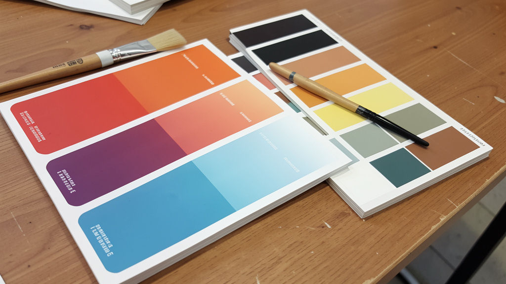
Move beyond room-by-room decisions. Discover the 5-Step Harmony Framework to design a cohesive, flowing color story from entryway to bedroom—without starting over.
Imagine walking through your home and feeling a sense of calm continuity, where each room welcomes you with a subtle echo of the last, creating a narrative that feels both intentional and effortless. This seamless experience isn’t accidental—it’s the result of a thoughtfully crafted color palette designed for flow. In this comprehensive guide, we dismantle the overwhelming process of whole-home color selection into a clear, actionable system. You’ll learn how to build a palette that honors each room’s unique purpose while weaving a visual thread throughout your entire living space, transforming disjointed rooms into a harmonious sanctuary where color guides the journey without demanding attention.
Introduction: Why Flow Matters More Than You Think
Color does more than decorate; it communicates. In the context of a home, color flow—the intentional progression of hues from one space to the next—shapes how we experience our environment on a psychological and emotional level. A disjointed color scheme, where each room is chosen in isolation, creates visual static. Your brain processes each doorway as a new visual event, increasing cognitive load and subtly disrupting relaxation. Conversely, a cohesive palette guides the eye gently through the space, enhancing architectural features, influencing perceived room size, and fostering a sense of unity that feels both expansive and intimate.
This principle aligns with established understanding in environmental design: visual continuity in living spaces supports a calmer sensory experience. When colors transition smoothly, the brain registers the home as a single, coherent environment rather than a series of disconnected zones. This isn’t about matching every room exactly—a monotonous approach that lacks personality and depth—but about creating deliberate relationships between colors that feel inevitable and restful. A hallway painted a slightly deeper variation of the living room’s wall color doesn’t feel like a separate space; it feels like a natural progression. A muted green accent pillow in the living room echoed by a small ceramic vase in the adjacent dining room creates a visual handshake between spaces.
Drawing from enduring color theory principles and patterns observed across diverse residential settings, this guide synthesizes foundational strategies that create lasting flow. We move beyond fleeting trends to focus on adaptable techniques that work regardless of style—whether your home leans minimalist, traditional, rustic, or eclectic. Whether you’re moving into new construction, renovating a historic property with original features, or simply refreshing your current space room by room, the framework ahead provides a roadmap to transform fragmentation into harmony. The goal is not perfection in every detail, but intentionality in the journey through your home.
The Harmony Framework: Your 5-Step System for Whole-Home Color Flow
At the heart of creating flowing color palettes lies a structured approach. The Harmony Framework is a systematic method developed specifically to address the unique challenge of connecting multiple rooms through color. Unlike room-specific guides that treat each space as an island, this framework begins with the macro view: your home as a single visual ecosystem. It’s designed to be adaptable to any architectural style, lighting condition, or constraint—whether you’re working with existing finishes you cannot change or starting with blank walls.
The framework consists of five sequential, interdependent steps. Each step builds upon the previous one, creating a cascade of intentional decisions. Skipping steps is a common reason palettes fail to achieve true flow. For instance, selecting a vibrant bedroom color before establishing an anchor often leads to visual tension in connecting spaces. By following this order, you create a foundation that supports every subsequent choice, turning overwhelming decisions into manageable actions. This methodology reflects principles consistently applied in professional residential color planning and has been refined through observation of successful applications across varied home types.
Step 1: Establish Your Anchor—The Non-Negotiable Foundation
Every cohesive home palette begins with an anchor: a single neutral tone that appears consistently throughout the entire house. This isn’t necessarily the most prominent color in every room, but it is the visual thread that ties everything together. Think of it as the bass note in a musical chord—it may not always be the loudest element, but it provides the harmonic foundation that allows other notes to resonate clearly. Without this anchor, colors float in isolation, creating visual noise rather than melody.
Why this step is crucial: The anchor creates predictability and comfort. It’s especially valuable in open-concept homes where multiple rooms are visible simultaneously. Psychologically, repetition of a core element signals order and calm to the mind. The anchor color typically appears on the majority of visible vertical surfaces—walls, significant built-ins, or architectural elements—and often extends to ceilings and trim for maximum cohesion. This consistent backdrop allows bolder choices in secondary spaces to feel intentional rather than chaotic.
How to choose your anchor with precision:
– Start with fixed elements you cannot change. Your anchor must harmonize with permanent features: flooring (hardwood species and stain, tile color), stone surfaces, brick fireplaces, prominent exterior views, or original woodwork. For example, if you have warm-toned wood floors throughout, your anchor should carry warm undertones (creamy whites, soft beiges, warm greiges) rather than cool grays that may create visual tension. Hold large paint swatches directly against these elements in natural light at different times of day.
– Analyze light quality room by room. Homes with abundant south-facing windows may support slightly deeper anchors, while north-facing homes with cooler, diffused light often benefit from warmer, lighter anchors. Similarly, homes with high ceilings or expansive windows may need a marginally deeper anchor value to avoid feeling washed out. Spend time observing how light moves through your home across morning, midday, and evening hours.
– Test rigorously before committing. Paint large swatches (minimum two by two feet) of potential anchor colors on multiple walls in different rooms—especially where rooms connect visually. Observe them under natural light at dawn, noon, and dusk, and under your home’s artificial lighting for several days. Does the color feel consistent across spaces? Does it enhance fixed elements? Does it evoke the calm you seek? Your anchor should be a tone you genuinely enjoy living with daily—it’s the backdrop of your life. Never choose solely from a small chip in a store.
Common considerations:
– Avoid selecting an anchor based solely on a favorite room’s decor or a trending color. The anchor must work universally across all connected spaces.
– Pay close attention to undertones in neutrals. Whites and grays exist on a spectrum: warm (yellow/red undertones), cool (blue/green undertones), or balanced. Match the undertone thoughtfully to your fixed elements. A cool-toned neutral against warm wood can create subtle visual friction over time.
– Consider the ceiling and trim. Painting ceilings and trim the same color as walls (or a lighter variation of the anchor) creates a unifying envelope that significantly enhances flow, especially in homes with lower ceilings. This technique is frequently used to create a sense of expanded space and intentional continuity.
Illustrative example: A homeowner inherited a 1920s bungalow with original honey-toned oak trim and floors running continuously from the entry through the living room into the dining area. Initially drawn to a cool-toned neutral for a contemporary feel, large swatch testing revealed it made the warm wood appear unexpectedly orange, creating visual dissonance at every transition. After testing warmer off-whites, a soft neutral with subtle beige undertones was selected. This anchor complemented the oak beautifully. When carried consistently into every room—even the updated kitchen with light cabinetry—the entire main floor felt connected. The oak trim, once perceived as a limitation, became a celebrated unifying feature. The hallway to the bedrooms, painted the same anchor tone, felt like a natural extension rather than a separate corridor.
Step 2: Define Your Flow Path—Mapping the Journey Through Your Home
Your home has a natural circulation pattern—the route most people take when moving through it. This is your flow path. In most homes, it begins at the primary entryway, moves through common living areas (living room, kitchen, dining), and extends toward private zones (bedrooms, bathrooms). Identifying this path is essential because color transitions must follow human movement. Flow isn’t about static room aesthetics; it’s about the dynamic experience of moving through space.
Why this step is crucial: Color flow is a narrative. Without mapping the path, you risk creating abrupt shifts that feel jarring rather than intentional. A bold color at the dead-end of a narrow hallway can feel disruptive. The same color at the terminus of a long corridor, however, may create a satisfying destination. Understanding sightlines (what you see when standing in one room looking into another) is equally critical. In open-concept homes, the flow path includes visual connections between zones, not just physical movement.
How to map your flow path systematically:
1. Create a simple floor plan sketch. Use graph paper or a digital tool. Outline walls, doorways, windows, and major architectural features. Accuracy matters less than capturing spatial relationships.
2. Trace primary and secondary routes. Use a bold line for the most common path (e.g., front door → entry → living room → kitchen). Use a lighter line for secondary paths (back door → mudroom → kitchen; bedroom hallway → bathroom). Include sightlines with dashed lines—stand in each doorway and note which rooms are visible from that vantage point.
3. Identify critical transition zones. Mark areas where rooms connect physically (hallways, archways, open pass-throughs) or visually (open-concept sightlines). These zones are the “seams” where flow is made or broken. Pay special attention to thresholds—doorways where two distinct colors meet.
Applying color strategically along the path:
– Entryway (The Prologue): This sets the entire tone. Your anchor color should dominate here, creating immediate cohesion. A slightly deeper variation of the anchor on one wall can create welcoming depth without introducing a new hue. Avoid bold statements here—they can disrupt the transition into the home.
– Common Areas (The Central Chapters): These spaces (living, dining, kitchen) are where the palette expands. Introduce secondary colors here, but always tie them back to the anchor. In open-concept layouts, use the anchor on the majority of walls, a secondary color on significant elements (feature walls, large cabinetry), and accents sparingly. Ensure secondary colors visible across sightlines relate harmoniously.
– Private Areas (The Epilogue): Bedrooms and bathrooms are more personal sanctuaries. They can feature softer variations of secondary colors or new accent colors, but must still relate to the anchor. The hallway leading to these zones is critical—it should use the anchor color to act as a visual buffer.
– Transition Zones (The Punctuation): Hallways, corridors, and stairwells should primarily use the anchor color or a very light variation of it. This creates a neutral “breathing space” between rooms, allowing the eye to reset. Avoid introducing new colors in narrow hallways; it can create visual clutter. Use art, lighting, or textiles in preview colors to gently signal the next space.
Analogy for clarity: Think of your flow path as a river journey. The anchor color is the water—consistent, flowing, and connecting everything. Secondary colors are the landscapes along the banks: forests (greens), cliffs (deep blues), meadows (warm taupes)—changing scenery but always connected to the water. Transition zones are the calm pools between rapids, providing moments of rest before the next experience. Accents are the wildlife—a flash of kingfisher blue or deer brown—that appears unexpectedly but belongs to the ecosystem.
Illustrative contrast: One approach painted the entryway a vibrant navy, the living room a sage green, and the narrow hallway to the bedrooms a bright yellow. Walking through felt disjointed, like moving between unrelated sets. The colors clashed at thresholds. By repainting the entry and entire hallway in the established anchor (a warm light neutral), and using navy as an accent in the living room (pillows, art) and yellow as an accent in the bedrooms (lamp base, small artwork), the journey became smooth. The eye now moves naturally, with colors echoing rather than colliding.
Step 3: Build Your Palette Pyramid—The Cognitive Peak of Flow
This is the core engine of the framework: a three-tiered system for selecting, balancing, and deploying colors across your entire home. The Palette Pyramid ensures that every hue has a defined role and relationship to others, preventing haphazard choices that disrupt flow. It transforms color selection from an emotional guessing game into a strategic hierarchy.
The Fundamental Principle: A flowing palette isn’t a collection of favorite colors; it’s a deliberate hierarchy of hues where each level supports the next, creating visual rhythm, rest, and intentional emphasis.
The pyramid has three distinct levels:
- Base Level (Majority of visible surfaces): Your anchor color. This appears consistently on walls, ceilings, large built-ins, and significant architectural elements throughout the home. It is the constant, the foundation. This level provides visual rest and unity.
- Secondary Level (Significant portion): Two to three colors that complement and define the base. These colors give individual rooms personality while maintaining relationship to the anchor. They appear on feature walls, cabinetry, large furniture upholstery, area rugs, and substantial decor items. Secondary colors should vary in depth (lightness/darkness) to create dimension.
- Accent Level (Small portion): One to two dynamic colors used sparingly for energy, personality, and seasonal flexibility. These appear in accessories, artwork, textiles (pillows, throws), small decor, and floral arrangements. Accents can vary slightly by room but must harmonize with the secondary colors used in that space.
How to select secondary colors with intention:
– Leverage the color wheel thoughtfully. For serene, effortless flow, choose analogous colors (hues adjacent on the wheel, like blue and green). For more dynamic energy while maintaining harmony, consider split-complementary schemes (a base color plus two colors adjacent to its complement, like blue with muted yellow-orange and red-orange). Avoid pure complementary pairs (direct opposites like red/green) unless significantly softened (e.g., dusty rose and sage green).
– Prioritize depth contrast over hue novelty. A common oversight is selecting secondary colors too similar in lightness to the anchor, causing rooms to blur together visually. Instead, create intentional contrast: if your anchor is light, choose one secondary at medium depth and one at deeper depth. Example: Anchor = light beige; Secondary 1 = medium sage; Secondary 2 = deep navy. This creates visual interest and defines space without clashing.
– Test relationships rigorously. Place large swatches of your anchor and potential secondary colors side-by-side on the wall where they’ll meet. Live with them for 48 hours. Do they create optical tension? Do they feel balanced? Take a black-and-white photo of the swatches. If the colors show distinct light, medium, and dark separation, they’ll create depth and harmony in real life. If they merge into similar grays, they lack necessary contrast.
How to deploy accents for maximum flow impact:
– Accents are your opportunity for personality, seasonal change, and emotional connection. In the living room, accents might be mustard yellow pillows; in the bedroom, dusty rose throws. However, flow requires discipline.
– Critical rule for flow: Accents in visually connected rooms should share at least one common color. If the living room features terracotta accents, the dining room (visible through an archway) should include a terracotta vase, artwork with terracotta elements, or even terracotta-toned wood in a sideboard. This “color echo” creates a subtle visual thread that ties spaces together seamlessly.
– Limit your entire home’s accent palette. Restrict yourself to two to three accent colors total for the whole house. Rotate them strategically: terracotta appears in the living room, kitchen textiles, and master bedroom; sage green appears in the dining room, guest room, and bathroom accessories. This repetition is what creates flow. Introducing a completely new accent color in every room fragments the experience.
Illustrative pyramid application: A family renovated their open-plan main floor. Base: a warm off-white neutral on all walls, ceilings, and trim. Secondary 1: a light greige on the kitchen island base and living room sofa upholstery. Secondary 2: a deep blue on the dining room feature wall and the accent wall in the adjacent home office. Accent 1: Burnt orange in throw pillows (living room), a ceramic vase (dining room), and a reading chair ottoman (office). Accent 2: Sage green in potted plants throughout, a table runner (dining), and a desk organizer (office). Walking through the space, the eye catches the burnt orange and sage green repeating across zones. The consistent warm off-white base unifies everything, while the secondary colors define functional areas. The result feels intentional, layered, and calm—not matchy-matchy, but deeply connected.
Nuanced adaptations for complex homes:
– Multi-story homes: Treat each floor as a mini-pyramid sharing the same Base level. Secondary colors can shift slightly per floor to support function: cooler tones (soft blues, greens) upstairs for calm in bedrooms; warmer tones (warm taupes, soft terracottas) downstairs for energy in living areas. Maintain the same Accent colors throughout for vertical flow.
– Homes with distinct wings or zones: If your home has a separate guest wing, in-law suite, or detached office, you may introduce one new Secondary color specific to that zone. However, tie it back to the main home palette by using one of the main home’s Accent colors prominently in the new zone. This creates relationship without demanding identicality.
– Historic homes with original features: Let preserved elements (wallpaper borders, tilework) inform Secondary or Accent choices. If you have original mint green bathroom tile, make mint green an Accent color used sparingly elsewhere (a vintage vase in the hallway, book covers on a shelf) to create intentional echoes rather than treating it as an isolated artifact.
Step 4: Master Transitions—Seamless Shifts Between Spaces
Transitions are where theoretical flow becomes lived experience. A transition occurs wherever two rooms meet—through doorways, archways, open sightlines, or changes in flooring. Poor transitions create “color collisions,” where hues clash abruptly at thresholds. Mastering transitions ensures that moving from room to room feels like turning a page in a beautifully designed book: connected, intentional, and satisfying.
Why this step is crucial: Even with a perfect Palette Pyramid, abrupt changes at thresholds disrupt the mind’s sense of continuity. Transitions are the punctuation in your home’s color story—they provide pauses, emphasis, connection, and rhythm. A well-executed transition feels effortless; a poorly executed one creates subconscious friction every time you walk through a doorway.
Proven techniques for smooth transitions:
– The Gradient Method: Gradually shift color depth (lightness/darkness) along the primary flow path. Start with the lightest variation of your anchor in the entryway, use the true anchor color in the main living areas, and transition to a slightly deeper shade in hallways leading to private zones or in rooms intended for intimacy (library, dining room). This creates a gentle visual descent that feels intuitive. Implementation tip: Work with your painter to mix custom variations—don’t rely solely on pre-made “light” or “deep” versions, as undertones can shift unexpectedly.
– The Echo Technique: Repeat a specific color element from the departing room in the arriving room. Leaving a living room with sage green curtains? Include a sage green pillow, artwork with sage elements, or even a potted plant with sage-toned leaves in the adjacent dining room. This visual “handoff” guides the eye smoothly across the threshold. The echo should be subtle—not a matching curtain, but an intentional callback.
– Architectural Softening: Use moldings, trim, built-in shelving, or room dividers painted in the anchor color to frame transitions. A doorway with anchor-colored trim acts as a visual buffer between two rooms with different secondary colors. In open-concept spaces, a floor-to-ceiling bookshelf painted the anchor color can define zones while maintaining visual connection through the consistent color.
– Flooring and Textile Bridging: If flooring changes between rooms (e.g., hardwood to tile), use area rugs that incorporate colors from both adjacent rooms. A rug in the living room/dining room transition zone should include the living room’s secondary color and the dining room’s secondary color. Similarly, a runner in a hallway can feature accent colors previewing the rooms it connects.
Special case solutions:
– Open-concept spaces (living/kitchen/dining): Define zones without walls using the Palette Pyramid rigorously. Paint all walls the Base anchor color. Use Secondary colors on large, zone-defining elements: kitchen island base (Secondary 1), living room sofa (Secondary 1), dining room feature wall (Secondary 2). Ensure Secondary colors relate (analogous or split-complementary). Use area rugs in each zone that include the Base color plus one Secondary color. Repeat Accent colors across zones (e.g., burnt orange pillows on the sofa, burnt orange dishes visible on open shelving, burnt orange in a dining room centerpiece).
– Hallways and corridors: These are transition zones, not destinations. Paint walls and ceilings the Base anchor color. Use art, a console table, or lighting fixtures in colors that preview the next space. For a long hallway leading to bedrooms, consider a very subtle gradient (lightest variation at the start, true anchor at the end) to create gentle movement. Avoid bold wallpaper or deep colors—they can amplify narrowness and disrupt flow.
– Staircases (vertical transitions): Treat stairs as a critical flow element. Paint risers and spindles the Base anchor color. Use a runner in one of your home’s Accent colors that appears both upstairs and downstairs (e.g., the same terracotta runner visible from the entry hall and at the top of the stairs). Wall color on stair landings should match the adjacent hallway’s Base color.
– Arched doorways and pass-throughs: Paint the entire archway structure (surround, soffit) in the Base anchor color. This creates a “frame” that softens the transition between two rooms with different Secondary colors. Avoid painting each side of the arch a different color—it creates a harsh visual line.
Consideration to avoid: Painting each side of a standard doorway a different bold Secondary color (e.g., deep blue on the living room side, sage on the dining room side). This can create a “stop sign” effect at the threshold, visually chopping the space and disrupting flow. Instead, paint the entire doorway area—including the wall surface around the opening—for at least twelve inches on both sides—in the Base anchor color. Then introduce the room’s Secondary color further inside the space. This buffer zone allows the eye to adjust gradually.
Illustrative example: A designer was tasked with creating flow in a downtown loft where the living area, kitchen, and sleeping nook existed in one vast, window-walled space. The client feared it would feel like a warehouse. The Harmony Framework was implemented: Base = a crisp but warm white neutral on all walls, ceilings, and the kitchen upper cabinets. Secondary 1 = a deep warm gray on the lower kitchen cabinets and the platform bed base. Secondary 2 = a soft blue-green on a large modular sofa section and the headboard wall. Accent = Mustard yellow in throw pillows (sofa), a pendant light over the dining table, and a small armchair in the sleeping nook. A large area rug under the living zone incorporated all colors. The consistent white Base unified the vast space. The deep warm gray created grounding zones. The mustard yellow Accent repeated strategically created visual threads. The client reported the space felt “zoned but not chopped, personal but peaceful.” The flow was so seamless guests often didn’t realize the sleeping area was visible from the entry until they were standing beside it.
Step 5: Refine with Light and Texture—The Final Layer of Cohesion
Color does not exist in isolation. Light—both natural and artificial—and texture dramatically alter how color is perceived, felt, and experienced. Ignoring these elements is why many theoretically perfect palettes feel “flat,” “cold,” or “off” after implementation. This step ensures your palette performs beautifully across all conditions and adds the dimensional richness that transforms painted walls into a lived-in sanctuary.
Why this step is crucial: A color that looks serene at the paint store can appear stark under certain lighting or muted in a low-light room. Texture adds tactile depth and visual interest without introducing new colors, preventing a “flat” or “institutional” feel. This refinement layer is what separates thoughtful applications from spaces that feel unfinished. It acknowledges that homes are lived in, not just viewed.
Working intelligently with light:
– Natural light analysis per room: Observe how light enters each space over a full day. South-facing rooms receive warm, direct sunlight for most of the day—cooler-toned colors (soft blues, greens, grays) can balance this warmth beautifully. North-facing rooms receive cool, indirect light all day—warmer colors (creamy whites, soft taupes, warm beiges) add necessary coziness and prevent sterility. East-facing rooms have warm morning light that fades—choose colors that look good in both warm and neutral light (balanced greiges). West-facing rooms have intense, warm afternoon light that can wash out colors—deeper values or warm neutrals often hold up better. Action: Note the primary light direction for each room on your flow path map.
– Artificial light consistency: Bulb color temperature (measured in Kelvin) profoundly affects color perception. Warm white bulbs (2700K-3000K) enhance warm undertones and create coziness; they are ideal for living rooms, bedrooms, and dining areas. Neutral white (3500K-4000K) offers clarity and is suitable for kitchens, bathrooms, and home offices. Critical for flow: Use the same color temperature throughout your primary flow path. If your anchor is a warm neutral, use 2700K bulbs everywhere along the main journey (entry, living, dining, hallways). Inconsistent temperatures (e.g., 2700K in living room, 4000K in kitchen) can make the same wall color appear different, breaking flow. Invest in dimmers to adjust intensity without changing temperature.
– Testing protocol: View your final color swatches under your home’s actual lighting conditions. Tape swatches to the wall. Observe at morning, midday, afternoon, and after dark with lights on. Take smartphone photos (without filters) at each interval. Compare. Does the color maintain its intended character? Does it harmonize with fixed elements under all lights? This step prevents costly adjustments later.
Integrating texture for depth and warmth:
– Texture adds visual interest and sophistication without adding new colors to your pyramid. In a room dominated by the Base anchor color, texture prevents monotony and invites touch. Key application zones:
– Walls: Consider limewash, Venetian plaster, grasscloth wallpaper (in the anchor color), or subtle textured paint finishes for one wall per room. Avoid high-gloss in living areas—it can feel clinical.
– Textiles: Layer chunky knit throws, nubby bouclé pillows, slubby linen curtains, and woven rugs. Even in neutral tones, these textures create shadow and highlight that make walls feel alive. A white linen curtain has vastly more visual interest than a flat white wall.
– Materials: Introduce wood grains (oak, walnut, ash), stone (travertine, slate), metal finishes (brushed brass, matte black, aged iron), and ceramic. Choose finishes that complement your palette’s undertones. Warm wood tones enhance warm color palettes; cooler metals suit cooler schemes. Guideline: For every significant wall area, incorporate at least one textured element.
– The texture-to-color relationship: In rooms using lighter Base colors, increase texture to add warmth and prevent sterility. In rooms with deeper Secondary colors, use smoother textures to avoid heaviness. A deep blue wall benefits from a smooth matte finish and silk pillows; a light beige wall shines with plaster texture and a chunky wool rug.
Real-world refinement example: In a minimalist home with warm off-white walls (Base anchor), the designer avoided a sterile “showroom” feel through intentional texture layering. One living room wall featured a subtle limewash finish in the anchor tone. The sofa was upholstered in heavy slub linen. A large jute rug with a subtle weave pattern covered the oak floors. Oak floating shelves displayed ceramic vases with visible hand-thrown texture. Linen curtains filtered light softly. The consistent warm off-white Base unified the space, while the varied textures created warmth, depth, and tactile invitation. Visitors consistently described the space as “calm but not cold,” “simple but rich.” The texture did the work of adding complexity without complicating the color story.
Room-by-Room Application: Bringing the Framework to Life
Theory becomes tangible when applied to specific spaces. This section demonstrates how the Harmony Framework adapts to each room’s unique function, lighting, and relationship to adjacent spaces—while maintaining unwavering commitment to whole-home flow. We’ll use a consistent hypothetical home with an established anchor of a warm off-white neutral with subtle beige undertones to illustrate cohesive application. Fixed elements include honey-toned hardwood floors throughout the main level and light quartz countertops in the kitchen. The flow path begins at the front entry, moves through the living room into the open kitchen/dining area, then down a hallway to three bedrooms and two bathrooms.
Entryway: Setting the Tone with Intention
The entryway is your home’s handshake—it forms the first impression and sets expectations for the entire journey ahead. It’s often small, may lack abundant natural light, and serves as the critical transition from outside to inside.
- Role in the flow narrative: The prologue. It should feel welcoming, calm, and hint at the palette to come without revealing everything. Its primary job is to ease the transition into the home’s color story.
- Palette Pyramid application:
- Base (Majority): Walls, ceiling, and trim painted the warm off-white anchor. This immediate repetition creates instant cohesion and makes the space feel larger.
- Secondary (Significant portion): A console table in a warm wood tone (echoing the honey-toned floors) or painted in a medium-depth Secondary color used elsewhere (e.g., a soft greige for a contemporary touch). If the entry has a small accent wall (like behind a bench), use a slightly deeper variation of the anchor for subtle depth without introducing a new hue.
- Accent (Small portion): A single piece of artwork featuring one of the home’s Accent colors (e.g., a small painting with terracotta elements), or a ceramic bowl in that Accent color. Avoid clutter—this space should feel uncluttered and serene.
- Critical flow considerations:
- The entryway must visually connect to the next space (usually the living room). Include a decor item in the living room’s dominant Secondary color. If the living room features a sage green sofa, place a small sage green vase or bookend on the entry console.
- Lighting is crucial. Use a warm white bulb (2700K) in the entry fixture. If possible, add a small lamp on the console for layered, welcoming light. Avoid cool, bright overheads that feel institutional.
- Mirrors strategically placed opposite the door reflect light and the adjacent space, visually expanding the entry and previewing the flow path ahead.
- Common considerations:
- Entryways are often dim. Stick to light values. A deep color here can feel like a visual barrier, not an invitation.
- Over-accessorizing disrupts the calm introduction. Limit decor to three to five intentional items. This isn’t a storage dump—it’s a curated transition zone.
- Paint the interior side of the front door the Base anchor color or a Secondary color used consistently. A bold, isolated color on the door interior creates a jarring note the moment you enter.
Living Room: The Heart of Connection and Flow
As the central hub of most homes, the living room connects to multiple spaces (entry, dining, kitchen, hallway). It needs to feel inviting, versatile for various activities, and act as a harmonizing bridge between adjacent zones.
- Role in the flow narrative: The central chapter. It often has the most complex sightlines and must harmonize with several Secondary colors used in connected rooms. Its palette choices have ripple effects throughout the home.
- Palette Pyramid application:
- Base (Majority): All walls and ceiling painted the warm off-white anchor. Consistency here is essential for flow, especially in open concepts.
- Secondary (Significant portion): Two Secondary colors deployed strategically: Secondary 1 (a soft greige) on the large sofa and area rug; Secondary 2 (a deep blue) on a feature wall (e.g., behind the fireplace) and in substantial decor like a large armchair. This creates depth and defines zones within the room.
- Accent (Small portion): Two Accent colors rotated intentionally: Terracotta in throw pillows and a ceramic lamp base; Sage green in potted plants, a woven basket, and artwork matting. These Accents will echo in adjacent rooms.
- Flow considerations for complex connections:
- If open to the kitchen: Ensure the kitchen’s island color (if not the anchor tone) matches one of the living room’s Secondary colors (e.g., deep blue island base). Repeat the living room’s Accent colors in the kitchen (terracotta dishware visible on open shelves, sage green herb pots on the windowsill).
- If visible from the dining room: The dining room’s feature wall color should be one of the living room’s Secondary colors (e.g., deep blue). Echo an Accent color (sage green) in dining room textiles or art.
- Area rugs as zone definers: In open concepts, the living room rug should incorporate the Base color (in border or pattern) plus both Secondary colors. This anchors the zone visually without walls.
- Light and texture integration:
- Large windows require careful color testing at different times of day. The warm off-white walls may appear warmer in afternoon sun—ensure this warmth complements, not clashes with, Secondary colors.
- Add texture through a chunky knit throw on the sofa, a nubby wool rug, linen curtains, and the natural grain of the oak coffee table. These textures make the neutral Base feel rich and inviting.
- Layer lighting: Ambient (recessed or ceiling), task (floor lamp by seating), and accent (wall sconces highlighting art). All bulbs 2700K for consistency.
Kitchen: Where Function Meets Flow
Kitchens are high-activity zones with significant fixed elements (cabinets, countertops, backsplash) that heavily influence color choices. Flow is critical because kitchens are often visually connected to living and dining areas.
- Role in the flow narrative: An active, energetic chapter that must feel connected to adjacent social spaces. It should support function without disrupting the home’s visual continuity.
- Palette Pyramid application:
- Base (Majority): Walls painted the warm off-white anchor. If upper cabinets are painted, ensure they match the anchor tone exactly. Mismatched neutrals can create visual friction. If cabinets are stained wood, ensure the stain tone harmonizes with the honey-toned floors (warm tones).
- Secondary (Significant portion): Lower cabinets or kitchen island base painted in one Secondary color used in the living room (e.g., deep blue). Countertops (light quartz) act as a neutral bridge. Bar stools upholstered in the other Secondary color (soft greige fabric).
- Accent (Small portion): Terracotta appears in ceramic canisters on the counter, a fruit bowl, or tea towels. Sage green appears in fresh herbs, a small plant on the windowsill, or artwork. These directly echo the living room Accents.
- Special considerations for existing elements:
- Existing cabinets you cannot change: Let cabinet color inform your Secondary choices. If cabinets are a warm wood, choose wall color (Base anchor) to complement it. Select Secondary colors for bar stools, rugs, and textiles that harmonize with the wood tone. Use open shelving to display dishes in your Accent colors.
- Backsplash: Choose tile in a neutral that bridges cabinet and countertop colors. A subtle subway tile with warm gray grout complements both the warm off-white walls and honey-toned floors. Avoid introducing a bold, isolated color here—it can become a visual anchor that fights your palette.
- Appliances: Stainless steel is neutral. Black appliances can act as a deep neutral accent if used consistently (e.g., black range, black bar stools). Avoid mixing appliance finishes (stainless + black + white) unless intentional and balanced.
- Transition tip for open concepts: Place a small tray on the kitchen counter holding items in the dining room’s Secondary color (e.g., if dining room has a deep blue feature wall, include a deep blue coaster or small vase). This creates a subtle visual handoff between zones.
Dining Room: Intimate Gatherings with Visual Connection
This room is designed for connection and conversation, often requiring a balance of warmth, elegance, and relationship to adjacent spaces (typically living room and kitchen).
- Role in the flow narrative: A bridge chapter. It typically sits between living and kitchen areas, so its palette must harmonize with both. It can afford slightly deeper tones for intimacy but must not isolate itself.
- Palette Pyramid application:
- Base (Majority): Walls and ceiling painted the warm off-white anchor. Consistency with adjacent rooms is paramount for flow.
- Secondary (Significant portion): One Secondary color dominates here for cohesion: deep blue on the feature wall behind the buffet or china cabinet. The dining table and chairs can be in a warm wood tone (echoing floors) or upholstered in soft greige fabric.
- Accent (Small portion): Table linens, a centerpiece vase, or wall art incorporate the home’s Accent colors—terracotta in napkins or a ceramic pitcher; sage green in a runner or floral arrangement. Rotate seasonally while staying within the Accent palette.
- Flow considerations:
- The dining room’s Secondary color (deep blue) must be one used in adjacent rooms (living room feature wall, kitchen island). This repetition is the glue of flow.
- If the dining room is visible from the living room, ensure the deep blue wall is visible from the living area. This creates a visual anchor that ties the spaces together.
- Echo an Accent color from the kitchen in the dining room (e.g., the same terracotta ceramic style used in the kitchen appears as a vase here).
- Lighting focus: Dining rooms rely heavily on artificial light. Use a warm dimmable pendant (2700K) centered over the table. Test wall colors under this specific light—deep blue can look dramatically different under warm vs. cool bulbs. Layer with wall sconces or a buffet lamp for ambiance.
Bedrooms: Personal Sanctuaries Within the Whole
Bedrooms are retreats designed for rest, so palettes should promote calm. However, they must still connect to the home’s overall flow—especially the hallway leading to them. Isolation creates fragmentation.
- Role in the flow narrative: The epilogue. More personal and subdued than common areas, but not disconnected. The transition from hallway to bedroom should feel like a gentle deepening of the home’s story, not a hard cut.
- Palette Pyramid application (Master Bedroom example):
- Base (Majority): Walls painted the warm off-white anchor. For a cozier feel, especially in larger bedrooms, consider a very light variation of a Secondary color (e.g., a slightly warmer off-white) but only if it harmonizes perfectly with the hallway’s anchor tone. When in doubt, stick to the established Base anchor for maximum flow.
- Secondary (Significant portion): One Secondary color dominates for calm: a soft, muted green on the accent wall behind the bed. Bedding in layers of the anchor tone and the muted green.
- Accent (Small portion): A softer version of the home’s terracotta Accent appears in a velvet pillow or small artwork—dusty terracotta rather than bright orange. Sage green is already covered by the Secondary wall.
- Flow considerations:
- The hallway leading to bedrooms is critical. Paint it the warm off-white anchor. This acts as a visual buffer and reset zone between the active common areas and private retreats. Use art in the hallway that previews bedroom colors (e.g., a landscape with soft green tones).
- Echo one Accent color from the main floor in the bedroom. A small piece of art with terracotta elements on the nightstand creates a subtle thread back to the living room.
- Guest bedrooms can use the other Secondary color (soft greige) on an accent wall, maintaining relationship to the whole-home palette while offering variety.
- Nuance for restful palettes: Bedrooms benefit from colors with low saturation (muted, grayed-down hues). Avoid pure, bright colors on large surfaces—they can be stimulating. The soft muted green works because it’s softened. Test colors specifically for their calming effect in the bedroom’s unique light.
Bathrooms: Refreshing Retreats with Cohesive Threads
Bathrooms are small but high-impact spaces. Flow is critical because they’re often accessed directly from hallways or bedrooms. They should feel fresh, clean, and intentionally connected—not like an afterthought.
- Role in the flow narrative: An interlude. Should feel refreshing and connected to the zone it serves (e.g., master bath to master bedroom; hall bath to common areas).
- Palette Pyramid application (Hall Bathroom example):
- Base (Majority): Walls painted the warm off-white anchor. In small bathrooms, this maximizes perceived space and light. Ceilings and trim also the anchor tone for cohesion.
- Secondary (Significant portion): Vanity painted in one Secondary color used nearby (e.g., if the adjacent hallway leads to the living room with soft greige sofa, paint the vanity soft greige). Shower tile should be a neutral that complements the anchor tone (e.g., warm white subway tile with light gray grout).
- Accent (Small portion): Towels, a shower curtain liner, or small art in one Accent color (sage green). Rotate towels seasonally within the Accent palette.
- Special considerations:
- Moisture and light: Use semi-gloss or satin paint finish on walls for durability and ease of cleaning. Test colors under the bathroom’s specific lighting, which is often harsher than other rooms. Warm white bulbs (2700K-3000K) are essential—they make skin tones look better and complement warm palettes.
- Existing tile you cannot change: Identify the tile’s dominant undertone. If it has warm beige tones, ensure your anchor has warm undertones. Use large mirrors, light textiles, and consistent lighting to minimize the tile’s visual impact. Choose vanity color to bridge the tile and your palette.
- Master bathroom connection: If the master bath connects directly to the master bedroom, use the bedroom’s Secondary color (soft muted green) on the vanity or in shower tile accents. Repeat the bedroom’s softer terracotta Accent in towels or art for seamless flow between personal zones.
Home Office, Laundry Room, and Specialty Spaces: Purposeful Integration
These rooms serve specific functions and can have more distinct personalities, but must still tie back to the home’s overarching palette to avoid fragmentation.
- Home Office:
- Flow role: A focused chapter. Should support concentration while feeling connected.
- Pyramid application: Base = warm off-white anchor walls. Secondary = soft greige on built-in shelves or a large desk. Accent = Terracotta in a desk organizer or small artwork. Ensure the door (when closed) is painted the anchor tone to maintain hallway flow.
-
Flow tip: If the office is visible from a common area, ensure its Secondary color (soft greige) is used elsewhere in sightlines (e.g., living room sofa).
-
Laundry Room / Mudroom:
- Flow role: A functional interlude. Should feel intentional, not neglected.
- Pyramid application: Base = warm off-white anchor walls (brightens the space). Secondary = Paint cabinets or a pegboard deep blue for durability and visual interest. Accent = Sage green in a small rug or labeled bins.
-
Flow tip: Since these rooms are often off hallways, using the Base anchor on walls maintains continuity. A pop of Secondary or Accent color makes the space feel considered.
-
Basement / Rec Room:
- Flow role: An extension chapter. Often lacks natural light, requiring strategic choices.
- Pyramid application: Base = warm off-white anchor walls (critical for reflecting light). Secondary = Warm-toned Secondary like a soft terracotta on one wall to add coziness without heaviness. Accent = Deep blue in seating or game table.
- Flow tip: If accessed via stairs from the main floor, ensure the stairwell walls are the anchor tone. Echo a main-floor Accent color (sage green in plants) to tie the basement visually to the rest of the home.
Navigating Real-World Challenges: When Flow Meets Reality
Even the most thoughtful framework encounters obstacles. These solutions preserve flow integrity while adapting to constraints. The key is working with limitations, not against them, using the Pyramid as your anchor.
Challenge 1: Existing Fixed Elements You Cannot Change (Tile, Floors, etc.)
You inherit a home with dated but permanent features: tile with strong color, wood floors with distinct tone, or countertops you cannot afford to replace.
Strategic solution:
– Identify the undertone, not the surface color. Tile or surfaces often have warm (red/yellow) or cool (blue) undertones beneath the visible hue. Hold neutral swatches against it. Does a warm beige make it look harmonious? Or a cool gray? Choose your Base anchor to complement the undertone, not fight the surface color. For warm-toned tile, a warm off-white anchor softens it. For cool-toned tile, a balanced neutral anchor modernizes it.
– Limit the element’s visual dominance. In a bathroom with bold tile, paint all walls above the tile line the Base anchor color. Use large mirrors, light textiles, and consistent warm lighting to draw the eye upward and away from the tile. Frame the tile as a “period feature” rather than a palette dictator.
– Create intentional buffer zones. If a room has a challenging fixed element (e.g., kitchen with golden-toned cabinets), ensure the adjacent hallway is painted the Base anchor color. This visual reset prepares the eye before entering the space. Within the room, use textiles and decor in your Secondary/Accent colors to shift focus.
– Illustrative example: A homeowner’s kitchen featured golden-toned cabinets and countertops with pronounced veining. Replacement wasn’t feasible. They selected a warm greige for the walls—a tone that bridged the cabinets’ warmth and the chosen whole-home Base anchor (a lighter greige for other rooms). They added open shelves with light dishes, matte black hardware on cabinet doors, and a large area rug in the adjacent living area featuring black and cream. The black became a Secondary color used consistently (bar stools, light fixtures), modernizing the space. The kitchen felt updated and intentionally connected to the rest of the home.
Challenge 2: Open-Concept Living with Competing Sightlines
In vast open plans, multiple rooms are visible simultaneously from many vantage points, making color choices feel overwhelming.
Strategic solution:
– Rigorous adherence to the Pyramid Base. Paint all walls and ceilings the Base anchor color. This is essential for flow in open concepts. It creates the unifying backdrop that allows zones to feel connected.
– Define zones with Secondary colors on vertical elements, not walls. Use Secondary colors on large furniture (sofa, dining table base), built-ins (kitchen island base, bookshelves), and area rugs. A bookshelf painted Secondary Color A can physically and visually separate the living zone from the dining zone while maintaining color relationship.
– Unify horizontal planes. Use the same flooring material throughout the entire open area. If changes are unavoidable (e.g., tile in kitchen, wood in living), use a large area rug that spans the transition zone and incorporates colors from both areas.
– Strategic Accent repetition is critical. Place decor items in your Accent colors where they are visible from multiple zones. A large potted plant with sage green leaves sits between living and dining areas. Terracotta ceramic dishes are displayed on open kitchen shelving visible from the living room. This repetition creates visual threads that the eye follows naturally across the space.
– Pro tip: Stand in the center of the space and slowly turn 360 degrees. Note what colors your eye lands on. Ensure those colors are from your Pyramid palette and repeat intentionally. Remove or relocate items that introduce outside colors.
Challenge 3: Rental Properties or Temporary Spaces
You cannot paint walls, change flooring, or alter fixed elements. Flow feels impossible.
Strategic solution:
– Redefine your “Base anchor” as a portable neutral. Your anchor becomes a large area rug in a consistent neutral tone (e.g., warm beige jute) used in every main room. Or a consistent sofa color (if you own it). This portable anchor creates visual continuity as you move through the space.
– Use textiles to create flow corridors. Carry the same throw blanket color from the living room sofa to the bedroom armchair. Use matching curtain panels (in your Base neutral) in every window along the flow path. This repetition creates intentional threads.
– Art and accessories as flow tools. Group artwork with similar color schemes in adjacent rooms. Frame fabric swatches in your chosen Accent colors for cohesive, removable gallery walls. Use removable wallpaper on a single accent wall only if it includes your Pyramid colors and is placed strategically (e.g., dining room feature wall visible from living room).
– Lighting consistency is your secret weapon. Replace all visible bulbs with the same warm white temperature (2700K). Use matching lamp styles (e.g., all black metal bases) in connected rooms. Consistent lighting makes disparate wall colors feel more harmonious.
– Rental-friendly approach: Use large, framed fabric pieces (in your Accent colors) leaned against walls instead of hung art. They’re removable, add texture and color, and can be moved room-to-room to reinforce flow.
Challenge 4: Differing Personal Preferences Within a Household
One person loves bold, saturated colors; the other prefers serene neutrals. Compromise feels impossible without sacrificing flow.
Strategic solution:
– Anchor firmly in a rich neutral. The Base level satisfies the neutral preference. Choose a warm, inviting neutral (not stark white) that feels intentional and cozy.
– Allocate bold colors to Secondary and Accent roles in specific zones. Designate rooms where the bold-color lover spends significant time (home office, powder room, library nook) for deeper Secondary colors or strategic Accent use. The powder room can feature a deep teal as a Secondary element while the rest of the home uses teal only as a tiny Accent (a vase in the entry).
– Compromise on Accent colors. Choose Accent colors that bridge preferences—e.g., a deep teal instead of bright red, or a muted terracotta instead of neon orange. These offer personality without overwhelming the neutral preference.
– Depersonalize decisions with observation. View large swatches together in the actual space at different times of day. Take photos. Discuss what you see objectively: “Does this make the wood floors look warmer?” “Does this feel calming at night with the lights on?” Using observable effects reduces emotional friction.
– Illustrative outcome: One partner loved deep emerald green; the other preferred calm neutrals. They chose a warm greige Base anchor. Emerald green became a Secondary color only in the first partner’s home office (on the accent wall and desk chair) and as a tiny Accent in the living room (one pillow, a small art print). The second partner’s study used a soft blue Secondary. Both offices echoed the same terracotta Accent color in small items. The shared spaces felt serene; each had their bold color in personal zones. The terracotta Accent created a subtle thread between their spaces, honoring both preferences within the flow framework.
Budget and Timeline: Implementing Flow Without Overwhelm
Creating flow doesn’t require repainting your entire home in a single weekend or spending a fortune. A phased, intentional approach is often more sustainable, less stressful, and yields better long-term results. This plan prioritizes high-impact, low-cost changes first.
Phase 1: Foundation and Anchor (Weeks 1-2) — Budget Focus: Moderate
- Action: Finalize and test your Base anchor color. Paint one central, high-visibility room (living room) and the connecting hallway. This becomes your physical reference point for all future decisions.
- Why start here: Painting the hallway first creates immediate flow between existing rooms. It’s the highest-impact, lowest-square-footage change. Seeing the anchor in place builds confidence for next steps.
- Budget considerations: Buy sample pots first. Paint large swatches. Once confirmed, purchase paint for the hallway and one room. Use quality brushes/rollers—better tools yield better results. Recruit help; share a meal as thanks.
- Flow impact: Instantly connects two rooms. Reduces visual chaos immediately.
Phase 2: Core Flow Path (Weeks 3-6) — Budget Focus: Moderate to Higher
- Action: Paint remaining rooms along the primary flow path (entry, kitchen walls, dining room). Introduce Secondary colors on key elements: repaint kitchen island base, add area rug in living room with Secondary colors, update sofa pillows with Accent colors.
- Why this order: Completes the visual journey through the main living areas. Establishes the full Palette Pyramid in the most used spaces.
- Budget considerations: Focus paint budget on walls. For Secondary colors on furniture, consider DIY: repaint bar stools or a console table yourself. Shop secondhand for area rugs; dye pillow covers in your Accent colors. Use removable wallpaper for a Secondary-color accent wall in the dining room if painting isn’t feasible yet.
- Flow impact: Transforms the main floor into a cohesive experience. Sightlines now feel intentional.
Phase 3: Personal Zones and Refinement (Weeks 7-12) — Budget Focus: Flexible
- Action: Address bedrooms and bathrooms room-by-room as budget allows. Start with the master bedroom (paint accent wall in Secondary color, update bedding to include Accent colors). Then tackle bathrooms (paint vanity, update towels).
- Why this order: Private zones have less impact on whole-home flow than common areas. Completing them last reduces pressure. Each room finished adds cumulative cohesion.
- Budget considerations: Paint remains high ROI. Update textiles gradually: buy one set of sheets in a Secondary color, then add Accent-colored throws over time. Use removable hooks for art to avoid wall damage if renting.
- Flow impact: Extends the cohesive story into restful spaces. Hallways painted in Phase 1 now seamlessly connect to updated rooms.
Phase 4: Texture, Light, and Accents (Ongoing) — Budget Focus: Variable
- Action: Layer in texture (rugs, throws, curtains), refine lighting (consistent bulbs, dimmers), and rotate Accent colors seasonally through accessories.
- Why ongoing: This is maintenance and evolution, not a project. Small, intentional additions deepen the flow over time.
- Budget considerations: Thrift stores for textured baskets and ceramic vases. Swap pillow covers seasonally instead of buying new pillows. Install dimmer switches yourself (if comfortable) for under $20 each.
- Flow impact: Adds sophistication and prevents the palette from feeling static. Flow becomes a living, evolving quality.
Critical budget reminder: Paint is often the highest-impact, most accessible change for flow. Prioritize wall colors over furniture replacement. A thoughtfully chosen wall color in a hallway does more for flow than a new decorative item. When purchasing paint, buy enough for the entire project area at once to ensure color consistency—running out mid-project and matching later can lead to visible differences.
Your Questions, Answered
Q: How do I choose an anchor color if my home has no consistent fixed elements (e.g., different flooring in each room, mismatched countertops)?
A: When fixed elements lack consistency, shift your anchor strategy. First, identify the largest unifying factor: natural light quality and architectural style. Choose a versatile, balanced neutral that works across multiple undertones—such as a true greige (balanced gray and beige). Test it rigorously in every room. Second, create consistency artificially: paint all trim, doors, and ceilings the exact same color (your chosen anchor). This “architectural anchor” visually ties disparate floors and surfaces together. In extreme cases, painting existing wood floors a uniform light tone is an option (though significant). The goal is to introduce one consistent element where none existed.
Q: Can I use deep colors (navy, charcoal, forest green) and still achieve seamless flow?
A: Yes—deep colors can create dramatic, sophisticated flow when deployed intentionally within the Pyramid framework. Use your deep color strictly as a Secondary color (never the Base anchor) in rooms where you want intimacy and focus (library, dining room, bedroom accent wall). Ensure your Base anchor is a light, warm neutral to balance the depth and prevent a “cave effect.” In transition zones (hallways, corridors), use the light Base anchor color to provide visual breathing room between deep-colored rooms. Always test deep colors on large swatches—they absorb light and can feel overwhelming in small doses or low-light rooms. Pair deep Secondaries with ample layered lighting (2700K bulbs) and reflective surfaces (mirrors, metallic accents) to maintain warmth. Flow is maintained by repeating the deep Secondary color in small doses elsewhere (e.g., deep blue dining room wall echoed by deep blue bar stools in the adjacent kitchen).
Q: How many different colors is too many for a flowing whole-home palette?
A: For true whole-home flow, strictly limit your Palette Pyramid to: one Base anchor color, two to three Secondary colors total for the entire house, and two Accent colors total. This does not mean every room uses all colors—bedrooms might only use Base and one Secondary. The restriction prevents visual chaos. If you love color variety, express it through patterns and textures within your chosen colors (e.g., a rug with multiple shades of your Accent color, textured wallpaper in your Base color). Introducing a new Secondary color in every room fragments the experience. Remember: flow is created through repetition and relationship, not novelty. If a room feels “missing” something, add texture or adjust lighting before adding a new color.
Q: What if I have a true open-concept space where kitchen, living, and dining are one undivided room?
A: Treat the entire space as one unified zone with sub-zones defined by function, not walls. Apply the Pyramid rigorously: Base anchor color on all walls and ceilings. Secondary colors appear only on large, zone-defining elements: kitchen island base (Secondary 1), living room sofa (Secondary 1), dining room rug (Secondary 2). Ensure Secondary colors are harmonious (analogous or split-complementary). Use area rugs to anchor each sub-zone; each rug should include the Base color plus one Secondary color. Critical for flow: repeat Accent colors across all sub-zones. Terracotta pillows on the sofa, terracotta dishes visible on open kitchen shelving, terracotta in a dining room centerpiece. This repetition creates invisible threads that guide the eye smoothly across the space. Avoid using different bold colors on walls—that’s the fastest way to create visual fragmentation in an open plan.
Q: How do I incorporate bold wallpaper without disrupting the flow between rooms?
A: Wallpaper can enhance flow when used as a calculated Accent element, not a room-defining Secondary. Choose a wallpaper pattern that prominently includes your Base anchor color and at least one Secondary or Accent color from your Pyramid. Use it on a single feature wall in one room (e.g., dining room accent wall), and ensure that wall is visible from an adjacent space. Then, echo one of the wallpaper’s colors in the adjacent room through smaller elements: if the wallpaper has sage green vines, place a sage green vase or artwork with sage elements in the living room. Avoid using different bold wallpapers in connected rooms—they compete visually. For rental-friendly options, consider removable wallpaper panels framed like art, or use wallpaper only inside a bookshelf backing (visible when doors are open). The key is relationship: the wallpaper must speak the same color language as the rest of your home.
Q: My home has very little natural light (north-facing, small windows). How do I choose colors that won’t make it feel darker or depressing?
A: Prioritize light-reflective colors with warm undertones to counteract cool, flat light. Your Base anchor should be a light warm neutral—not a cool white, which can feel sterile. Options include warm off-whites or very light warm greiges. Secondary colors should be medium-depth, not deep. Use eggshell or satin finishes on trim and doors to bounce available light. Incorporate mirrors strategically opposite the few light sources you have. Most critically, layer artificial lighting: ambient (ceiling fixtures with dimmers), task (floor lamps, under-cabinet kitchen lights), and accent (wall sconces, picture lights). Use exclusively warm white bulbs (2700K) throughout the flow path. Test all colors under your actual lighting conditions for multiple days—what looks warm in the store may read cool in your space. Texture becomes even more important here: nubby textiles, woven rugs, and wood grains add visual warmth that color alone cannot provide.
Q: How do I maintain flow when adding a new room (finished basement, home addition, ADU)?
A: Treat the new space as a deliberate extension of your existing flow path. Begin by bringing your established Base anchor color into the new space on all walls and ceilings. This creates immediate visual connection. Then, select Secondary colors that relate directly to the palette of the room it connects to. For example, if the basement stairs open into a hallway painted your Base anchor, continue the Base on the basement walls. Choose a Secondary color used upstairs (like the deep blue from your living room feature wall) for the basement accent wall or large furniture. This creates continuity. If the new space has a distinct purpose (home theater, craft room), use your existing Accent colors to tie it back (e.g., deep blue seating, terracotta storage bins). For detached structures (ADU, garage apartment), use the same Base anchor and one Secondary color consistently, then allow more freedom with Accents. The repeated Base and Secondary create the essential thread of flow.
Q: Can I use the same paint color in multiple rooms but in different finishes (matte in living room, satin in kitchen)? Will this disrupt flow?
A: Yes, and this is recommended for functional reasons. Use matte or flat finish on walls in low-traffic areas (bedrooms, living rooms) for a smooth, non-reflective look. Use eggshell or satin finish in high-traffic or moisture-prone areas (hallways, kitchens, bathrooms) for durability and easier cleaning. Semi-gloss is ideal for trim, doors, and cabinetry. Crucially, use the exact same paint color (same brand, product line, name, and batch number) across all finishes. The hue remains identical; only the sheen changes. To the eye moving through the space, the color reads as consistent. The functional benefit of appropriate sheens outweighs any negligible visual difference in sheen. Always buy all paint for the entire project at once to ensure batch consistency—different batches of the “same” color can have slight variations that disrupt flow.
Q: How do seasonal changes or holidays affect a flowing palette? Should I change colors?
A: A well-designed flowing palette is timeless and requires no seasonal color changes to the Base or Secondary levels. Flow is maintained through consistency. However, Accent colors are your tool for seasonal expression without disrupting the foundation. Keep Base and Secondary colors constant year-round. Rotate Accent colors through textiles and decor: switch pillow covers from terracotta (autumn) to sage green (spring); use throws in seasonal hues. For holidays, incorporate decor within your existing Accent colors rather than introducing new ones. If terracotta is one of your Accents, use terracotta-toned pumpkins for fall or terracotta pottery for spring flowers. If celebrating with traditional colors, choose decorations where red is a deep burgundy (relating to terracotta) and green is a muted sage (relating to your green Accent). Store off-season Accents neatly. This approach keeps the foundational flow stable while allowing joyful, temporary expression. The home always feels like your home.
Q: What is the single most common mistake people make when trying to create color flow?
A: The most frequent error is focusing on individual rooms in isolation without establishing a master plan first. People fall in love with a “perfect” bedroom color swatch, paint the room, and only later realize it clashes with the hallway and living room. This reactive approach guarantees fragmentation. The second most common oversight is ignoring undertones—choosing a cool-toned neutral for walls while having warm wood floors throughout. The constant visual tension between cool and warm undertones creates subtle friction in every connected space. Always start with Step 1 (Anchor) and Step 2 (Flow Path) before selecting any room-specific colors. Test swatches in the actual spaces, observing at multiple times of day. Intentionality at the beginning prevents corrections later.
Q: How do I adapt the framework for a very small home (studio apartment, tiny house) where all functions share one space?
A: In compact spaces, flow is about creating visual zones without physical walls. The Pyramid framework becomes even more critical. Base anchor color on all walls and ceiling to maximize perceived space and light. Define functional zones (sleeping, living, kitchen) using Secondary colors on large, movable elements: a room divider screen painted Secondary Color 1, a large area rug in Secondary Color 2 under the living zone, kitchen cabinets in Secondary Color 1. Use Accent colors consistently across zones—a terracotta pillow on the sofa bed, terracotta dishes in the kitchenette, terracotta in a small plant on the desk. Vertical space is key: use floating shelves painted the Base anchor to maintain airiness; display items in your Accent colors on them. Lighting zones with consistent 2700K bulbs (a pendant over the kitchenette, a floor lamp by the seating area) reinforces the zones. The repetition of Base, Secondary, and Accent colors throughout the single space creates rhythm and intentionality, making the small area feel curated and calm.
Conclusion and Your Next Step
Creating a home where color flows seamlessly is one of the most impactful design decisions you can make. It transforms a collection of disconnected rooms into a cohesive sanctuary that supports your well-being, reflects intentionality, and feels uniquely yours. By applying the Harmony Framework—establishing a thoughtful anchor, mapping your home’s unique flow path, building a disciplined Palette Pyramid, mastering transitions with proven techniques, and refining with light and texture—you gain a systematic approach that removes overwhelm and delivers lasting, harmonious results. This isn’t about achieving magazine-perfect perfection; it’s about crafting an environment where every transition feels considered, every color has purpose, and the journey through your home feels like a gentle, welcoming narrative.
Recap the three non-negotiable pillars of flow:
1. Anchor Consistency: Your Base color must harmonize with fixed elements and appear reliably throughout connected spaces. It is the visual constant that allows variation to feel intentional.
2. Path-Driven Transitions: Color decisions must follow your home’s natural circulation and sightlines. Transitions are not afterthoughts—they are the critical seams where flow is woven.
3. Pyramid Discipline: Every color must serve a defined role (Base, Secondary, Accent). Limiting your total palette and repeating colors strategically creates relationship, not randomness.
The 24-Hour Rule: Before purchasing any paint, large furniture item, or significant decor piece that introduces a new color to your Pyramid, implement this pause. Tape your final color swatches to the wall in the actual space. Live with them for a full 24 hours. Observe them at dawn, noon, dusk, and under your home’s lighting at night. Walk past them repeatedly on your normal path. Does the color still feel calm and connected after a full cycle of light? Does it harmonize with adjacent spaces? If, after 24 hours of real-world observation, the color consistently evokes the feeling you intend, you are ready to proceed. This simple discipline prevents impulsive choices that disrupt flow and saves significant time, money, and frustration.
The Big Picture: Color flow is more than an aesthetic achievement; it’s an investment in your daily experience. In a world filled with visual noise and fragmentation, your home can be a place of coherence, calm, and conscious design. The framework you now hold is a tool for creating that refuge—one intentional, flowing step at a time. Start small. Paint the hallway. Notice the difference. Build confidence. Your home’s story is waiting to be told in color, and you now have the language to tell it beautifully.
Explore Our Complete System:
[The Psychology of Color: How Hues Shape Mood and Behavior in Every Room] | [Lighting Layouts Decoded: Layering Light to Enhance Your Color Palette] | [Texture Layering Masterclass: Adding Depth and Warmth Without New Paint] | [Budget-Friendly Palette Refresh: Updating Flow in a Single Weekend] | [Room-by-Room Guide: Adapting Flow Principles to Historic and Character Homes] | [Seasonal Palette Shifts: Refreshing Your Home’s Energy While Maintaining Flow] | [Color Tools Demystified: Using the Color Wheel and Value Scale Like a Professional Designer]