Unlock warmth without clutter, function without coldness, and light without glare—through timeless principles that make Scandinavian interiors feel like a deep breath for the soul.
Scandinavian design is far more than a Pinterest mood board of light wood floors and white walls. It is a deeply intentional philosophy born from long winters, democratic ideals, and profound respect for nature—a response to environmental constraints that evolved into a global language of humane modernism. This guide moves beyond surface aesthetics to reveal how light becomes architecture, wood tells stories, and simplicity serves human well-being. Whether you live beneath the midnight sun or in a sun-drenched southern climate, you’ll discover actionable frameworks to weave these principles authentically into your space, avoiding sterile minimalism while cultivating genuine comfort, clarity, and calm.
Introduction: Beyond the Aesthetic—A Philosophy Forged in Landscape
To understand Scandinavian design, one must first feel the weight of a Nordic winter. Imagine daylight lasting only six hours. Snow blanketing forests for months. Communities gathering around candlelight not as ambiance, but as necessity. In this context, design was never decorative—it was survival. Every object earned its place. Every window was positioned to capture fleeting sun. Every texture invited touch against the cold. What the world now calls “Scandinavian style” emerged not from trend boards, but from hygge (Danish coziness), lagom (Swedish balance), and koselig (Norwegian warmth)—cultural values prioritizing human connection, egalitarian access to beauty, and harmony with nature.
This philosophy gained international recognition after the 1954 “Design in Scandinavia” exhibition toured North America, introducing enduring forms that resonated globally. Yet its roots stretch deeper: to Viking longhouses optimizing hearth warmth, to 18th-century Swedish folkhems (people’s homes) advocating dignity for all classes, to postwar social democracy embedding beauty into everyday life. Today, as we navigate digital overload and spatial anxiety, Scandinavian design offers more than visual calm—it provides a framework for intentional living. This guide synthesizes historical insight, material awareness, spatial psychology, and practical adaptation strategies to help you move beyond imitation toward authentic integration. You’ll learn not just what to choose, but why it works—and how to make it uniquely yours.
The Scandinavian Design Philosophy: Five Pillars That Anchor Every Choice
Before selecting a single paint swatch or furniture piece, internalize these foundational principles. They are the compass that prevents Scandinavian design from becoming sterile or clichéd. When choices feel uncertain, return to these pillars—they resolve contradictions and guide authentic decisions.
Pillar 1: Democratic Design—Beauty Accessible to All
Scandinavian design rejects the notion that elegance belongs only to the wealthy. Historically, designers created furniture using standardized parts and locally sourced materials so beauty could be accessible across communities. This ethos persists today in approaches that prioritize thoughtful engineering without sacrificing form. In your home, this translates to:
– Prioritizing investment in foundational pieces (a well-constructed sofa frame) while embracing affordable textiles or handmade accents.
– Choosing modular or multi-functional items—a storage ottoman that seats guests and hides blankets, a dining table extendable for gatherings.
– Celebrating humble materials—unfinished oak, linen, paper cord—valued for honesty and tactility, not prestige.
Why this matters: When design serves people, not status, spaces feel welcoming, not intimidating. A hand-thrown ceramic mug holds as much dignity as a designer vase if it brings daily joy.
Pillar 2: Nature as Co-Designer
Scandinavians don’t merely “bring nature indoors”—they collaborate with it. Windows frame birch branches like living art. Wood grain is left visible, honoring the tree’s life. Stone hearths echo mountain landscapes. This isn’t decoration; it’s dialogue. Environmental psychology suggests that visual connection to natural elements supports emotional well-being. In practice:
– Embrace “imperfect” natural textures: Knots in wood, slubs in linen, variations in handmade pottery. These aren’t flaws—they’re fingerprints of authenticity.
– Seasonal rotation: Swap summer’s light cotton throws for winter’s sheepskin. Display foraged pinecones in December; dried wildflowers in July. This ritual deepens connection to place and time.
– Biophilic layering: Combine multiple nature elements—wood floor + wool rug + stone vase + living plant—to create sensory richness.
Common pitfall to avoid: Using plastic “faux” plants or laminated wood with printed grain. The eye often detects artifice, which can disrupt the sense of authenticity many seek.
Pillar 3: Light as Architecture
In regions where winter sun barely clears the horizon, light isn’t an accessory—it’s structural. Scandinavian designers treat light with the same intentionality as walls or ceilings. This pillar has three dimensions:
– Maximizing daylight: Strategic mirror placement opposite windows, sheer curtains that diffuse without blocking, light-reflective surfaces (white walls, pale wood).
– Humanizing artificial light: Avoiding single overhead sources (which cast harsh shadows) in favor of layered pools—floor lamps for reading nooks, wall sconces for ambient glow, candle clusters for intimacy.
– Quality over quantity: Warm-white LEDs (2700K–3000K) mimic sunset tones. Dimmers allow light to adapt to mood and hour.
Real-world example: An apartment with limited daylight might use a matte-white ceiling to bounce available light deeper into the room, while a low-slung walnut media console prevents visual “heaviness” that would absorb light. Every surface can serve luminosity.
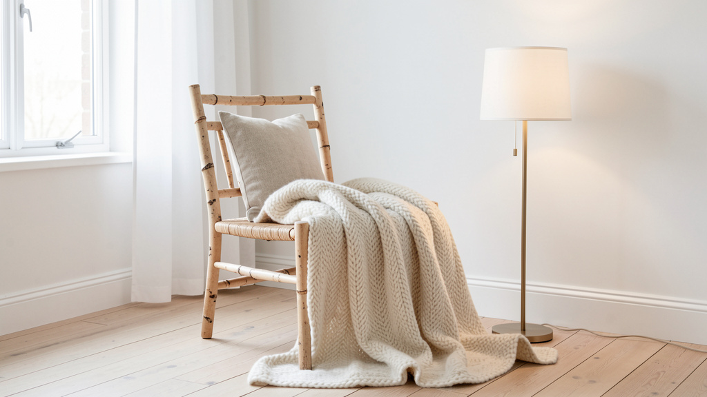
Pillar 4: Functional Warmth (Not “Minimalism”)
Western media often conflates Scandinavian design with stark minimalism. This is a critical misunderstanding. True Scandinavian spaces are edited, not empty. Every object should justify its presence through utility or emotional resonance—but never at the expense of comfort. Notice how a living room might feature:
– A streamlined sofa (function) draped with a chunky-knit alpaca throw (warmth)
– A single sculptural floor lamp (beauty) positioned precisely where evening reading occurs (purpose)
– Open shelving displaying well-loved cookbooks (utility) beside a child’s clay sculpture (meaning)
This balance stems from lagom—”just enough.” Not deprivation, not excess. When curating your space, ask: “Does this serve my body, my tasks, or my heart?” If not, it may create visual noise.
Pillar 5: Quiet Color Storytelling
While white dominates popular imagery, authentic Scandinavian palettes are nuanced symphonies. Historically, limited pigment availability led to earth-derived hues: mushroom beige from clay, forest green from moss, deep blue from indigo berries. Today’s palette honors this legacy:
– Base: Warm whites (not cool stark whites), oat, soft gray—acting as light amplifiers.
– Secondary: Muted naturals—sage, clay, charcoal, oatmeal—providing grounding.
– Accent: Thoughtful pops—ochre, terracotta, deep teal—used sparingly like punctuation.
Critical insight: Color temperature should harmonize with your climate. In sun-drenched regions, cooler whites (hint of gray) may prevent glare. In cloudy climates, warm whites (hint of yellow) can counteract cool light. This adaptation is rarely discussed but vital for authenticity.
The Fundamental Principle: Scandinavian design is not about removing until the space feels bare, but refining until every element serves human well-being—physically, emotionally, and spiritually.
The Core Elements Decoded: Light, Wood, and Simplicity in Practice
Having established the philosophical foundation, we now translate theory into tangible action. This section dissects the three most misunderstood elements—light, wood, and simplicity—with granular detail, implementation frameworks, climate adaptations, and budget pathways. Treat this as your operational manual.
Light: Harnessing Every Ray, Natural and Artificial
Light is the silent protagonist of Scandinavian interiors. Its management requires strategy, not just aesthetics. Let’s break it into actionable layers.
Understanding Your Light Reality
Before buying a single lamp, conduct a simple light observation:
1. Track sun paths: Note where direct sun hits floors/walls at morning, midday, and late afternoon.
2. Identify shadow zones: Corners that stay dark even at noon.
3. Assess quality: Is light harsh (south-facing in summer) or diffuse (north-facing)?
Example: A homeowner in a cloudy climate discovered her living room received limited direct sun. Instead of fighting it, she embraced layered artificial lighting and reflective surfaces to create cozy luminosity without mimicking brighter climates.
Daylight Maximization Framework
| Strategy | How-To | Climate Adaptation | Budget Path |
|---|---|---|---|
| Window Treatment | Install sheer linen curtains on ceiling-mounted rods (extends visual height). Avoid heavy drapes. | Hot climates: Consider UV-filtering film to protect surfaces while maintaining view. | Use unbleached cotton fabric hemmed simply. |
| Surface Reflectivity | Paint ceilings and upper walls in matte white (reflects light without glare). Use light wood floors with matte finish. | Dark winters: A subtle sheen on trim can help bounce available light. | Refresh existing trim with white paint; no replacement needed. |
| Strategic Mirrors | Place large mirror opposite main window. Angle slightly downward to capture floor light. | Small rooms: Use floor-length mirror to enhance perceived space. | Thrift store mirror framed in natural wood. |
| Furniture Scale | Choose low-profile seating (sofas under 32″ tall) to avoid blocking window light. | Open-plan homes: Transparent furniture (acrylic chairs) can maintain light flow. | Reupholster existing low sofa in light fabric. |
Artificial Light Layering System
Scandinavian lighting avoids the “interrogation room” effect of single overhead lights. Build these three layers:
1. Ambient Layer (Foundation):
– Purpose: Gentle overall illumination.
– Tools: Wall sconces (mounted at seated eye level), upward-shining floor lamps, dimmable ceiling fixtures with fabric shades.
– Pro Tip: Dimmers on every circuit allow light to adapt to time of day and activity. Start evenings at lower brightness; increase only as needed.
2. Task Layer (Precision):
– Purpose: Focused light for activities.
– Tools: Adjustable-arm desk lamps, under-cabinet kitchen lighting, reading lamps with directional shades.
– Critical Detail: Position task lights to avoid casting shadows on work surfaces. For kitchen counters, mount lights toward the front edge of cabinets.
3. Accent Layer (Soul):
– Purpose: Emotional warmth and focal points.
– Tools: Candle clusters (real or high-quality LED), small table lamps on shelves, soft string lights.
– Cultural Insight: Candlelight holds deep cultural significance across Scandinavia. Placing candles at seated eye level—not on high mantels—creates intimate pools of light that support connection.
Common Mistake Alert: Using cool-white bulbs (4000K+) “for brightness.” This often creates clinical, unwelcoming spaces. Warm-white bulbs (2700K–3000K) generally foster cozier atmospheres in living areas. Reserve slightly cooler temperatures for task lighting in kitchens or workshops where visual clarity matters.
Seasonal Light Rituals
Scandinavians actively adapt lighting with seasons—a practice tied to well-being:
– Autumn/Winter: Introduce candlelight earlier in the day. Add warm-toned string lights to bookshelves. Use lamps with amber-tinted glass shades.
– Spring/Summer: Maximize daylight hours. Store heavier lampshades; use bare bulbs with warm filaments for evening. Open curtains fully upon waking to support natural rhythms.
Why this works: These rituals acknowledge natural cycles. Many find that consistent warm-light exposure in evenings supports relaxation and restful transitions into night.
Wood: The Soul of Scandinavian Interiors
Wood is not merely a material in Scandinavian design—it’s a narrative thread connecting home to forest, past to present. Understanding its role transforms generic “light wood floors” into intentional storytelling.
Why Wood? The Cultural and Practical Rationale
Beyond aesthetics, wood serves meaningful purposes:
– Thermal Comfort: Wood often feels warmer underfoot than tile or concrete (even at identical temperatures), reducing perceived chill.
– Acoustic Softening: Wood absorbs sound vibrations better than hard surfaces, lowering ambient noise—a valuable trait in compact living spaces.
– Psychological Calm: Visible wood grain in interiors is associated with feelings of calm for many people. Organic patterns engage the senses gently.
– Sustainability Ethos: Scandinavian forestry follows strict certification standards—every harvested tree is typically replanted. Choosing certified wood supports this cycle.
Decoding Wood Tones: Beyond “Light Oak”
Not all pale woods are equal. Each species carries distinct character:
| Wood Type | Color Profile | Grain Pattern | Best For | Authenticity Check |
|---|---|---|---|---|
| Scandinavian Pine | Pale yellow-white, subtle knots | Straight, fine lines | Floors, wall paneling | Look for visible resin pockets (“pitch pockets”)—sign of authenticity |
| Ash | Cool gray-white | Dramatic, cathedral-like waves | Furniture frames, chairs | Heavy, durable; ideal for high-use pieces |
| Birch | Warm creamy white | Tight, subtle figuring | Cabinets, plywood surfaces | Often used in vintage Danish furniture |
| Oak (European) | Honey-gold (unstained) | Bold, pronounced grain | Tables, statement floors | Seek naturally light finishes over chemically altered ones |
| Teak (Vintage) | Silvery-gray patina | Straight, oily grain | Mid-century furniture | Authentic vintage teak weathers to soft gray; new teak is golden |
Critical Guidance: Avoid mixing more than two wood tones in one open space. If your floors are warm oak, choose furniture in matching oak or contrasting black-stained ash—not multiple competing tones. Cohesion creates calm.
Wood Application Framework: Floors, Furniture, Accents
Floors: The Foundation
– Ideal: Wide-plank pine or oak (5″+ width) with matte oil finish. Oil enhances grain while allowing natural aging. Avoid high-gloss finishes—they can feel artificial and show every mark.
– Budget Path: Engineered wood with substantial top layer (refinishable). Or, paint existing dark floors white using porch-and-floor paint (matte finish), then distress lightly for character.
– Climate Adaptation: In humid regions, engineered wood may be preferable to solid wood. In very dry climates, maintaining moderate humidity helps prevent cracking.
Furniture: Honoring Craft
Authentic Scandinavian furniture celebrates joinery and honest construction:
– Look for: Visible dovetail joints on drawers, tapered legs (reducing visual weight), bentwood elements.
– Avoid: Particleboard with thin veneers, hidden metal brackets that compromise repairability, overly ornate carvings.
– Budget Strategy: Seek vintage pieces at estate sales. Mid-century furniture is often sturdier than modern equivalents. Refinish with natural oil (not paint) to preserve character.
– DIY Option: Build simple shelving using unfinished pine boards and black iron pipes. Sand edges smooth; finish with beeswax for warmth.
Accents: Texture and Scale
Wood shouldn’t dominate—it should converse:
– Small-scale accents: Wooden bowls for keys, teak trays, birch bark vases.
– Textural contrast: Pair smooth wood with rough-hewn elements (a live-edge slab as a console).
– Proportion rule: In small rooms, choose slender wood legs on furniture to maintain airiness. In large rooms, substantial wood pieces anchor the space.
Caring for Wood: The Scandinavian Maintenance Ritual
Scandinavians maintain wood not as chore, but as mindful practice:
1. Daily: Dust with microfiber cloth (traps particles without scratching).
2. Monthly: Wipe with damp cloth + drop of mild soap. Never soak.
3. Seasonally: Re-oil high-traffic areas with natural wood oil. Test in inconspicuous spot first.
4. Repair philosophy: Embrace minor scratches. Some gently rub walnut meat into light scratches—the natural oil may help blend the mark. For dents, a damp cloth and warm iron (briefly) can sometimes lift the wood fiber.
Why this matters: This care ritual builds relationship with your home. A floor with gentle wear tells a story of lived-in warmth—far more valuable to many than sterile perfection.
Simplicity: The Art of Intentional Curation
“Simplicity” is the most misapplied term in design. Scandinavian simplicity is not emptiness—it’s clarity. It’s the courage to remove the non-essential so the essential can breathe. This section provides concrete frameworks to achieve simplicity without sterility.
The Editing Process: A Room-by-Room Method
Follow this sequence for any space:
1. Empty completely: Remove all furniture and decor. Clean thoroughly.
2. Reintroduce with purpose: Bring back only items that pass the “Triple Filter”:
– Function: Does it serve a necessary task? (e.g., sofa for seating)
– Emotion: Does it spark genuine joy or memory? (e.g., grandmother’s quilt)
– Beauty: Does it possess inherent aesthetic value? (e.g., a well-proportioned ceramic vase)
3. Pause at 70%: Stop when the room feels “almost full.” Leave breathing room. This prevents clutter creep.
4. Add texture, not objects: If the space feels sparse, introduce tactile layers (a chunky knit throw, a nubby jute rug) rather than more furniture.
Real-life application: A family applied this to their living room. They removed two accent chairs (redundant), kept the sofa (function), added a single vintage sheepskin (emotion/beauty), and layered a handwoven rug over the wood floor (texture). The room felt larger, calmer, and more inviting—without buying anything new.
Negative Space: The Silent Design Element
Negative space (empty areas) is as intentional as filled space. In Scandinavian design:
– Walls: Leave generous wall area bare. Group art in intentional clusters rather than scattering single pieces.
– Surfaces: Keep countertops, tables, and shelves mostly clear. Use trays to corral small items (remotes, coasters).
– Floors: Ensure clear pathways between furniture. Avoid blocking natural movement flow.
Psychological benefit: Negative space can reduce visual noise. Many find that rooms with ample breathing room support focus and calm.
Storage as Simplicity Engine
Clutter is the enemy of simplicity. Scandinavian homes master “invisible organization”:
– Closed storage first: Prioritize cabinets with doors over open shelving. Store daily items out of sight.
– Open storage rules: If using open shelves:
– Limit to a portion of total storage
– Style with restraint: Group items by color/texture; leave space between objects
– Rotate seasonally (display summer linens in spring; store winter blankets)
– Hidden solutions:
– Ottoman with interior storage
– Bed frames with built-in drawers
– Window seats with lift-up lids
– Fabric bins inside cabinets for sub-categorization
Budget hack: Repurpose vintage suitcases as under-bed storage. Line shelves with removable paper for subtle visual interest inside cabinets.
Simplicity Pitfalls to Avoid
- The “Showroom Trap”: A space that looks perfect but feels unlived-in. Counter with: One slightly rumpled linen cushion. A book left open on the armchair. A child’s drawing tucked under a magnet.
- Monotony: Simplicity ≠ sameness. Introduce subtle variation: Mix wood tones intentionally (light floor + medium table), layer white textiles with varying textures (smooth cotton + nubby wool).
- Ignoring personal history: A home should reflect its inhabitants. Display one meaningful collection (seashells, vintage cameras) with intention—not scattered randomly.
Room-by-Room Implementation: Weaving Principles into Daily Life
Theory becomes meaningful only when applied. This section translates Scandinavian philosophy into specific, actionable strategies for each living space. Consider your home’s unique constraints—square footage, light conditions, family needs—as you adapt these frameworks.
The Living Room: Heart of Hygge
This is where philosophy becomes practice. The goal: a space that invites lingering, conversation, and quiet moments.
Layout Strategy
– Arrange seating to encourage connection (not rigid rows).
– Ensure every seat has access to light (natural or task) and a surface for a drink.
– Leave clear pathways—minimum 24″ between furniture pieces.
Lighting Blueprint
– Ambient: Wall sconces flanking the main window; dimmable.
– Task: Adjustable floor lamp beside primary reading chair.
– Accent: Cluster of unscented beeswax candles on the coffee table; small table lamp on sideboard.
Pro Tip: Place lamps at varying heights (floor, table, shelf) to create dimensional light pools. Avoid matching lamp sets—they can feel staged.
Material Palette
– Floor: Light oak planks with matte finish. Layer with a flat-weave wool rug (neutral tone with subtle pattern).
– Seating: Low-profile sofa in performance linen (durable yet soft). Add one deep armchair in charcoal wool for contrast.
– Textiles:
– Throw: Chunky-knit alpaca in oatmeal (draped over sofa arm)
– Cushions: Mix of sizes in linen, bouclé, and subtle herringbone. Stick to 3 colors max: white, clay, soft gray.
– Critical detail: Remove cushion inserts monthly; fluff and rotate to maintain plumpness.
Authentic Touches
– Display well-loved books spine-out on a low shelf (not perfectly aligned).
– Place a single seasonal element: A bowl of pinecones in winter; a small vase of foraged branches in spring.
– Avoid: Generic mass-produced art. Instead, frame a child’s drawing in a simple wood frame, or display a vintage textile as wall art.
Adaptation for Small Spaces: Use a nesting coffee table (tucks under sofa when not in use). Choose a sofa bed for guest flexibility. Mount TV on wall to free floor space. Mirrors strategically placed to enhance perceived depth.
The Kitchen: Functional Poetry
Scandinavian kitchens prioritize workflow, warmth, and human scale—not just aesthetics.
Color and Material Strategy
– Cabinets: Painted in warm white with matte finish. Avoid high-gloss—it shows every fingerprint.
– Countertops: Honed (matte) quartz or soapstone. Honed surfaces hide scratches better than polished; soapstone develops a patina over time.
– Backsplash: Simple subway tile in matte white or handmade tile with subtle variation.
– Hardware: Black iron or unlacquered brass pulls (develops soft patina with use).
Lighting Precision
– Under-cabinet task lighting: LED tape lights with warm color temperature (2700K), dimmable. Install toward front edge of cabinets to illuminate countertops.
– Pendant lights: Hang 30″ above island/table. Choose simple shapes (paper lanterns, matte black cones). Use dimmers.
– Ambient: Recessed lights only if necessary; otherwise, rely on pendants and under-cabinet light to avoid “hospital ceiling” effect.
Storage Philosophy
– The “Daily Zone”: Store frequently used items within easy reach. Less-used items go higher or lower.
– Open shelving: Limit to one area. Style with restraint: Group mugs by color; display only beautiful everyday dishes. Store mismatched items behind closed doors.
– Drawer organization*: Use dividers for utensils. Line drawers with cork or felt for quiet closing.
Human-Centered Details
– Install a small shelf near the sink for soap and hand towel—no bending required.
– Choose a kitchen table with rounded corners (safer for children, softer visually).
– Keep a small vase of fresh herbs on the counter—functional and fragrant.
– Budget adaptation: Paint existing dark cabinets white. Replace hardware. Add open shelving using reclaimed wood brackets.
Climate Note: In humid kitchens, choose moisture-resistant materials: thermofoil cabinet fronts, sealed concrete floors. Avoid solid wood near sinks.
The Bedroom: Sanctuary of Rest
This room must prioritize sleep hygiene and sensory calm above all.
Color Psychology
– Walls: Warm white or very pale clay. Avoid pure white—it can feel clinical.
– Ceiling: Paint same color as walls to create cocooning effect.
– Note: Cool colors (soft blues, greens) may support relaxation for some. In low-light climates, warm neutrals can prevent melancholy. Choose based on your climate and personal response.
Lighting for Rest
– No overhead lights: Eliminate harsh ceiling fixtures if possible.
– Bedside: Wall-mounted swing-arm sconces (free bedside tables; provide focused reading light).
– Ambient: Small table lamp with fabric shade on dresser (dimmed low before sleep).
– Blackout solution: Layer sheer curtains (for daytime privacy) with blackout roller shades behind them (for sleep). Mount shades inside window frame to minimize light gaps.
– Critical habit: Consider smart bulbs that shift from cooler (morning) to warmer (evening) tones. Or use amber-tinted bulbs after sunset to support natural wind-down.
Textile Layering for Comfort
– Mattress: Prioritize comfort—wool toppers can aid temperature regulation.
– Bedding:
– Fitted sheet: Organic cotton percale (cool, crisp)
– Top sheet: Linen (breathable, softens with washes)
– Duvet cover: Heavyweight cotton or washed linen in oat or stone
– Throw: Lightweight wool blanket at foot of bed
– Pillow strategy: Mix firm and soft pillows. Use protectors to extend life.
– Floor: Wool rug extending beyond bed on all sides (warm underfoot upon waking).
Decluttering for Mental Calm
– Store all clothing in closets/drawers. No visible piles.
– Limit bedside items to: lamp, book, water glass.
– Use under-bed storage boxes on casters for off-season clothing.
– Digital detox: No TVs. Charge phones in another room. If needed, use a simple analog alarm clock.
Small Bedroom Hack: Choose a bed frame with built-in drawers. Use wall-mounted shelves instead of nightstands. Paint door and trim same color as walls to visually recede.
The Bathroom: Spa-Like Serenity
Transform this utilitarian space into a daily ritual of calm.
Material Choices
– Walls: Large-format tiles (minimizes grout lines) in matte white or soft gray. Or, paint walls with moisture-resistant matte paint.
– Floor: Small hexagonal tiles in matte finish (less slippery). Add a teak bath mat that dries quickly.
– Vanity: Floating wood vanity (creates visual lightness; easy to clean under).
– Hardware: Brushed nickel or matte black (hides water spots better than chrome).
Lighting for Function and Mood
– Vanity lighting: Vertical sconces flanking mirror (eliminates shadows on face). Avoid overhead lights shining directly into mirror.
– Shower: Recessed waterproof LED with dimmer. Add a small niche shelf for a single candle (LED for safety).
– Ambient: Small wall sconce near toilet area for nighttime use (dimmed low).
Storage Solutions
– Open shelving: One small shelf for daily essentials (soap, towel). Keep items minimal and beautiful.
– Closed storage: Recessed medicine cabinet with mirrored door. Use matching glass jars for cotton balls, Q-tips.
– Towel strategy: Install heated towel rail (luxurious in cold climates). Fold towels neatly; display only what’s used daily. Store extras in nearby linen closet.
Sensory Details
– Keep a small tray with hand soap, lotion, and a single eucalyptus sprig (refreshing scent).
– Use a bamboo bath caddy for books during baths.
– Place a small potted snake plant on vanity—it thrives in humidity.
– Budget path: Paint existing vanity cabinet. Replace hardware. Add peel-and-stick tile backsplash. Use baskets for under-sink organization.
The Home Office: Focused Clarity
Design for sustained concentration without visual fatigue.
Ergonomic Foundation
– Desk: Solid wood surface (reduces glare vs. glass). Height: elbows at 90 degrees when typing.
– Chair: Prioritize lumbar support. Chairs with gentle curves often support posture.
– Monitor: Top of screen at eye level. Use a document holder beside screen to avoid neck strain.
Lighting for Eye Comfort
– Primary: Adjustable task lamp with warm LED (positioned to avoid shadow on work surface).
– Ambient: Indirect light—bounce a floor lamp off a white wall.
– Critical: Position desk perpendicular to window (not facing it) to avoid screen glare. Use sheer curtains to diffuse harsh sun.
Visual Calm Strategies
– Wall color: Very pale warm gray (may reduce eye strain vs. white).
– Desk surface: Keep clear except for current task. Use drawer organizers for supplies.
– Cable management: Route cords through desk grommets; use adhesive clips to secure.
– Inspiration board: One small cork board for essential notes—not a chaotic collage.
Biophilic Integration
– Place a small ZZ plant or pothos on desk (low light tolerant).
– Use a wooden desk organizer.
– Frame a single nature photograph (forest, lake) at eye level for micro-breaks.
– Pro Tip: Set a timer to look out the window for 20 seconds every 20 minutes—may reduce digital eye strain.
Small Space Solution: Wall-mounted fold-down desk. Use a rolling cart for supplies that tucks away. Choose a chair that stacks neatly when not in use.
Adapting Scandinavian Design to Your Reality: Climate, Budget, and Space
Authenticity lies not in rigid replication, but in thoughtful adaptation. This section addresses real-world constraints with empathy and expertise—transforming perceived limitations into design strengths.
For Non-Scandinavian Climates: Intelligent Light Adaptation
Scandinavian design originated under specific light conditions. Blindly copying it elsewhere can create discomfort. Adapt intelligently:
Sun-Drenched Climates (Southern US, Mediterranean, Australia)
– Challenge: Harsh direct sun causes glare, heat buildup, and faded fabrics.
– Solutions:
– Window films: Apply UV-filtering, light-diffusing film (preserves view).
– Exterior shading: Install adjustable exterior awnings or bamboo shades (blocks heat before it enters).
– Color adjustments: Use cooler whites (hint of gray) on walls to counteract warm sunlight. Choose linen or cotton textiles (breathable) over heavy wools.
– Material swaps: Opt for light travertine or honed concrete floors instead of wood (stays cooler underfoot).
– Real example: A homeowner used sheer white roller shades behind bamboo exterior shades. By day, bamboo blocks heat; roller shades diffuse remaining light softly. Interior palette: warm white walls, light oak floors, abundant plants.
Perpetually Cloudy Climates (Pacific Northwest, UK, Ireland)
– Challenge: Persistent gray light feels flat and draining.
– Solutions:
– Amplify every ray: Paint ceilings bright white (reflects available light downward). Use mirrors opposite windows.
– Warm artificial layers: Install dimmable warm-white LEDs (2700K) on every circuit. Add candlelight earlier in the day.
– Color strategy: Lean into warm neutrals—oatmeal, clay, soft terracotta—to counteract cool ambient light. Avoid cool grays.
– Textural richness: Layer deep-pile rugs, bouclé throws, nubby wool cushions. Texture creates visual interest where light lacks dimension.
– Pro insight: Horizontal surfaces below windows can bounce light deeper into rooms. Replicate with a low console table under a window.
Humid/Tropical Climates (Southeast Asia, Florida)
– Challenge: Moisture affects wood; mold risks increase.
– Solutions:
– Material substitutions: Choose teak (naturally rot-resistant) or high-quality engineered wood for furniture. Avoid solid pine in damp areas.
– Ventilation focus: Prioritize cross-breeze flow in layout. Use ceiling fans with wood blades.
– Textile choices: Opt for quick-dry materials—bamboo linen, outdoor-grade performance fabric for upholstery.
– Storage: Use cedar-lined closets; silica gel packs in drawers. Elevate furniture slightly off floors to improve air circulation.
– Cultural bridge: Integrate local craftsmanship—handwoven rattan baskets, banana fiber textiles—to honor both Scandinavian principles and regional heritage.
For Small Spaces: Making Less Feel Like More
Scandinavian design excels in compact footprints. Apply these space-expanding techniques:
Visual Expansion Tactics
– Monochromatic base: Paint walls, trim, and ceiling the same warm white. This eliminates visual “stops,” making walls recede.
– Strategic mirrors: Place a large mirror opposite the main window. Angle slightly downward to capture floor light.
– Furniture scale: Choose pieces with slender legs (creates sightlines underneath). Avoid bulky armrests.
– Vertical storage: Install shelves up to 12″ below ceiling. Use matching bins for visual calm.
Multi-Functional Furniture Framework
| Piece | Dual Purpose | Space Saved | Scandinavian Example |
|——-|————–|————-|———————-|
| Sofa Bed | Seating + Guest Bed | Eliminates need for spare room | Modular systems with storage |
| Nesting Tables | Coffee Table + Side Tables | Tucks away when not needed | Stackable designs |
| Wall-Mounted Desk | Workspace + Folds Flat | Frees floor space completely | DIY with reclaimed wood + iron brackets |
| Ottoman with Lid | Footrest + Storage + Extra Seat | Replaces storage chest + stool | Simple upholstered styles |
| Loft Bed | Sleeping + Desk/Storage Below | Creates distinct zones in studio | Systems with integrated storage |
Zoning Without Walls
– Rugs as anchors: Define living area with a rug; dining area with another.
– Furniture placement: Position sofa back toward dining zone (no need for divider).
– Lighting separation: Use a floor lamp to mark reading nook; pendant over dining table.
– Color continuity: Keep wall color consistent throughout; vary textiles to distinguish zones.
Real Transformation: A small studio used these principles:
– Painted entire space warm white
– Installed floor-to-ceiling white shelves (storage + visual height)
– Chose a low sofa with visible legs
– Used a round dining table (feels less imposing)
– Added a large mirror opposite the window
Result: Felt spacious, functional, and intentionally curated—not cramped.
Budget-Conscious Implementation: Authenticity Without Expense
Scandinavian design champions resourcefulness. You need not buy new to embody its spirit.
Phase 1: Edit and Rearrange (Cost: $0)
– Conduct the Triple Filter audit (Function/Emotion/Beauty). Remove items that no longer serve you.
– Rearrange furniture to improve flow and light access.
– Deep clean windows, floors, surfaces—freshness costs nothing.
Phase 2: Refresh Existing Items (Cost: <$100)
– Paint: Transform dark furniture with matte white or soft gray paint. Sand lightly first; use primer.
– Hardware swap: Replace dated cabinet pulls with simple black iron or brass knobs.
– Textile update: Sew new cushion covers from affordable linen-look cotton. Dye faded throws in oatmeal or clay.
– Lighting: Replace cool-white bulbs with warm 2700K LEDs. Add plug-in wall sconces (no wiring needed).
Phase 3: Strategic New Purchases (Cost: <$300)
– Priority 1: A single high-impact textile—a wool rug or chunky knit throw. Buy secondhand; clean thoroughly.
– Priority 2: One well-made wood item (vintage stool, simple shelf). Check local markets, estate sales.
– Priority 3: Plants. Snake plants or ZZ plants thrive on neglect; add life instantly.
DIY Projects with Authentic Spirit
– Wooden Crate Shelves: Sand and oil discarded fruit crates; mount horizontally as open shelving.
– Linen Curtains: Hem unbleached linen fabric; hang on simple iron rod.
– Clay Vases: Hand-build small vases with air-dry clay; finish in matte white.
– Paper Cord Seat Repair: Re-weave a vintage chair seat with paper cord (tutorials available online).
Wisdom from Practice: Many cherish pieces made by loved ones—a slightly warped pine shelf, oiled yearly, holding a morning coffee mug. Perfection is not the goal—meaning is.
Avoiding Common Pitfalls: When Good Intentions Go Astray
Even well-meaning efforts can miss the mark. Recognize these traps:
Pitfall 1: Sterile Minimalism
– Symptom: Empty rooms that feel cold, unwelcoming, or like a showroom.
– Root Cause: Confusing “simplicity” with “emptiness.” Removing without adding warmth.
– Antidote: Introduce one “imperfect” human element per room—a slightly rumpled throw, a book left open, a child’s artwork framed simply.
Pitfall 2: Cultural Appropriation vs. Appreciation
– Symptom: Using sacred Indigenous patterns as disposable decor.
– Root Cause: Extracting aesthetics without understanding context.
– Antidote: Research origins. Support authentic makers directly when possible. Focus on universal principles (light, wood, simplicity) rather than specific cultural symbols you don’t have connection to.
Pitfall 3: Ignoring Personal History
– Symptom: A home that looks like a catalog but feels disconnected from its inhabitants.
– Root Cause: Prioritizing trends over personal narrative.
– Antidote: Display one meaningful collection intentionally. Frame travel postcards. Keep the worn armchair that holds family memories—reupholster it in linen.
Pitfall 4: Over-Lighting
– Symptom: Rooms that feel harsh despite “warm” bulbs.
– Root Cause: Too many light sources at full brightness; no dimming capability.
– Antidote: Install dimmers where possible. Start with lights at lower brightness. Add layers only where needed. Embrace softer light as restorative.
Scandinavian Design vs. Other Styles: Clarifying the Confusion
Mislabeling dilutes understanding. Let’s distinguish Scandinavian design from frequently confused styles—with concrete examples.
Scandinavian vs. Minimalism
- Minimalism: “Less is more.” Focus on reduction, negative space, industrial materials (concrete, steel). Emotional neutrality is intentional. Example: A room with white walls, single black chair, bare floor.
- Scandinavian: “Less, but warmer.” Reduction serves human comfort. Natural materials, texture, and subtle color create intimacy. Example: Same room, but with light wood floor, wool rug, linen cushion on chair, small plant.
- Key Difference: Minimalism removes to achieve purity; Scandinavian design edits to enhance well-being. One feels like a gallery; the other feels like a home.
Scandinavian vs. Japandi (Japanese + Scandinavian Fusion)
- Japandi: Blends Scandinavian lightness with Japanese wabi-sabi (beauty in imperfection). Deeper colors (charcoal, indigo), more asymmetry, emphasis on artisanal craftsmanship. Example: Light oak floor + black-stained wood table + hand-thrown ceramic vase with visible texture.
- Scandinavian: Lighter overall palette, more emphasis on accessible warmth, smoother finishes. Example: Same floor + natural oak table + simple ceramic vase.
- When to choose: Prefer Japandi if drawn to deeper contrast and artisanal uniqueness. Choose Scandinavian for airier, more accessible warmth.
Scandinavian vs. Coastal/Hamptons
- Coastal: Nautical references (ropes, anchors), crisp whites, blues, sandy beiges. Materials: whitewashed wood, rattan, seagrass. Example: White slipcovered sofa, blue throw pillows, rope mirror.
- Scandinavian: No thematic references. Palette grounded in nature (not ocean). Materials: untreated wood, wool, linen. Example: Light oak sofa frame with oat linen slipcover, clay-toned cushion, birch wood mirror.
- Critical distinction: Coastal design tells a “beach story”; Scandinavian design tells a “human story.” One is decorative; the other is philosophical.
Scandinavian vs. Modern Farmhouse
- Modern Farmhouse: Rustic accents (shiplap walls, barn doors), black fixtures, apron-front sinks. Mixes industrial and rustic. Example: White shiplap wall, black metal light fixture, reclaimed wood table.
- Scandinavian: No rustic “distressing.” Clean lines, light wood, integrated storage. Example: Smooth white wall, simple paper pendant light, light oak table with tapered legs.
- Why it matters: Farmhouse embraces “crafted imperfection”; Scandinavian values “honest simplicity.” One feels nostalgic; the other feels timeless.
Your Questions, Answered
Q: Is Scandinavian design only for white walls and light wood?
A: Absolutely not. While light palettes dominate imagery (for practical light-amplifying reasons), authentic Scandinavian homes use nuanced color. In Denmark, you’ll find deep forest green libraries; in Finland, saunas with rich cedar walls. The principle is intentionality—color serves purpose. In a north-facing room, warm clay walls combat gloom. In a sun-drenched room, cool gray prevents glare. Start with light neutrals if uncertain, but feel empowered to introduce color where it supports your well-being.
Q: How do I add Scandinavian warmth without making my home feel cold or sterile?
A: Warmth lives in texture and human traces. First, audit surfaces: Replace smooth/slick materials (glass, high-gloss laminate) with tactile ones (linen, wool, unfinished wood). Second, layer textiles: A chunky knit throw, a nubby jute rug, bouclé cushions. Third, introduce “lived-in” cues: A book left open on the armchair, a single stem in a simple vase, slightly rumpled bedding. Finally, prioritize warm artificial light (2700K bulbs, dimmers, candles). Sterility comes from perfection; warmth comes from gentle imperfection.
Q: Can Scandinavian design work in a dark apartment with no natural light?
A: Yes—this is where its principles shine brightest. Focus on artificial light layering: Install dimmable warm-white LEDs on every circuit. Add wall sconces at seated eye level. Place mirrors opposite any light source (even a hallway light). Choose warm white walls (not cool white) to reflect available light softly. Embrace deeper base colors if needed—soft clay or warm gray can feel cozier than stark white in low light. Most importantly: Introduce candlelight early in the evening. In Nordic cultures, this isn’t decoration; it’s psychological necessity. Your space can feel like a sanctuary, not a cave.
Q: Is IKEA “real” Scandinavian design?
A: IKEA embodies the democratic design pillar—making functional, aesthetically considered items accessible. Many pieces draw inspiration from Nordic heritage. However, authenticity depends on how you use it. A room filled with unassembled boxes feels temporary. But an sofa reupholstered in durable linen, paired with a vintage teak coffee table and hand-thrown ceramics? That’s thoughtful curation. IKEA is a tool; your intention makes it authentic.
Q: How do I incorporate family heirlooms or colorful art into a Scandinavian space?
A: Scandinavian design isn’t about erasing your story—it’s about framing it intentionally. For heirlooms: If a dark wood cabinet holds meaning, place it against a light wall and style minimally (one vase on top). For colorful art: Choose one statement piece as a focal point. Keep surrounding elements neutral to let it shine. Group smaller colorful items together (a shelf of vintage pottery) rather than scattering them. The goal isn’t monochrome—it’s visual harmony where personal treasures feel celebrated, not chaotic.
Q: What’s the difference between hygge (Danish) and koselig (Norwegian)?
A: Both translate roughly to “coziness,” but with cultural nuance. Hygge (Denmark) emphasizes togetherness—candlelit dinners with friends, shared blankets. Koselig (Norway) leans into serene solitude—a quiet moment with tea by the window, the comfort of a familiar sweater. In design: Hygge might mean a deep sofa for gathering; koselig might mean a single armchair nook with a reading lamp. Honor whichever resonates with your lifestyle. Both reject coldness in favor of human-scale warmth.
Q: Are plants essential to Scandinavian design?
A: Not essential, but deeply aligned. Plants fulfill multiple pillars: connection to nature, adding life to simplicity, and improving air quality. However, authenticity matters more than checklist compliance. If you travel frequently or lack a green thumb, choose resilient varieties (snake plant, ZZ plant) or high-quality faux plants that mimic texture. Better to have one thriving real plant than five struggling ones. The principle is intentional life, not botanical perfection.
Q: How do I maintain simplicity with children or pets?
A: Scandinavian homes with families prioritize “hidden organization” and durable materials. Use closed storage for toys (bins inside cabinets). Choose performance fabrics that resist stains but feel soft. Embrace washable rugs (flat-weave wool). Designate a “landing zone” near the door for shoes/backpacks. Most importantly: Edit ruthlessly. Keep only toys/books in current rotation; store the rest. A calm space reduces family stress. Remember—simplicity serves your life; it shouldn’t create more work.
Q: Can Scandinavian design feel too “light” or “airy” for my taste?
A: Absolutely—and that’s okay. Adapt the framework. Choose deeper wood tones (walnut instead of pine). Use warm gray or clay walls instead of white. Layer in charcoal textiles. Incorporate black accents (light fixtures, furniture legs) for grounding. The core principles—function, natural materials, human-centered light—remain intact. Your home should reflect your comfort. As designers in the region often note: “Scandinavian design is a language, not a uniform. Speak it in your own voice.”
Q: Where should I splurge vs. save?
A: Splurge on foundational, high-use items that impact daily comfort and longevity:
– Splurge: Sofa frame (solid wood), mattress, primary lighting (dimmer switches, quality fixtures), wood floors.
– Save: Decorative accents (vases, trays), textiles (throws, cushions—rotate seasonally), wall art (prints, DIY frames), open shelving (DIY with reclaimed wood).
This aligns with democratic design: Invest where it matters most; enjoy flexibility elsewhere.
Conclusion and Next Step
Scandinavian design endures not because it is trendy, but because it answers timeless human needs: the need for light in darkness, warmth in cold, calm in chaos, and beauty within reach. It is not a style to copy, but a lens through which to see your home—and your life—with greater intention. You now hold a framework far deeper than “light wood and white walls”: a philosophy of democratic beauty, a science of light management, a psychology of simplicity, and adaptable strategies for your unique reality.
The Three Anchors to Carry Forward
- Light is non-negotiable: Treat it as architecture. Layer it. Warm it. Let it guide your choices.
- Wood tells stories: Choose honestly. Care for it mindfully. Let its grain remind you of nature’s presence.
- Simplicity serves people: Edit without emptiness. Curate with meaning. Leave room for life to unfold.
The 24-Hour Rule: One Tiny Action
Within the next day, complete this single, specific act:
Replace one cool-white light bulb (4000K+) in your most-used living space with a warm-white bulb (2700K–3000K). Install it in a lamp you use every evening. Turn it on tonight. Notice the shift in mood.
This micro-action embodies the entire philosophy: a small, intentional change that directly enhances human well-being. No renovation required. No expense beyond a modest bulb. Yet it transforms atmosphere. This is Scandinavian design in its purest form—accessible, immediate, profoundly human.
The Bigger Picture: Design as Daily Practice
Your home is not a project to finish. It is a living practice—a series of small choices that accumulate into a life well-lived. Some days, simplicity means clearing a countertop. Other days, it means leaving the child’s drawing on the fridge. Some winters, light means lighting every candle. Some summers, it means opening every window. Honor your rhythms. Adapt the principles. Release perfection.
As you move forward, carry this Nordic sentiment close to your heart:
“The best time to plant a tree was 20 years ago. The second best time is now.”
Your journey toward a calmer, more intentional home begins not with a grand overhaul, but with one warm bulb, one edited shelf, one deep breath in a space that finally feels like yours.
Explore Our Complete System:
The Art of Hygge: Creating Cozy Moments in Everyday Life | Sustainable Wood Choices: A Guide to Ethical Home Materials | Light Layering Masterclass: From Harsh to Harmonious | The 30-Day Declutter: A Room-by-Room Simplicity Plan | Global Design Wisdom: Japanese Wabi-Sabi, Mexican Talavera, and More | Budget-Friendly Textiles: Linen, Wool, and Cotton Guide | Seasonal Home Rituals: Aligning Your Space with Nature’s Rhythms