Transform Your Space with Confidence: A Step-by-Step Framework for Choosing, Hanging, and Living with Art That Resonates
Creating a home filled with art that speaks to you requires neither a curator’s degree nor an unlimited budget. True artistry in arrangement emerges from cultivating a personal visual language that evolves with your life. This guide offers a thoughtful, adaptable framework for selecting art that reflects your authentic perspective and arranging it with intention—from dynamic gallery walls to meaningful solo statements. Discover how to navigate common challenges, honor your space’s unique character, and build a collection that feels uniquely yours while enhancing each room’s atmosphere and function.
Introduction
Step into a space where art feels deeply integrated—not merely decorative—and you may notice an immediate shift. The room breathes. There’s a quiet sense of coherence, as if the environment gently affirms, you belong here. This feeling arises from intentional curation: a thoughtful relationship between object, architecture, and inhabitant. Yet for many, the path to that resonance feels uncertain. Is this piece too large? Will these colors harmonize with my existing palette? How do I begin a gallery wall without creating visual chaos? These questions reflect a universal desire to shape environments that nurture us. Drawing from established principles of spatial design, environmental psychology, and widely observed patterns in how people interact with art in domestic settings, this guide transforms uncertainty into actionable clarity. Art arrangement is less about rigid rules and more about cultivating awareness—of your space’s proportions, your emotional responses, and the subtle narratives your choices convey. Whether you’re placing your first framed print or refining a long-held collection, this framework meets you where you are, supporting the creation of spaces that feel authentically, peacefully yours.
The Resonance Framework: Four Steps to Art That Feels Like Home
True visual harmony emerges when selection and arrangement align across three interconnected layers: your inner landscape (emotions, memories, values), your physical environment (light, scale, architecture), and your lived experience (how you move through and use the space). The Resonance Framework distills this into four fluid, iterative steps. This is not a rigid checklist but a cyclical practice—a way of seeing that deepens with each piece you welcome. By moving through Reflect, Select, Arrange, and Evolve, you cultivate not just a wall of art, but a visual ecosystem that supports well-being and tells your evolving story.
Step 1: Reflect – Uncover Your Authentic Artistic Voice
Before measuring walls or browsing images, pause. Skipping this foundational step is the most frequent source of disconnected collections. Reflection transforms art from decoration into dialogue.
Why this step is crucial: Environments reflecting personal identity often foster greater comfort and a sense of belonging. Art aligned with your inner landscape can serve as a subtle anchor throughout daily life. Conversely, pieces chosen solely to match trends or others’ expectations may create subtle visual friction over time.
How to do it correctly: The 20-Minute Memory Mapping Exercise
1. Gather quietly: Sit in the intended room. Minimize distractions. Have paper and pen ready.
2. Recall sensory anchors: Close your eyes. What memory brings calm? (e.g., “Walking through a sun-dappled forest,” “Morning light on a kitchen table,” “Rain on a city window.”) Note 3–5 vivid memories with sensory details: colors, textures, sounds, emotions.
3. Identify emotional keywords: For each memory, extract 1–2 precise emotional keywords: serene, nourished, curious, grounded, playful—avoiding vague terms like “happy.”
4. Translate to visual cues: How might these manifest visually? “Forest walk” → deep greens, vertical lines, organic textures. “Kitchen light” → warm ochres, soft gradients, tactile surfaces.
5. Define your non-negotiables: What must this art do? “Invite calm upon entering,” “Spark joy during morning routines,” “Honor a meaningful journey.” Write these down.
This exercise shifts focus from external trends to internal resonance. For instance, someone discovering a connection to “textured quiet” might choose a hand-loomed textile fragment in a simple raw wood frame for a reading nook—a piece that offers tactile warmth and personal meaning. That is resonance.
Common mistakes to avoid:
– Rushing to fill space: Blank walls are invitations, not emergencies. Allow time for reflection.
– Confusing external preferences with your own: Does the piece spark genuine connection for you? Trust your initial emotional response.
– Over-prioritizing exact color matching: Instead of matching throw pillows precisely, use your Memory Map’s emotional keywords and textural cues. A “serene” memory might resonate with soft sage green sharing similar luminosity and organic texture, even if not an exact color match.
Nuance: Reflection is not about locking into one aesthetic forever. Life evolves—new chapters, locations, passions—and your visual language can gracefully expand. Today’s earth-toned “grounded” palette may beautifully welcome tomorrow’s “curious” accent from a new experience. Authenticity, not uniformity, is the goal.
Step 2: Select – Curate with Intention and Joy
With reflection insights in hand, selection becomes purposeful exploration. This step bridges inner intention with practical realities: budget, space constraints, sourcing ethics, and long-term care. Selection is where awareness meets action.
Why this step is crucial: Thoughtful selection prevents “art fatigue”—that quiet dissatisfaction when pieces feel disconnected in your actual space. It builds a collection with layered meaning, where each item carries intention, making your environment feel curated over time, not assembled overnight.
How to do it correctly: The Triad Selection Method
Instead of seeking one “perfect” piece, consider three complementary roles for any significant wall or zone:
1. The Anchor: Carries dominant emotional weight or visual presence (e.g., a landscape evoking “serene,” a portrait conveying “strength”).
2. The Connector: Links the Anchor to your space or other art through subtle shared elements—a color note, complementary texture, or thematic echo (e.g., a pressed fern photograph beside a forest landscape).
3. The Spark: A smaller, personal element introducing gentle contrast or narrative (e.g., a vintage postcard from a meaningful trip, a child’s drawing in a simple frame, a minimalist line sketch offering visual pause).
Example for a hallway needing “calm transition”:
– Anchor: Soft-focus photograph of mist over water (serene, expansive)
– Connector: Small framed botanical specimen (echoes organic forms)
– Spark: Tiny brass compass (symbolizing journey, warm metallic accent)
Sourcing with Awareness and Joy:
– Local Artists & Studios: Visit open studios, craft fairs, or community galleries. Purchasing directly supports creators and yields unique pieces with inherent story. Many artists welcome conversations about their process.
– Thrift Stores, Estate Sales, Flea Markets: Approach with curiosity. Look beyond frames—a faded botanical print’s patina may hold charm; a vintage map carries history. Clean gently; consider professional conservation for fragile finds. The search itself can be part of the joy.
– Online Platforms (Used Thoughtfully): Filter using your Reflection keywords (“textured,” “organic,” “minimalist”) rather than only colors. Zoom to assess texture. Read artist descriptions. For color-critical pieces, request physical samples if available.
– Your Own Creations: A framed child’s drawing, a meaningful photograph you captured, a textile you crafted—these hold profound emotional weight. They are authentic art.
– Reproductions Done Thoughtfully: There is dignity in loving a historical work. Choose archival-quality prints (giclée on acid-free paper) from reputable sources. Thoughtful framing elevates even reproductions. Avoid mass-produced posters with plastic finishes.
Budget-Conscious Pathways:
– Method A (Intentional Investment): Allocate a small monthly “art fund.” Save for one meaningful piece per season. Quality builds lasting connection.
– Method B (Gradual Curation): Invest first in simple, well-made frames (unfinished wood you can stain, uniform black or white). Fill gradually with thrifted art, personal photos, or meaningful ephemera (concert tickets, pressed flowers). Uniform frames create cohesion across diverse contents.
– Method C (Immediate Cohesion): Create a “salon wall” using existing items: book covers, vintage sheet music, fabric swatches, postcards. Grouped with consistent spacing and unified framing, ordinary objects become extraordinary art.
Common mistakes to avoid:
– Selecting in isolation: Before purchasing significant art, photograph your empty wall. Use a free app (Canva, PowerPoint) to mock up scale and relationship. Or cut paper templates to arrange on the floor.
– Ignoring scale relative to furniture: General guidance: Art width should span ⅔ to ¾ the width of furniture below. For a 72-inch sofa, seek art (or grouped arrangement) between 48–54 inches wide. Adjust for room proportions—larger spaces often benefit from slightly larger art to avoid a “floating” effect.
– Overlooking the frame’s role: The frame is part of the artwork’s presence. A heavy ornate frame alters the feel of modern art. Consider frame color, material, and profile during selection. Sometimes, reframing a thrifted find is the most impactful upgrade.
Nuance: Harmony arises from relationship, not replication. A warm wood frame may harmonize with cool-toned art if its undertone echoes a subtle element within the piece. Step back. Does the combination feel settled? Does it feel like you? Trust that quiet sense of alignment over rigid color matching.
Step 3: Arrange – Design with Balance and Flow
Arrangement is where spatial awareness meets visual rhythm. It’s the deliberate placement of selected pieces to guide the eye, honor architecture, and support how you live. This step moves beyond “centered over the sofa” into nuanced composition. Fear not—this is about cultivating sensitivity to balance, negative space, and sightlines, not complex mathematics.
Why this step is crucial: Poor arrangement can undermine even beautiful art. Hanging too high creates disconnection; overcrowding induces visual tension. Intentional arrangement ensures art enhances a room’s purpose—calming an entryway, defining a dining zone, or drawing the eye toward a pleasant view. It transforms individual objects into a cohesive visual experience.
How to do it correctly: The Layered Layout Process
1. Define the Focal Point: What is the room’s primary purpose? In a living area, it may be the conversation zone; in a bedroom, the bed. Position main art to support, not compete with, this focal point. Avoid placing major art directly opposite a window with a compelling view—it creates visual competition.
2. Honor Eye-Level Principles (A Guideline, Not a Rule): The center of your primary art piece (or grouped arrangement) typically aligns comfortably between 57–60 inches (145–152 cm) from the floor—approximating average eye level. Critical nuance: Adapt contextually:
– Above furniture: Measure 6–8 inches (15–20 cm) from the furniture top to the bottom of the frame. Then verify the center of the art lands near the 57–60″ range. Adjust for tall bookshelves (slightly higher) or low consoles (slightly lower). Always sit in primary seating to check sightlines.
– Hallways/Staircases: Follow the stair slope. Begin lower at the bottom step, rising gradually. The center point should feel accessible as you ascend.
– Children’s Spaces: Lower the center point to 42–48 inches (107–122 cm) for engagement and ownership.
3. Embrace Negative Space (The Power of Pause): Empty wall space is essential visual breathing room. It allows art to be seen and appreciated. Step back frequently during arrangement. Does the space feel calm or cluttered? Negative space around a single powerful piece amplifies its impact. Consistent spacing between grouped pieces creates rhythm.
4. Create Flow Between Pieces: Art should feel connected, not isolated. Use your “Connector” piece to bridge gaps. Repeat a color, shape, or texture subtly across the room. If art appears on opposing walls, ensure they “converse” through scale, complementary tones, or thematic links. Avoid placing two very large, visually heavy pieces directly opposite each other if it feels confrontational in your space.
The Fundamental Principle: Art arrangement is not about rigid rules but about creating visual harmony that guides the eye and supports your experience of the space. Balance is felt, not measured. Trust the quiet satisfaction of a composition that feels settled.
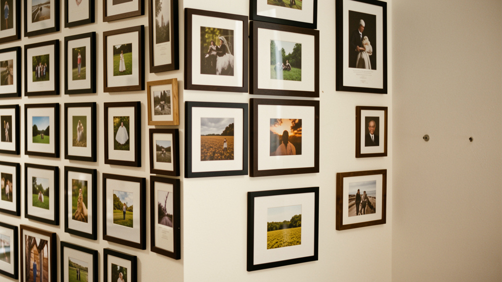
Gallery Wall Mastery: Beyond the Grid
Gallery walls thrive on planning and intentional variety.
– The Template Method (Highly Recommended):
1. Arrange all frames on the floor against the actual wall (or on large craft paper taped to the wall).
2. Experiment with layouts. Maintain consistent spacing between frames—2–3 inches (5–7.5 cm) fosters cohesion. Use cardboard spacers.
3. Trace the entire arrangement onto the paper. Cut out the shapes. Tape the template to the wall. This is your map. Mark nail holes through the paper. Remove paper. Hammer nails precisely. Hang art. Flawless alignment, zero wall damage.
– Layout Styles Decoded:
– Symmetrical Grid: Ideal for identical frames and similar-sized art (family photos, botanical series). Creates order and calm. Best for hallways, above beds, offices. Tip: Inject subtle life with one slightly varied piece or frame tone to avoid stiffness.
– Organic/Salon Style: Mix frame styles, sizes, and orientations freely. Creates energy and personality. Ideal for living or dining areas. Key to success: Unify through one consistent element—all frames black, all mats white, or all pieces sharing a dominant color family (e.g., earth tones). Without unity, it risks feeling chaotic.
– Linear/Horizontal Flow: Arrange pieces in a long, low line. Excellent for narrow walls, above sofas with limited vertical space, or to visually widen a room. Maintain tight, consistent spacing.
– Vertical Column: Perfect for stairwells, beside doors, or flanking a fireplace. Creates upward movement, making ceilings feel taller.
– The “Odd Number” Guideline: Groups of 3, 5, or 7 pieces often feel more dynamic than even numbers, which can feel static. This is a helpful starting point, not a law—sometimes two powerful pieces create beautiful tension.
Common mistakes to avoid:
– Hanging too high: Art near the ceiling feels disconnected. Revisit the eye-level guideline. When uncertain, hang slightly lower.
– Inconsistent spacing in groups: Random gaps signal “unplanned.” Use spacers during the template phase. Consistency creates calm and intentionality.
– Ignoring architectural features: Work with windows, doors, moldings. Center arrangements on the architectural feature (e.g., the fireplace), not the entire wall. A gallery wall wrapping a corner can be stunning with meticulous template planning.
– Overlooking viewing distance: Large art needs space to be appreciated. In a compact entryway, oversized art may feel oppressive. Step into the room from adjacent spaces. How does the arrangement read from 10 feet away? Adjust scale accordingly.
Nuance: Arrangement is dynamic. Seasons shift. Moods evolve. You need not feel locked in. Rotate smaller pieces seasonally (lighter palettes in spring/summer, deeper tones in fall/winter). Swap a “Spark” piece for a new find. A well-planned arrangement has room to breathe and grow with you.
Step 4: Evolve – Let Your Collection Grow With You
A home is a living environment, not a static museum. Your art collection can thoughtfully reflect your journey. The Evolve step releases pressure to “get it perfect forever” and invites ongoing, gentle curation. This is where collections gain depth, history, and profound personal meaning.
Why this step is crucial: Life changes—relationships deepen, families grow, locations shift, perspectives evolve. A static collection may gradually feel disconnected from your present reality. Intentional evolution ensures your environment continues to support and reflect who you are now. It also combats “art stagnation,” where pieces become invisible wallpaper through prolonged familiarity.
How to do it correctly: The Seasonal Scan & Story Integration
– Conduct a Quarterly “Art Check-In”: Set a gentle reminder. Spend 10 minutes walking through your home as if visiting. Ask:
– “Does this piece still resonate with how I feel today?”
– “Is there a new memory or milestone I wish to honor visually?” (e.g., a map of a new city, art from a meaningful trip)
– “Does the arrangement support how we currently use this space?” (e.g., Did a home office become a nursery? Does the art still feel appropriate?)
– Rotate with Intention: Create a “resting portfolio.” Store pieces not currently displayed in acid-free tissue within a flat archival box. Rotate seasonally or when seeking refreshment. A vibrant summer landscape can gracefully give way to a cozy winter scene.
– Honor New Chapters: After significant life events, consider adding a small, symbolic piece. Following a move, frame a key from your previous home beside a photo of your new street. After welcoming a child, include a tiny handprint drawing within an existing gallery wall. These integrations weave art into your emotional landscape with gentleness.
– Edit with Compassion: If a piece no longer serves you—regardless of cost or origin—it is acceptable to let it go. Thank it for its time. Donate, gift, or responsibly rehome it. Clutter, even beautiful clutter, can create subtle energetic drag. Making space for what does resonate is an act of self-care. Note on heirlooms: For objects with deep family significance but stylistic misalignment, create a dedicated “memory corner” with respectful lighting. This honors both the object and your current aesthetic.
Common mistakes to avoid:
– Fear of change: “I spent so much!” or “It was a gift!” should not trap you with art causing daily friction. Well-being in your space matters. Gifts are given with love; the giver likely wishes your happiness. Display elsewhere if possible, or express gratitude while explaining it doesn’t suit the current space.
– Over-rotating: Constant change prevents pieces from developing deep resonance. Aim for thoughtful shifts (seasonal, annual, milestone-based), not weekly rearrangements. Allow pieces to “settle” and become familiar anchors.
– Neglecting care: Evolution includes maintenance. During your quarterly scan, gently dust frames. Check for fading in direct sunlight. Tighten loose hardware. Preserving your art shows respect for the objects and your connection to them.
Nuance: Evolution is about layering, not discarding. A gallery wall begun with wedding photos can gracefully incorporate children’s early drawings, then school art, then travel mementos—becoming a rich, multi-generational visual diary. The arrangement may shift (adding a new column, adjusting spacing), but the core story deepens. This layered history is what transforms walls into vessels of memory, turning a house into a home filled with soul. Many observe that collections evolving alongside life foster a stronger sense of place and personal history.
Understanding Your Canvas: Room-by-Room Art Considerations
While the Resonance Framework provides universal grounding, each room serves a distinct purpose with unique spatial and emotional needs. Applying framework principles with room-specific awareness ensures your art actively supports how you live. This section translates core concepts into tailored guidance for key spaces, addressing scale, subject matter, emotional tone, and practical constraints.
The Living Room: The Heartbeat of Connection
This space often sets the home’s aesthetic tone—a zone for relaxation, conversation, and welcoming others. Art here should foster warmth, invite engagement, and reflect shared household spirit.
- Scale & Placement Strategy: Prioritize the main focal wall (often opposite primary seating). A single large statement piece (width ⅔ to ¾ of the sofa) creates instant anchoring. For larger walls, a thoughtfully composed organic gallery wall works beautifully. Ensure the bottom of the lowest frame sits 6–8 inches above the sofa back. Critical sightline check: Sit on the sofa. Does the art feel connected to you? Adjust downward if it feels distant. Avoid placing major art directly across from a large television; instead, flank the TV with smaller complementary pieces or use the perpendicular wall.
- Subject Matter & Emotional Tone: Choose imagery evoking your desired atmosphere: calm connection, joyful energy, thoughtful curiosity. Landscapes, abstracts with balanced palettes, figurative art suggesting interaction, or curated travel photography work well. Avoid overly provocative, chaotic, or somber imagery unless it deeply aligns with your family’s narrative and the room’s intended vibe. Example: A family passionate about hiking might feature a serene mountain landscape (Anchor), with smaller framed trail maps or pressed wildflowers (Connector/Spark)—a quiet story without words.
- Practical Considerations: Living rooms see frequent use. Ensure frames are securely hung with appropriate hardware. With young children or pets, consider acrylic glazing for safety. In open-plan layouts, use art to subtly define zones—a distinct gallery wall above the dining table visually separates areas while maintaining flow through unified frame colors or mat tones.
- Common Pitfall & Solution: Pitfall: Gallery wall feels visually busy in a relaxation space. Solution: Introduce more negative space. Remove one or two pieces. Ensure consistent 2.5-inch spacing. Unify with identical frames or white mats. Add a single larger “breathing” piece nearby to balance visual weight.
The Bedroom: Sanctuary for Rest and Renewal
This space demands art that actively supports rest, intimacy, and personal refuge. The goal is calm, not stimulation. Art here should feel like a gentle exhale.
- Scale & Placement Strategy: Above the bed is prime real estate. Art width should be proportional to the headboard (ideally 60–80% of headboard width). For a queen bed (60″ headboard), seek art 36–48″ wide. Hang so the bottom of the frame is 8–10 inches above the headboard top, ensuring the center point remains near the 57–60″ comfort zone when seated. Alternative: Flank the bed with two complementary smaller pieces (e.g., 16×20″ each) for symmetry and calm. Position art where it’s enjoyed while sitting up, not necessarily the first thing seen upon waking if visually complex.
- Subject Matter & Emotional Tone: Prioritize serenity. Soft landscapes (misty forests, calm seascapes), abstracts with muted cool or earthy palettes, gentle botanicals, or minimalist line art. Avoid high-contrast imagery, aggressive subjects, chaotic compositions, or art triggering strong emotional spikes. Personal Sanctuary Tip: Incorporate a deeply personal “Spark” piece visible only from your side of the bed—a small framed photo of a loved one, a meaningful handwritten quote. This creates an intimate, private moment within shared space.
- Practical Considerations: Bedrooms often have softer light. Matte or canvas finishes reduce glare from bedside lamps better than glossy surfaces. If using glass, non-reflective options minimize disruption. For lower ceilings, a vertical arrangement (column of three small pieces) draws the eye upward, enhancing perceived height.
- Common Pitfall & Solution: Pitfall: Art feels too stimulating, hindering relaxation. Solution: Conduct a “5-Minute Wind-Down Test.” Sit on the bed edge in evening light. Look at the art. Does your mind quiet? If racing, swap for a simpler, monochromatic piece. Remove text-heavy art. Increase negative space around the piece.
The Entryway & Hallway: First Impressions and Transitional Flow
These high-impact, often narrow spaces set the home’s tone and guide movement. Function is paramount: art should welcome, orient, and create arrival without obstructing flow.
- Scale & Placement Strategy: Entryways often have limited wall space. A single, well-chosen piece makes a powerful statement—proportional to the wall, not overwhelming. For narrow hallways, think vertically. A column of 3–5 pieces following a staircase slope or lining a long hall creates rhythm and draws the eye forward, enhancing perceived length. Crucial: Hang slightly lower in hallways—center point around 54–57 inches ensures visibility while walking past. In stairwells, begin the arrangement lower at the bottom step (center ~50″) and rise gradually to ~60″ at the top.
- Subject Matter & Emotional Tone: Set the desired entry mood. For calm: a serene landscape, single elegant botanical. For energetic welcome: a vibrant abstract, joyful candid photo. Hallways benefit from art telling a mini-story along the path—a series of related images (different city views, botanical progression). Pro Tip: Use a beautifully framed mirror as art. It expands space, reflects light, and is functional. Place opposite a window or art piece to double visual interest.
- Practical Considerations: These areas endure bumps and drafts. Ensure frames are sturdy. Avoid delicate paper art in unheated mudrooms. Use secure hardware rated for weight. In very narrow halls, ensure frames won’t catch on coats—opt for flush-mount frames or lean art on a console below.
- Common Pitfall & Solution: Pitfall: Hallway feels like a sterile corridor with disconnected art. Solution: Create a cohesive series. Print multiple photos from one journey in identical frames. Apply a consistent color filter. Arrange in a clean grid or linear flow. Add a small bench below with a textured runner—the art, furniture, and object work together to define the space.
The Dining Room & Kitchen: Nourishment and Gathering
Art here should enhance the experience of nourishment, conversation, and togetherness. It should feel inviting, not distracting during meals. Kitchens demand extra durability.
- Scale & Placement Strategy: Above the dining table is ideal. Art width should be narrower than the table (approx. ½ to ⅔ table width) to avoid crowding. Hang high enough to prevent head bumps—bottom of frame at least 30–36 inches above the table surface. In kitchens, focus on smaller walls: beside the range, between cabinets, or above a breakfast nook. Avoid placing art directly above stoves where heat and grease accumulate.
- Subject Matter & Emotional Tone: Evoke warmth, abundance, connection. Still lifes (fruit, ceramics), landscapes suggesting harvest, abstracts with warm earthy tones, or curated vintage recipe cards. Avoid overly literal food imagery (“a steak painting above dinner”). In kitchens, inject personality: a print reflecting a favorite cuisine’s origin, a map of a beloved wine region, cheerful botanicals. Conversation Starter: Art with subtle detail invites discussion—”What do you see here?” “Have you visited this place?”
- Practical Considerations (Especially Kitchens): Use acrylic glazing, not glass—lighter, shatter-resistant, safer near heat. Choose frames with sealed backs to protect against humidity and cooking oils. Avoid paper-based art above sinks or stoves. Canvas prints (without glazing) offer durability and warm texture. Ensure hanging hardware is extremely secure; cabinet vibrations can loosen nails over time.
- Common Pitfall & Solution: Pitfall: Art above dining table is too low, blocking sightlines. Solution: Measure meticulously. Sit in a dining chair. Have someone hold the art (or template) at the proposed height. Can you make eye contact across the table? Is the art comfortably within peripheral view while eating? Adjust upward until unobtrusive yet present.
The Home Office & Study: Focus and Inspiration
Art in a workspace should support concentration, spark creativity when needed, and reduce stress—not create visual distraction. Balance stimulation and calm.
- Scale & Placement Strategy: Place art within your natural sightline when looking up from your desk, but outside your central focus zone (screen/work surface). The wall opposite or beside your desk is ideal. Scale should be moderate—appreciable during breaks, not dominating. A single medium piece (e.g., 24×36″) or small tight grouping works well. Avoid art directly behind your monitor where it causes glare or distraction.
- Subject Matter & Emotional Tone: Tailor to your work style. For deep focus (writing, coding): minimalist art, subtle gradients, calming abstracts with cool tones. For creative work (design, brainstorming): gentle complexity, inspiring typography, color studies, field-related imagery (architectural sketches). Critical: Avoid high visual “noise”—busy patterns, clashing colors, emotionally charged imagery that pulls mental focus. Personal Anchor: Include one small, deeply personal “Spark” piece visible only to you—a symbol of your “why.” Provides quiet motivation without distracting others on video calls.
- Practical Considerations: Position away from monitor glare. Test at different times of day. Matte finishes are essential to minimize reflections. Ensure art is hung securely; printer vibrations or foot traffic can loosen hardware. For video calls, curate intentionally—a simple, elegant piece projects professionalism. Avoid controversial or overly personal imagery unless you control the camera angle.
- Common Pitfall & Solution: Pitfall: Art is too stimulating, causing mind-wandering. Solution: Conduct a “Focus Test.” Work for 20 minutes with the art in place. Do your eyes repeatedly drift to it unnecessarily? If yes, swap for something more monochromatic or simpler in composition, or move it slightly outside your primary sightline. Place a small plant between you and the art to soften the transition.
Children’s Rooms & Playrooms: Growth, Imagination, and Flexibility
Art here should nurture creativity, reflect the child’s evolving identity, and adapt easily. It’s a collaborative space, not just adult display.
- Scale & Placement Strategy: Hang at the child’s eye level for engagement—center point around 36–42 inches for toddlers, 42–48 inches for school-age. Use the template method extensively; children enjoy participating in arranging their gallery wall. Prioritize low, accessible walls. In playrooms, consider large-scale durable art: a framed world map on canvas, growth chart integrated with art, or a chalkboard/paintable wall section alongside curated art.
- Subject Matter & Emotional Tone: Follow the child’s lead. Rotate art based on current passions (dinosaurs, space). Include their artwork prominently—validates creativity and builds confidence. Mix professional prints with their creations. Choose themes encouraging imagination: whimsical illustrations, nature photography, diverse cultural representations. Avoid rigid gendered stereotypes unless the child explicitly embraces them. Collaborative Curation: Browse local art fairs or online together (within parameters). Let them choose one small piece. Fosters ownership and teaches curation.
- Practical Considerations: Safety first. Use acrylic glazing exclusively. Ensure frames have secure, child-safe hardware. Avoid glass, sharp edges, or heavy pieces over beds. In rentals or for easy rotation, use removable adhesive hooks (Command™ Picture Hanging Strips) rated exactly for the weight. Create a “gallery wall” on a large corkboard or fabric-covered board where art can be pinned and changed weekly.
- Common Pitfall & Solution: Pitfall: Art feels too “adult” or static, failing to engage the child. Solution: Dedicate one wall as the “Child’s Gallery.” Use uniform, simple frames (all white or natural wood) for their artwork. Change the display monthly. Involve them in hanging (with supervision). As they age, evolve curation together—discussing why they chose pieces, introducing artists they might connect with. Turns arrangement into meaningful shared activity.
Art Selection Deep Dive: Beyond the Obvious
Moving beyond “pick what you like” requires understanding art’s subtle visual language. This section builds your vocabulary around size, color, medium, and subject—equipping you to decode why pieces resonate and how to leverage attributes for desired emotional and spatial effects.
Decoding Size and Scale: It’s All Relative
Size is about relationship—to wall, furniture, room, and viewer. Misjudging scale is a frequent source of dissatisfaction.
- The Wall-to-Art Ratio Principle: A common guideline suggests art occupies 40–60% of the wall space not taken by furniture. For a large wall above a sofa, this means substantial art. For a small wall between windows, a modest piece or tiny cluster suffices. Calculate: Wall width (W) minus furniture width = available space. Target art width = available space × 0.4 to 0.6. Example: 120″ wall, 84″ sofa → 36″ available space. Target art width ≈ 18″. Nuance: In open-plan spaces or with high ceilings, you often need larger art to avoid a “floating” effect. Trust visual weight over strict math. A 30″x40″ piece will feel more connected than an 18″x24″ piece above that sofa. When uncertain, lean slightly larger.
- Visual Weight vs. Physical Size: A small, high-contrast black-and-white photo can have more “visual weight” (demand attention) than a large, soft-focus pastel landscape. Consider:
- High Visual Weight: Dark colors, high contrast, complex detail, bold subjects, saturated colors.
- Low Visual Weight: Light colors, low contrast, simple compositions, muted colors, ample negative space within the art.
- Application: Balance weights. Pair a high-weight Anchor with lower-weight Connector/Spark pieces. In small rooms, favor lower visual weight art to avoid overwhelm. In large, sparse rooms, use higher visual weight art to create presence.
- Room Size Illusion Tactics:
- Make a Small Room Feel Larger: Art with cool colors (blues, greens), horizontal compositions, subjects suggesting depth (receding landscapes). Avoid large, dark, or vertically dominant art. A well-placed mirror (framed as art) is highly effective for expanding perceived space.
- Make a Large Room Feel Cozier: Art with warm colors (reds, ochres), vertical compositions, or grouped arrangements creating visual “zones.” Larger-scale art or a dense gallery wall adds human scale and intimacy. Layer art with textiles (tapestries, framed fabrics) for warmth.
The Psychology of Color in Art Selection
Color is an immediate emotional trigger. Understanding its impact allows intentional shaping of a room’s atmosphere, moving beyond matching to strategic resonance.
- Core Color Emotions (General Guidelines—Personal association is paramount):
- Blues & Greens: Calm, serene, restorative. Ideal for bedrooms, bathrooms, focus spaces. Nuance: Deep navy feels grounding; pale sky blue feels airy; sage green feels organic.
- Yellows & Oranges: Energizing, warm, optimistic. Great for kitchens, dining rooms, entryways. Caution: Bright saturated yellows may feel agitating in large doses; opt for muted mustards or peaches for warmth without intensity.
- Reds & Purples: Passionate, dramatic, luxurious. Use sparingly as accents. A small red piece can energize a dining area; deep burgundy adds richness to a library. Avoid large fields of bright red in relaxation spaces.
- Neutrals (Whites, Grays, Browns, Blacks): Sophisticated, calm, versatile. Provide essential breathing room. Nuance: Warm whites feel cozy; cool grays feel crisp; rich browns feel earthy; black adds definition. A gallery wall unified by neutral frames/mats creates cohesion from diverse art.
- Harmonizing with Your Space (Without Matching):
- The Adapted 60-30-10 Concept: If your room’s palette is 60% warm white walls, 30% oak tones, 10% navy accents, your art could:
- Option A (Harmonious): Feature navy as a subtle accent within a neutral piece (e.g., distant mountain in a landscape).
- Option B (Complementary): Introduce a different accent color complementing navy (e.g., terracotta, olive green).
- Option C (Neutral Anchor): Be entirely neutral (black-and-white photo), allowing room colors to shine while adding texture.
- The “Pull a Thread” Technique: Identify one subtle, non-dominant color within your decor—a thread in a rug, glaze on a vase, undertone in flooring. Choose art featuring that exact shade. Creates a sophisticated, intentional connection invisible to casual eyes but deeply satisfying. Example: Rug has moss green flecks; select a botanical print with that specific moss green.
- Monochromatic Magic: An entire room or gallery wall using variations of one color family (e.g., all blues from sky to indigo) creates sophistication, calm, and cohesion. Powerful for small spaces or serene sanctuaries. Vary textures and values (lightness/darkness) within the scheme to maintain interest.
Medium Matters: Texture, Light, and Preservation
The physical material profoundly impacts presence, durability, and light interaction. Choosing the right medium is as vital as the image.
- Canvas Prints:
- Pros: Textured surface adds warmth; no glare (ideal for sunny rooms); lightweight; modern/gallery feel; durable for high-traffic areas.
- Cons: Less sharp detail than paper prints; texture may obscure fine lines; susceptible to punctures.
- Best For: Abstracts, landscapes, portraits where texture enhances; living rooms, hallways, bedrooms; homes with children/pets (no glass); modern, rustic, organic interiors.
- Paper Prints (with Mat and Frame):
- Pros: Highest detail/color fidelity; vast paper texture options; classic, refined presentation; mats add breathing room and unify pieces.
- Cons: Requires glazing (glass/acrylic) for protection; more fragile; heavier.
- Best For: Photography, detailed illustrations, fine art reproductions; spaces where detail is appreciated (offices, studies); traditional, eclectic, gallery-style interiors. Mat Tip: White/off-white mats create airiness. A mat matching a dominant color in the art creates cohesion. A contrasting mat (e.g., black on light image) adds drama.
- Metal Prints:
- Pros: Extremely durable, scratch/water-resistant; vibrant colors; modern aesthetic; no glare; easy to clean.
- Cons: Can feel cold/industrial; high reflectivity may not suit all decors; limited to contemporary styles.
- Best For: Kitchens, bathrooms, mudrooms, modern interiors; high-contrast photography, graphic art; spaces needing ultra-durable art.
- Textiles & Tapestries:
- Pros: Adds warmth, softness, acoustic absorption; rich textures/patterns; cultural depth; large-scale impact.
- Cons: Requires careful hanging (rods, shadow boxes); susceptible to dust/fading; may need professional cleaning.
- Best For: Creating cozy nooks, adding warmth to minimalist spaces, bohemian/global interiors; large blank walls. Preservation: Hang away from direct sun. Use UV-filtering window film if needed. Vacuum gently with low suction.
- Original Works (Paintings, Drawings, Mixed Media):
- Pros: Unique, irreplaceable; supports artists directly; carries creation energy/history; highest emotional value.
- Cons: Requires greatest care; sensitive to light/humidity; may need professional framing.
- Best For: Centerpiece Anchor pieces; spaces where authenticity matters. Critical Care: Use conservation-grade materials (acid-free mats/backing). UV-protective glazing is essential for works on paper. Consult a professional framer for valuable pieces. Avoid direct sun, radiators, humid bathrooms.
Subject Matter: Choosing Imagery with Intention
Content carries narrative weight. Selecting subject matter aligned with your Reflection step ensures emotional resonance.
- Landscapes & Nature: Universally calming. Evoke outdoor connection, tranquility, perspective. Consider: Does it feel expansive (mountains) promoting calm, or intimate (forest path) promoting focus? Avoid landscapes triggering negative associations for you.
- Abstracts: Offer emotional interpretation without literal narrative. Allow personal projection. Consider: What emotions do colors, shapes, and marks evoke in you? A chaotic abstract may energize one person and stress another. Choose based on desired room atmosphere.
- Figurative & Portraiture: Create connection, tell human stories. Can be deeply personal (family photos) or universally resonant. Consider: Expression and posture. Does it feel welcoming, contemplative, joyful? Avoid intense direct gazes in relaxation spaces if they feel confrontational to you.
- Typography & Quotes: Directly communicate values. Consider: Font style matters as much as words. Delicate script feels romantic; bold sans-serif feels modern. Ensure the message feels timeless for you. Place intentionally: motivation in office, loving phrase in bedroom.
- Still Life: Celebrate everyday objects, beauty in the mundane. Evoke nostalgia, mindfulness. Consider: Objects depicted. A fruit bowl feels abundant; a single vase feels serene; vintage tools feel nostalgic. Choose objects with personal meaning.
- Architectural Photography/Illustration: Highlights form, line, light. Creates sophistication or wanderlust. Consider: Does the architecture feel open (sunlit courtyard) or stark (Brutalist facade)? Choose based on the feeling you wish to cultivate.
Arrangement Styles Decoded: From Gallery Walls to Solo Statements
You’ve selected your pieces. Now, how do they converse on the wall? This section provides a detailed guide to major arrangement styles, including when to use them, execution tips, and avoiding pitfalls. Think of these as your compositional toolkit.
The Solo Statement: Power in Singularity
One piece commanding attention. Deceptively simple, requiring confidence and precision.
- When to Use It: Above a bed or sofa where furniture anchors; on a large focal wall; to showcase a single powerful piece (heirloom, significant purchase, child’s masterpiece); in minimalist interiors where negative space is intentional.
- Execution Guide:
- Centering is Key: Use a level and tape measure. Find the exact center of the wall section (or furniture below). Mark lightly. Ensure the center of the art aligns with this mark. Measure—don’t eyeball.
- Height Precision: Revisit eye-level principles. For art above furniture, measure 6–8 inches from furniture top to bottom of frame. Verify center point is near 57–60 inches. Sit in primary seating. Adjust if too high/low.
- Frame as Statement: Frame choice is critical. A bold frame becomes part of the presence; minimalist frame lets image dominate. Ensure it complements art and room style.
- Lighting Spotlight: A solo statement deserves dedicated lighting. A picture light mounted on the frame or focused track light transforms it, especially in evening. Draws the eye and enhances detail.
- Why It Works: Creates immediate calm and focus. Eliminates visual competition. Allows full absorption of nuances. Amplifies emotional impact. Makes a confident design statement.
- Pitfall to Avoid: Pitfall: Piece feels “lost” on a vast wall. Solution: Ensure scale is substantial (see Size/Scale section). If wall is enormous, consider if a pair or trio has more presence. Add flanking elements: sconces, tall plants, or bookshelves to frame visually without crowding.
The Symmetrical Grid: Order and Calm
Multiple identical/similar-sized pieces in perfect rows/columns. Epitome of order.
- When to Use It: Hallways, stairwells, above beds (flanking nightstands), offices/libraries for formal, organized feel; with uniform collections (family photos in matching frames, botanical series).
- Execution Guide (Template Method Essential):
- Uniformity is Key: All frames identical in size, style, color. Mats identical (width/color). Art should have similar visual weight and orientation.
- Calculate Spacing: Decide consistent spacing (e.g., 2 inches). Measure total arrangement width: (Columns × Frame Width) + ((Columns – 1) × Spacing). Same for height. Mark center point on wall at 57–60 inches.
- Template Creation: Arrange frames on floor. Trace entire layout onto craft paper. Cut out. Tape template to wall, aligning center mark. Mark nail holes through paper. Remove paper. Hammer nails. Pro Tip: Number frame backs and template spots to avoid confusion.
- Leveling: Use a long level across the top once hung. Adjust meticulously. Symmetry demands precision.
- Why It Works: Creates visual calm, order, sophistication. Feels intentional, collected, timeless. Excellent for showcasing series where collective pattern matters more than individual pieces. Reduces visual anxiety.
- Pitfall to Avoid: Pitfall: Feels stiff or corporate. Solution: Inject subtle life. Use art with warm, organic subjects (varied botanicals) within the grid. Choose frames with warm wood tone instead of stark black. Place one slightly different piece dead center to create focal point—”breaking the grid” intentionally.
The Organic Gallery Wall: Curated Eclecticism
Dynamic arrangement of varying frame styles, sizes, orientations, subjects. Most popular for expressing personality.
- When to Use It: Living rooms, dining rooms, creative studios—spaces for expression, conversation, showcasing collected-over-time aesthetic. Ideal for mixing meaningful pieces (travel photos, children’s art, thrifted finds, professional art).
- Execution Guide (Template Method Non-Negotiable):
- Define Your Unifying Element(s): Secret to avoiding chaos. Choose at least one consistent element:
- Frame Color: All black, all natural wood, all white (most reliable unifier).
- Mat Color: All white mats, all off-white mats.
- Color Palette: All art shares a dominant color family (e.g., earth tones).
- Subject Theme: All landscapes, all vintage maps.
- Combination: Black frames + white mats is a classic, foolproof combo.
- Floor Layout & Spacing: Arrange on floor against wall. Maintain consistent 2–3 inch spacing. Use cardboard spacers. Step back frequently. Is visual weight balanced? Shift pieces. Include mix of orientations.
- Template Creation: Trace entire arrangement onto large craft paper. Cut out shapes. Number each shape and corresponding frame back. Tape template to wall. Mark nail holes. Remove template. Hang.
- Anchor Points: Place your largest/most important piece (Anchor) slightly off-center for dynamic balance. Build arrangement around it.
- Why It Works: Feels personal, lived-in, full of story. Celebrates individuality and collecting journey. Creates rich visual interest rewarding closer looking. Highly adaptable to adding new pieces over time (leave a small intentional gap).
- Pitfall to Avoid: Pitfall: Looks messy or cluttered. Solution: Revisit your unifying element. Is it strong enough? If frames, mats, and colors vary with no theme, it will feel chaotic. Simplify. Remove the most discordant piece. Ensure consistent spacing—this is the single biggest factor in making an organic wall feel intentional.
The Linear Arrangement: Flow and Direction
Pieces arranged in a single horizontal line or gentle curve. Creates rhythm and guides the eye.
- When to Use It: Above long sofas or consoles; in narrow hallways to emphasize length; to visually “connect” elements in open-plan spaces (e.g., linking sofa zone to reading nook); above beds with low headboards.
- Execution Guide:
- Consistent Baseline: The bottom edges of all frames should align perfectly. Creates the clean line. Use a level and painter’s tape to mark baseline on wall before hanging.
- Spacing Strategy: For modern/minimalist feel: equal spacing (e.g., 3 inches). For organic/collected feel: vary spacing slightly but intentionally (e.g., 2.5″, 3″, 2.75″)—avoid random gaps. Variation should feel rhythmic.
- Mixing Sizes: Works beautifully with varying heights as long as bottoms align. A tall vertical piece next to a short horizontal creates dynamic interest while maintaining the line. Ensure tallest piece isn’t uncomfortably dominant.
- Curved Variation: For softer look (above curved sofa or alcove), arrange frames so centers follow a gentle arc. Requires meticulous template work. Advanced but stunning when executed.
- Why It Works: Creates calm order and intentional flow. Visually “grounds” furniture below. Makes narrow spaces feel longer and purposeful. Feels modern yet warm. Excellent for showcasing a series (e.g., chronological travel photos).
- Pitfall to Avoid: Pitfall: Line feels rigid like a shelf. Solution: Introduce subtle variation. Use frames of slightly different styles but same color. Include one piece intentionally breaking the baseline (e.g., small wall-mounted sculpture within the line). Ensure art subjects have thematic link to strengthen narrative flow.
The Salon-Style Wall: Historic Grandeur, Modern Twist
Dense, floor-to-ceiling arrangement covering an entire wall, frames nearly touching. Inspired by historic European galleries.
- When to Use It: Large uninterrupted walls in dining rooms, libraries, stairwells; homes with high ceilings; for serious collectors; to make a bold statement. Not recommended for small rooms or walls with windows/doors.
- Execution Guide (Advanced—Template Method Mandatory):
- Start from the Center: Begin floor layout with your most important piece (Anchor) in the exact center of your planned area. Build outward symmetrically or asymmetrically.
- Embrace Density: Frames should be very close—0.5 to 1.5 inches apart. Goal is a cohesive “tapestry” of art, not individual pieces with breathing room. Density creates the grand, immersive effect.
- Mix Strategically: Combine large paintings, small drawings, mirrors, plates, small shelves with objects. Vary orientations wildly. Key unifier is often frame style (e.g., all antique gold) or dominant color within art (e.g., all pieces feature some blue).
- Template is Everything: Trace entire dense arrangement. Complex—number every piece meticulously. Mark nail holes precisely. Not a style for wall improvisation.
- Lighting is Crucial: Single overhead light casts harsh shadows. Use multiple picture lights, track lighting with several heads, or wall sconces on either side for even illumination.
- Why It Works: Creates immense visual impact, history, personality. Feels abundant, collected, deeply personal. Maximizes display for avid collectors. Transforms blank wall into major architectural feature. Evokes legacy and curation.
- Pitfall to Avoid: Pitfall: Overwhelming or chaotic. Solution: Strong unifying element is critical (frame style/color is best). Edit ruthlessly—remove any piece not contributing to the whole. Ensure arrangement feels balanced top-to-bottom and side-to-side. If chaotic, increase spacing slightly or remove peripheral pieces. Requires confidence; if uncertain, opt for a less dense Organic Gallery Wall.
The Asymmetrical Pair: Dynamic Balance
Two pieces of different sizes, orientations, or subjects arranged for balanced tension. More interesting than identical pairs.
- When to Use It: Flanking a bed, fireplace, or console where symmetry feels too stiff; adding visual interest to narrow walls; when you have two meaningful pieces that complement but don’t match.
- Execution Guide:
- Balance Visual Weight, Not Size: Key is counterbalancing. A small, high-contrast dark piece can balance a larger, lighter, low-contrast piece. Place visually heavier piece closer to center axis; lighter piece slightly farther out.
- Create Connection: Pieces must relate through:
- Color: Dominant color in Piece A appears as accent in Piece B.
- Subject: Landscape paired with close-up botanical from that environment.
- Frame: Identical frames create instant cohesion.
- Orientation: Vertical piece paired with horizontal creates dynamic energy.
- Spacing: Space between pieces should feel intentional. Typically, inner edges 8–12 inches apart (wider for larger furniture). Measure from center point of furniture/wall feature outward equally for center of each piece, then adjust slightly based on visual weight.
- Height Alignment: Align the centers of both pieces horizontally at the same height (57–60″ from floor). Do not align tops or bottoms unless pieces are identical size. Center alignment creates balanced asymmetry.
- Why It Works: Feels modern, intentional, sophisticated. Creates subtle visual interest and movement. Avoids formality of perfect symmetry while maintaining balance. Allows two distinct pieces to shine while feeling connected.
- Pitfall to Avoid: Pitfall: Looks unbalanced or accidental. Solution: Step back repeatedly during template phase. Cover one piece. Does the other feel stable alone? Uncover. Does the pair feel resolved? If one “falls” visually, adjust spacing or swap a piece. Ensure the connection between them is clear (color, frame, theme).
The Precision of Placement: Hanging Techniques and Tools
A masterpiece poorly hung loses its presence. Precision installation is the final act of respect—for the art, the space, and yourself. This section provides a meticulous, safety-focused guide to hanging art securely and straight, covering tools, hardware selection, and step-by-step methods. Never underestimate the calm cultivated by a perfectly level frame.
Essential Toolkit: Invest in Quality
Gather tools beforehand to prevent frustration and damage. Keep a dedicated “art hanging kit” accessible.
- Measuring & Marking:
- Steel Tape Measure (25ft): Flexible, accurate. Avoid cloth tapes—they stretch.
- Pencil (Sharp): For light, erasable marks.
- Level: 24-inch or 48-inch bubble level essential. Laser levels helpful for large arrangements.
- Craft Paper (Butcher Paper) & Painter’s Tape: Non-negotiable for template method.
- Cardboard Spacers: Cut from cereal boxes to desired spacing (e.g., 2.5 inches).
- Hanging Hardware (Select Based on Weight & Wall Type): Critical for safety.
- Picture Hooks (with Nails): For lightweight art (under 10 lbs / 4.5 kg) on drywall. Choose hooks rated for at least double the art’s weight.
- D-Rings & Wire: Widely recommended standard for most framed art. Attached to frame’s back (not lip). Wire taut with slight give. Allows frame to hang flush. Use instead of sawtooth hangers for art over 5 lbs—sawtooth hangers dig into walls and cause tilting.
- Drywall Anchors (Toggle Bolts, Molly Bolts): Essential for medium to heavy art (10–50+ lbs / 4.5–23+ kg) on drywall without studs. Plastic anchors are insufficient—they pull out. Toggle bolts expand behind drywall for secure hold.
- Stud Finder: Essential for very heavy art (over 50 lbs / 23 kg) or valuable pieces. Locate wooden stud for most secure anchor. Drill pilot hole, use appropriate wood screw.
- French Cleat: Highly regarded for heavy, valuable, or frequently rotated art. Two interlocking profiles—one on wall, one on frame. Provides security, easy leveling/removal. Requires precise installation.
- Adhesive Hooks (Command™ Picture Hanging Strips): Excellent for rentals, lightweight art (verify weight rating exactly), temporary displays. Crucial: Follow surface prep instructions meticulously (clean wall with rubbing alcohol, wait 1 hour). Remove slowly straight down to avoid paint damage. Not recommended for valuable art, humid areas, or temperatures above 105°F (40°C).
- Safety & Finishing:
- Safety Glasses: Protect eyes when hammering or drilling.
- Rubber Mallet: Gentler than metal hammer for final alignment taps.
- Bumpers (Self-Adhesive Felt Pads): Stick to bottom two corners of frame back. Prevents wall scuffs, allows air circulation (reducing moisture risk), helps frame hang straight.
Step-by-Step: Hanging a Single Piece Perfectly
- Prepare the Art: Attach proper hanging hardware before bringing to wall. For frames over 5 lbs, install D-rings ⅓ down from top on each side. String durable picture wire between them, leaving 2–3 inches of slack. Attach bumpers to bottom corners.
- Measure & Mark: Determine desired height (center point 57–60″ from floor). Measure distance from top of frame to where wire/hook rests on nail (“hang point”). Critical: Have helper hold art against wall at desired position. Mark wall through wire/hook point with pencil. Alternative: Measure hang point precisely on frame back, then mark wall at (Desired Center Height + Hang Point Distance).
- Select & Install Wall Hardware: Based on art weight and wall type, choose hook, anchor, or stud-mounted screw. Install hardware at marked point. For anchors, drill pilot hole first. Ensure hardware is level and secure.
- Hang & Level: Carefully hang art. Use level across the top of the frame. Adjust gently. Tap bottom corners lightly with rubber mallet if needed. Step back. View from seating position. Make micro-adjustments.
- Final Check: Ensure wire is secure on hook. Gently tug downward to test security. Admire your precision.
Mastering the Template Method for Gallery Walls (The Foolproof Path)
This method eliminates guesswork, crooked arrangements, and wall damage from multiple nail holes. It is the single most valuable technique for any grouped arrangement.
- Gather & Arrange: Lay all frames face down on clean floor space against the actual wall. Arrange using your chosen style, maintaining consistent spacing with cardboard spacers. Step back. Refine until perfect.
- Trace & Number: Place large craft paper over entire arrangement. Trace outline of every frame. Remove frames. Crucially: Number each traced shape sequentially (1, 2, 3…). On the back of each corresponding frame, write matching number with pencil.
- Mark Hanging Points: For each traced shape, mark where nail/hook will go. For frames with wire: Find center top of traced shape. Measure down distance equal to frame’s “hang point.” Mark an “X” there. For frames with D-rings: Mark “X” at exact ring position. Double-check these marks—they are your blueprint.
- Cut & Tape Template: Carefully cut out entire traced arrangement as one piece. Tape paper template securely to wall using painter’s tape, aligning with planned center point (57–60″ for arrangement’s center). Use level to ensure template is perfectly horizontal.
- Poke & Hammer: Using sharp awl or nail tip, carefully poke hole through wall at each “X” mark on template. Remove template. You now have perfect, numbered pilot holes.
- Install Hardware: At each numbered hole, install appropriate hanging hardware (hook, anchor, etc.).
- Hang with Confidence: Starting with frame #1, hang each piece on its designated hook. Numbers ensure everything goes exactly where planned. Step back. Marvel at your perfectly aligned, stress-free gallery wall.
Special Scenarios: Solutions for Real-World Challenges
- Hanging on Plaster Walls: Older plaster is brittle. Use masonry bits for anchors. Toggle bolts often work best. Drill slowly. If hitting lath (wood strips), you may have found a stud—ideal for heavy art. Test anchors carefully; plaster can crumble. For valuable art, consult a professional.
- Hanging on Brick, Concrete, or Tile: Requires masonry drill bits and specialized anchors (sleeve anchors, wedge anchors). Wear safety glasses. Drill pilot hole slowly. Insert anchor. Use appropriate screw. Alternative: For lighter art on brick, heavy-duty adhesive hooks rated for surface and weight may work (test first). For tile, avoid drilling if possible; use high-quality adhesive hooks designed for smooth surfaces on impeccably clean, dry tile.
- Hanging Without Nails (Rentals, Delicate Walls):
- Command™ Strips: Follow weight ratings and surface prep exactly. Best for lightweight, flat-backed art. Test on inconspicuous area first.
- Tension Rods: Install decorative tension rod inside narrow alcove or between walls. Hang art from rod using S-hooks or clips. Great for hallways or beside beds.
- Floating Shelves or Ledge Shelves: Install sturdy floating shelf. Lean art against wall on shelf. Allows easy rotation and adds dimension. Ensure shelf is securely mounted into studs for heavier art. Ideal for displaying rotating collections of smaller pieces, books, and objects alongside art.
- Easel or Floor Display: For larger pieces, a well-chosen easel or floor-standing display offers flexibility without wall contact. Position thoughtfully to avoid traffic paths.
Your Questions, Answered
Q: How do I choose art for a room with very little natural light?
A: Prioritize art with lighter values, warm undertones, or reflective elements to counteract dimness. Matte finishes prevent glare from artificial lighting, while canvas or textured prints add tactile interest visible under lamps. Avoid very dark palettes that may recede visually. A well-placed picture light can transform how art is experienced in low-light spaces. Conservation guidelines consistently emphasize appropriate lighting to preserve artwork while enhancing visibility.
Q: What’s the safest way to hang art in a rental apartment without damaging walls?
A: For lightweight art (under 3 lbs), high-quality adhesive hooks (Command™ Picture Hanging Strips) used exactly per instructions—cleaning wall with alcohol, waiting, verifying weight rating—are generally safe. For heavier pieces, tension rods in alcoves or floating shelves mounted with removable adhesive systems offer creative solutions. Always review your lease agreement and discuss options with your landlord beforehand. Many property managers appreciate proactive communication about wall preservation.
Q: How can I incorporate children’s artwork into my gallery wall without it looking messy?
A: Uniformity creates cohesion. Use identical simple frames (all white or natural wood) and consistent matting for children’s art alongside other pieces. Group them intentionally within a larger organic gallery wall as your “Spark” elements. Rotate selections seasonally to keep the display fresh. This validates their creativity while maintaining overall visual harmony. Many families find this practice deepens children’s sense of belonging and pride in the home environment.
Q: My wall has a window or door breaking up the space. How do I arrange art around it?
A: Treat the architectural feature as your anchor. Center your arrangement on the window or door frame, not the entire wall. For a window, place art symmetrically on either side at consistent height. For a door, position art to the side or above, ensuring clearance for opening. The template method is invaluable here—trace the window/door outline on your paper template to visualize spacing accurately before marking the wall.
Q: How often should I rotate or change my art?
A: There’s no universal timeline—it depends on your connection to the pieces and life rhythms. Many find seasonal rotation (aligning with solstices or personal milestones) feels intentional without being overwhelming. Others prefer annual refreshes or milestone-based changes (after a trip, new chapter). The key is listening to your space: if a piece no longer resonates or feels invisible, it may be time for a gentle shift. Avoid constant change, which can prevent deep connection from forming.
Q: What’s the most common hanging mistake, and how do I avoid it?
A: Hanging art too high is overwhelmingly the most frequent error. Art floating near the ceiling feels disconnected. Always prioritize the eye-level guideline (center point 57–60 inches), adjusting contextually for furniture or room function. When uncertain, hang slightly lower. Sit in the primary seating position and assess—does the art feel accessible and connected to you? Trust that physical sensation over arbitrary measurements.
Q: How do I protect art from fading in a sunny room?
A: Prevention is key. Hang art away from direct sunlight whenever possible. For unavoidable sun exposure, use UV-protective glazing (acrylic or glass) and consider UV-filtering window film. Rotate light-sensitive pieces seasonally, storing originals safely and displaying archival reproductions in high-sun areas. Professional framers can advise on conservation-grade materials tailored to your specific lighting conditions and artwork value.
Q: Can I mix different frame styles successfully?
A: Absolutely—but intentionality is essential. Choose one strong unifying element: all frames share the same color (even if styles differ), all mats are identical white, or all art shares a dominant color family. In organic gallery walls, black frames or white mats are reliable unifiers across diverse frame styles. Step back frequently during arrangement. Does the variation feel purposeful and balanced, or chaotic? When in doubt, simplify.
Q: How do I arrange art above a sofa with a tall back?
A: Measure 4–6 inches from the top of the sofa back to the bottom of the frame—less space than standard due to the height. Ensure the art width spans ⅔ to ¾ of the sofa width. Critically, sit on the sofa and verify the art feels connected to your sightline. If the sofa back is very tall, consider whether art belongs on the adjacent wall instead to maintain visual flow and avoid a “floating” effect above the high back.
Q: What if I inherit art I don’t personally connect with but feel obligated to display?
A: Honor both the gift’s intention and your well-being. Consider a dedicated “memory space”—a smaller, respectful area like a hallway nook or secondary room where the piece can be displayed with care without dominating your primary living areas. Use thoughtful lighting and framing to show respect. If display isn’t feasible, express gratitude for the sentiment while explaining your current space constraints; many givers appreciate honesty paired with genuine appreciation for the gesture behind the gift.
Conclusion and Next Step
Creating a home filled with resonant art is a journey of self-discovery, not a destination of perfection. It’s about cultivating awareness and allowing your walls to reflect your evolving story with grace.
- Recap: The three foundational pillars are Reflection (uncovering your authentic visual language), Intentional Selection (curating pieces with purpose using the Triad Method), and Adaptive Arrangement (honoring space, sightlines, and your lived experience). These practices transform art from decoration into meaningful dialogue.
- The 24-Hour Rule: Within the next day, choose one small, manageable action: Measure the center point of your most-used seating area. Note the height. Or, spend ten minutes on the Memory Mapping Exercise for one room. Tiny, concrete steps build lasting momentum without overwhelm.
- The Big Picture: Your home is a living ecosystem. Art arrangement is one thread in a larger tapestry of how you shape environments that nurture you. As you practice these principles, you’ll develop a deeper intuition—not just for art, but for creating spaces that honor your humanity. Each piece hung with intention becomes a quiet affirmation: This space is mine. I belong here.
Explore Our Complete System:
The Mindful Home: Designing Spaces for Calm and Clarity | Color Harmony: A Practical Guide to Palette Creation | Sustainable Framing: Eco-Conscious Choices for Art Preservation | Lighting as Design: Illuminating Art and Architecture | The Evolving Home: Adapting Your Space Through Life’s Chapters | Textiles and Texture: Weaving Warmth into Every Room | Spatial Flow: Connecting Rooms with Intentional Design